Using the Editors


Chapter 2 . Editor Workspace

The editor is a graphical environment for building and manipulating screens, reports, and service components that make up your Panther application. All of the features that make GUIs (Graphical User Interfaces) easy to use are available in the editor—regardless of your environment. With Panther, you can create GUI applications that are virtually platform-independent as well as ensure that your application complies with the GUI standards of your choice.

While using the editor, you can:

This chapter addresses the basic aspects of the editor workspace:


Editor Workspace

When you start the editor, the editor workspace is displayed consisting of a menu, toolbars, a new screen and an associated Properties window. It can display optional secondary windows for screens, reports or service components. It is in this space that you begin creating the interface to your application.
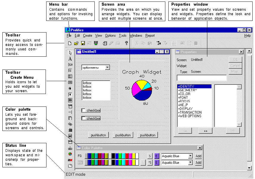
Figure 2-1 The Editor Workspace

The following components are displayed:

Menu bar
Contains available editor menu options.

Toolbars
With your mouse, you can quickly access commonly used commands. When you point to a button, a tooltip is displayed so that you can become familiar with the associated commands.

In Windows applications, toolbars can be moved and docked to various parts of the MDI frame. (For more information on this feature, refer to "Dockable Toolbars.")

Note: Under Motif, the tooltip does not display when the toolbar button is inactive.

Edit area
Displays an untitled application component. Here is where you place widgets and decorations that make up your application component. You can display multiple application components at once.

Properties window
Displays the property settings for the selected screen, service component, report or widget. Through the Properties window you define the initial look and feel of the object, such as colors, location, and size.

Status line
Displays the current state of the workspace. By default, the editor is in Edit mode. Other possible statuses are Test mode and Application mode. The status line also provides microhelp for Toolbar icons, menu commands, properties, and dialog box options.

Note: Under Motif, status line text does not display for inactive menu items.

Editor Windows

While working in the editor you can access other editor tools, such as the Toolbars and Color palette, to facilitate application development. You can ensure that these same windows open automatically every time you open the editor by saving your preferences; choose FileSave Pref.

You can access the other editor windows by selecting the appropriate command from the View menu.

Menu Bar

The editor menu bar provides you with easy access to the operations and commands that help you develop applications. This section provides a brief overview of each menu option and its contents.

File Menu

The File menu commands displayed on the toolbar allow you to create new application components, open and save existing components, and access test mode where you can test a screen or report.

The commands associated with the File menu include:

New
Creates a screen, service component, report, frameset, JPL file, repository entry, local (or remote) repository, local (or remote) library, or Java file.

Open
Opens a screen, report, service component, frameset, JPL module, repository entry, repository, library, database connection, middleware session, or Java file. Starting with Panther 5.30, there is also a Recent Files submenu that allows you to reopen files that were recently opened.

Close
Closes the current screen, report, frameset, or service component, an open repository, or a specific library. You can also choose to close a connection to the middleware or to a database.

Remove
Removes an entry from the open repository, or remove a specific library member (for example, a screen, a JPL module, a menu script file, a pixmap file).

Save
Saves the selected application component with its current name. If the application component is untitled, the Save As dialog box opens and you can save it to a specific library.

Save As
Lets you name and save the selected application component to a specific library, to the open repository, or to save as an ASCII text file.

Save All
Lets you save all currently open screens with their current names to their respective libraries or repositories. If any of the screens are untitled, the Save As dialog box opens.

Save Pref
Saves workspace preferences, such as Property window position and Toolbars display, as well as other settings indicated in the Options menu, such as showing the grid. Preferences saved here are overwritten if the Save Preferences on Exit option (under the Options menu) is turned on.

Revert
Reverts to the last saved version of the current screen. Unsaved changes made to the screen are not saved. An untitled screen reverts to an empty screen.

Source Mgmt
Lets you access your installed source code management tool (support for SCCS and PVCS). The option is only available if an open library or repository is under source code management. Choose to check-in or check-out a repository entry, screen or JPL procedure from a repository or library. You can also choose to cancel the check-out request. (For more details, refer to "Maintaining Libraries Under Source Control" in Application Development Guide.)

Test Mode
Lets you test the look and feel of the current screen, report, or frameset. You can test application components without saving the changes you made to them. Unsaved changes you have made to other open application components in the workspace are not lost when you go into Test mode. For further information on testing screens, refer to Chapter 38, "Testing Application Components," in Application Development Guide.

Exit or Quit
Ends your session in the editor. You are prompted to save any application components that you have created or changed but have not saved.

Edit Menu

Edit menu commands let you manipulate and design your application screens—providing alignment, centering, spacing, and sizing options as well as standard editing operations, like cut and paste.

The commands associated with the Edit menu include:

Undo
Undoes last several actions you performed in the workspace. The last action taken is displayed.

Redo
Re-performs the last action done in the workspace. The last action taken is displayed.

Cut, Copy, Delete, Paste, and Select All
Allows standard editing commands anywhere within the editor workspace.

Insert From Library
Allows you to read in existing JPL script, JavaScript, or VBScript from another open library into an open JPL text window.

Read File
Allows you to read in an existing JPL script, JavaScript, or VBScript from disk into an open JPL text window.

External Editor
Invokes the editor you specify (via the SMEDITOR variable) to edit JPL files, JavaScript, or VBScript in a text window.

Group
Provides the method for creating and identifying widgets as a selection group, as a table view, and as synchronized scrolling arrays. You can also select group members or entire groups and do group updates.

Align
Aligns a selected group of widgets (left, center, right, top, middle, or bottom) with respect to each other.

Size
Resizes a selected group of widgets by equalizing their heights, their widths, or both at once.

Space
Equalizes spaces (horizontally or vertically) between widgets within a selected group.

Center
Orients a selected group of widgets to the center (vertically and horizontally) on the screen.

Grid Align
Orients a group of selected widgets in relation to the editor's grid lines. You can orient vertically, horizontally, or both.

Find
Allows you to find a selected widget's source of inheritance or, conversely, find all the widgets that are the children of a repository object (namely widgets that inherit from a parent object). This also allows you the option of finding overlapping widgets on a given screen (for further information, see "How to Check for Overlapping Widgets").

Arrange
For reports, you can modify the view of layouts by collapsing some or all of the layout areas, or by changing their relative positions. For more information, refer to "How to Collapse and Expand Layout Areas" in Reports.

Create Menu

Create menu commands provide options for creating all widgets: labels, text, selection-type widgets, and grid widgets as well as graphical elements, like lines and boxes.

The drop-down list initially lists dual-deployment widgets (such as dynamic label and single line text widget) which are available on all platforms. At the bottom of the list is a submenu of Extended Widgets which cannot be deployed on every platform.

Extended Widgets currently include:

View Menu

View menu commands allow you to specify which of the editor's windows are displayed. The menu settings can be toggled on and off to display or hide specified windows. The View menu contains the following options:

Properties window
Lists the property settings for a selected screen or widget. You use this window to set properties for all objects on a screen and for the screen as a whole. You can also open the Properties window by double clicking on the workspace screen or on a widget or by pressing Enter. (See "Using the Properties Window.")

Repository TOC (table of contents)
Lists all screens in the open repository. You can open repository screens successively from the TOC window; you can have multiple repository screens open in your workspace. You can also delete repository entries from the TOC window. (See "Viewing the Repository Table of Contents.")

Library TOC (table of contents)
Lists all open libraries and their contents. You can open screens successively from the TOC window; and you can have multiple screens open in your workspace. You can open additional libraries (local and remote), add files to a library, delete files from a library, open JPL modules in a library, and extract files from a library to a system file in the TOC window. (See "Viewing the Library Table of Contents.")

Widget List
Lists all widgets in the active screen and provides an alternative method for selecting widgets, including those that are hidden or placed behind another widget. If you have multiple screens open in the workspace, as you move from screen to screen, the Widget List changes to reflect the active screen selection. (See "Using the Widget List.")

Color palette
Shortcut tool for applying foreground and background colors to screens and widgets. Displays 16 Panther-specific, GUI-specific and GUI-independent colors.

DB Interactions
Graphical map, or representation, of the relationships between parent and child table views and their links in the active screen. Provides a method for selecting these database widgets and accessing their properties. (See "Setting Link Properties" in Application Development Guide.)

Component Interface
(COM/MTS/EJB only) Provides a way of setting methods (type, name, and parameter) and properties (name, type and read-only options) for service components in three-tier applications. (See "Defining the Component Interface.")

Report Structure
The report structure window displays a diagram of the report structure. Each report element—format, data groups, detail data, and the report itself—has a corresponding node in the structure. (See Chapter 3, "Introducing Report Structure," in Reports.)

Options Menu

Options menu commands let you to specify how your workspace in the editor looks and acts. You can save these preferences as well as the editor's screen positions by choosing FileSave Pref. Or, you can save your current state and preferences by choosing Save Preferences on Exit from the Options menu. Refer to the following section for details on setting preferences.

Grid
Toggles the display of the screen grid (or choose the Grid button on the toolbar). By default, the grid is displayed and provides a guide for placing and aligning widgets. The grid must be displayed for the grid alignment command to function.

Multiple Select Mode
(Character mode only) Set by default to allow you to select noncontiguous widgets by simply clicking on each desired widget; then you can carry out commands or set properties on all selected widgets at one time. This option functions like Shift+click or Ctrl+click in windowing environments.

Inherit
Toggles inheritance on and off. When Inherit is off, changes made in repository screens are not propagated to open application screens that are set to inherit from a repository. Turning Inherit on immediately restores inheritance and propagates any changes in repository screens to open application screens.

Set Inherit Warnings
Allows you to turn inheritance warning messages off or on.

Multiple Create Mode
(Character mode only) Causes the Create toolbar and Create menu to stay in create mode rather than automatically returning to the Select icon or Select mode option, respectively.

Save Preferences on Exit
This overwrites any preferences you previously saved (including those saved using FileSave Pref).

Snap to Grid
(GUI only) Causes any new or repositioned widgets to position to its closest horizontal and vertical anchor points on the grid. If the grid is not displayed, this preference has no effect.

Auto Release on Screen Close
When the option is deselected, you are prompted whenever you choose to close a library screen or repository screen that you have reserved from a library or repository. Select this option to turn the prompt off, in which case the reservation is automatically released when you close either type of screen.

Drag Screen Size
When this option is enabled, dragging a corner of the report window resizes the report, not just the viewport. When it is disabled, you can resize a report and leave the report's Geometry unchanged.

Direct to External Editor
If you select this option, it opens any JPL module directly in your local editor and allows you to edit it; however, to confirm the edits, the local editor reads the JPL from the editor to the JPL text window.

Configure Toolbars
This option allows you to choose which toolbar menus are visible in the editor:

Editor Tooltips
(GUI only) Determines whether to show tooltips on editor screens.

Editor Tabs
This configures the number of tab stops for the whichever external editor you are using.

Undo Levels
Allows you to specify a number of undo levels (0-99) that you can perform while working in the editor.

Service Alias
(JetNet/TUXEDO only) This configures the user alias to use when testing services. For more information, refer to "Using Service Aliases to Test Services" in JetNet/ Oracle Tuxedo Guide.

Check Overlap on Screen Save
Forces the editor to check for overlapping widgets before actually saving the screen or screens affected by the save request. Used for Web screens since HTML does not support overlapping widgets. (See page E-17, "How to Check for Overlapping Widgets.")

Reload Java Classes
Reloads the Java classes when entering test mode or exiting the editor.

Enable Debugger
Allows you to debug the events associated from the current screen when you enter test mode. Refer to Chapter 39, "Using the Debugger," in Application Development Guide for details on setting preferences and using the Panther debugger. You can also enable the debugger directly from application or test modes, and set preferences there as well.

Tools Menu

The Tools menu provides the ability to import database objects, compile Java code, and access the Menubar, Styles, and JIF editors.

Import Database Objects
Provides access to the Database Browser where you can import database objects to the currently open repository.

Compile Java
Compiles the specified Java class. You can override the default command string using SMJAVACOMPILE. You can create new Java files from FileNewJava or edit Java files from FileOpenJava. For more information on using Java, refer to Chapter 21, "Java Event Handlers and Objects," in Application Development Guide.

Generate TM SQL
For the current screen, writes the SQL statements that the transaction manager generates for the screen to a file. One use for these SQL statements is to construct stored procedures in the database.

Generate Component
For a service component, creates the type library for COM or MTS components or the Java files for Enterprise JavaBeans. You can also prepare EJBs for deployment.

Menubar Editor
Invokes the Menubar editor which creates and edits menus that you can attach to individual screens via the editor or define for your application as a whole. For more information, refer to Chapter 25, "Menu Bar Editor."

Styles Editor
Invokes the Styles editor which enhances the transaction manager's control of the appearance and behavior of widgets on your database application screens. For more information, refer to Chapter 23, "Styles Editor."

JIF Editor
(JetNet/Tuxedo only) Invokes the JIF editor where you create and edit JIF files containing information about services, service groups, and reliable queues in a JetNet or Tuxedo application. For more information, refer to Chapter 24, "JIF Editor."

IBM Visual Age for Java
(WebSphere only) Invokes IBM Visual Age for Java if it is available to your computer. You can specify the path for the program by setting SMIBMVJAVA in your setup file.

IBM WebSphere Administrative Console
(WebSphere only) Invokes the IBM WebSphere Administrative Console if it is available to your computer. You can specify the path for the program by setting SMIBMWSADMIN in your setup file. Windows will check the registry settings for IBM WebSphere if the setup variable is not set.

Windows Menu

Windows menu commands provide access to all open windows in your editor workspace. At the bottom of the Windows menu is a list of open windows/screens from which you can select and bring focus.

Next User Screen
Moves focus from one user-created screen to another.

Next System Screen
Moves focus from one Panther system screen (non user-created) to another.

Cascade
(Windows environment only) Moves and resizes all open screens and windows into a layered arrangement within the MDI frame.

Tile
(Windows environment only) Moves and equally resizes all open screens and windows within the MDI frame.

Arrange Icons
(Windows environment only) This neatly arranges the icons for minimized windows.

Raise All
(Motif environment only) Raises all Panther screens to the top of the display, and layers them according to the window stack.

Report Menu

Report menu commands allow the generation of reports from within the editor. In three-tier environments, these reports can be generated only on the client via a local database connection; server-based reports must be processed using the command line or by JPL commands.

Preview Report
Opens a Run Report dialog box providing options to run the main or a subreport, pass arguments to the report, direct output to the internal viewer, a printer or a file, and access the print and page setup dialog boxes.

Print Setup
Opens the Print Setup dialog box, allowing the specification of printer options.

Page Setup
Opens a dialog box allowing basic page setup options including paper size, orientation and margins.

Output Viewer
Opens the viewer window so that report output files that were saved as metafiles may be viewed.

Show Property Links
Shows the property links associated with a selected widget in the layout window or node in the report window.

Toolbars

GUI versions of the editor contain toolbars with the most popular menu items.

Figure 2-2 The Toolbar in the Motif Version of the Editor

Dockable Toolbars

In Windows executables, you can expose or hide any of six toolbars. Panther runs within an MDI frame. If a toolbar is visible in the editor, it can be separated, moved and docked anywhere within the frame.

By choosing OptionsConfigure Toolbars, you can select the check boxes of the toolbars you want to display in the editor.
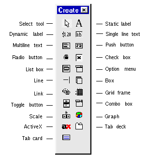
Create Toolbar
Shortcut tool for creating widgets. Select a widget from the Create toolbar and click on the screen at the desired location to place the widget. To temporarily activate multiple create mode, press Ctrl+click on a widget icon in the Toolbar. Cancel the mode by pressing Enter or by selecting a different widget icon in the toolbar.

Figure 2-3 Create Toolbar

Create Toolbar for Framesets
In Windows, shortcut tool for creating splitters in framesets. Select a splitter from the Create toolbar and click on the desired location in the frameset.

Figure 2-4 Create Toolbar for Framesets
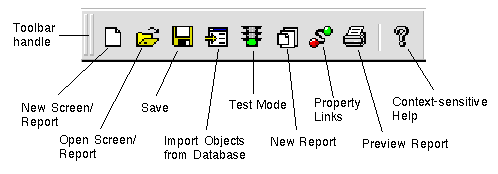
Main Toolbar
Contains some of the more commonly-used functions from the File and Reports menus.

Figure 2-5 Main Toolbar

Edit Toolbar
Allows easy access to some of the more commonly-used functions from the Edit menubar.

Figure 2-6 Edit Toolbar

Positioning Toolbar
Contains the alignment and positioning functions from the Edit menubar.

Figure 2-7 Positioning Toolbar

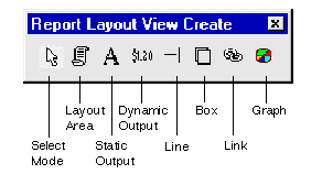
Report Layout Toolbar
Contains the shortcuts for report widget creation. This toolbar is only active when a report has focus.

Figure 2-8 Report Layout Toolbar

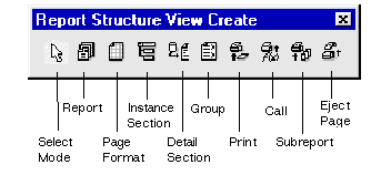
Report Structure Toolbar
Allows you to create additional nodes in the report structure. This toolbar is only active when the Report Structure window has focus.

Figure 2-9 Report Structure Toolbar

How to Use Dockable Toolbars

Chapter 25, "Menu Bar Editor," contains information about making toolbars.


Types of Widgets

Widgets are self-contained in that they hold all the information they require. Each widget type has a unique set of properties which, in fact, define the widget—the way it looks and the way it behaves. There are widgets that function as labels and only display text; others are used to accept data, while others only output data. The editor provides, via the Properties window, a way for you to establish the initial behavior and look of your application screens and their content. However, for the most part, you can change these defaults at runtime with Panther-provided library functions or through the property API.

You can create widgets via the Create toolbar or the Create menu. On the Create menu, the widgets that are only available on certain platforms are accessible from CreateExtended Widgets.

Each widget type is briefly described here. References to more detailed information for implementing these widgets are also indicated.

Display-Type Widgets

Display-type widgets are those which display information, either textually or graphically. For the most part, the user cannot bring focus to these widget types, and therefore, cannot modify the content directly.

Static label
Provides a means for displaying protected, static text to the user. The content of this widget cannot be accessed or modified by the user at runtime. It is for display purposes only. You define the content and the look of the static label at design time. You cannot change its content programmatically at runtime. Refer to Chapter 13, "Display Widgets," for more information on static labels.

Availability: All platforms

Dynamic label
Displays output data that is received either from the system, from a database, or programmatically; at runtime, a dynamic label is protected from data entry and, therefore, cannot receive focus. A dynamic label can be textual or pictorial. In addition, you can assign double-click events to dynamic labels. Refer to Chapter 13, "Display Widgets," for more information on dynamic labels.

Availability: All platforms

Graph
Presentation graphics include the ability to display data as a pie chart, bar/line chart, or XY-plot, in a two- or three-dimensional perspective. The graph can be populated with data derived from user entry in other fields on the screen, calculated data in other fields, and database-derived widgets. Refer to Chapter 13, "Display Widgets," for details on creating and using graphs in your application.

Availability: All platforms

Data Entry Widgets

Text widgets are used for accepting and displaying data at runtime. You can define the initial content of these widgets by setting the appropriate property. Refer to Chapter 14, "Data Entry Widgets," for information on creating data entry fields.

Single line text
Provides a single line area to accept or display data. You can display multiple elements by specifying that a single line text widget be an array. Each element in the array appears as a separate occurrence. An array can be arranged either horizontally or vertically.

Availability: All platforms

Multiline text
Accepts or displays multiple lines of word-wrapped text. The text array is enclosed within a single border. At runtime, this type of array can be scrolled by dragging the mouse, or by using the keyboard or scroll indicators. The multiline text widget can also be a non-word wrapped array.

Availability: All platforms

Combo box
Combines a text widget and list box, providing the user with the choice of typing data in the text portion or selecting an item from the drop-down list (nonscrollable in Motif) portion.

Availability: Motif, Windows

Grid widget
A two-dimensional array that can scroll both vertically and horizontally. The grid widget acts as a container for accepting or displaying tabular data, such as columns and rows from database tables, or spreadsheet-type data. Refer to Chapter 15, "Grid Widgets," for more information on defining grid properties.

Availability: All platforms

Input Widgets

These widgets, although very different from one another, in general, provide the user with a means of inputting data without having to type data.

Option menu
Provides a drop-down (non-scrolling in Motif) list of suggested choices from which the user can choose. Typically, option menus are used when the range of possible values for the field is limited to a relatively small number of valid values and only one selection can be made. The option menu is useful when a user might not know the possible values, and also when it's preferable that the user select a value rather than type an entry character-by-character. An option menu can be populated with data from an external source, like a database, or even from another screen. Refer to Chapter 20, "Selection Widgets," for more information about option menus and other selection widgets.

Availability: All platforms

Scale
Provides a way for the user to choose a value within a specified range. This widget is a combination of a scroll bar, or slider, which runs between a minimum and maximum value, and a dynamic label, which displays above a scroll bar or to the left of a horizontal scale. The label changes to reflect the current value. Scale widget values are digits only. Refer to "Using Scales" for more information.

Availability: All platforms

Command Widget

A command widget, when activated, executes an action or event. It requires no user input other than choosing the widget. Although other widget types can carry out a command, most GUI applications make frequent use of push buttons to perform an action.

Push button
Provides a way for users to quickly and easily execute an action or procedure with a single mouse click. You can display a text label or a picture (under the GUI platforms) on push buttons. You can specify the button's initial state—whether it can be pushed (active) or not (inactive)—and identify it as the screen's default or cancel button. When activated, push buttons appear to be pressed. Drop shadows are used in the GUIs, while a color change indicates activation in character mode. Refer to Chapter 19, "Push Button Widgets," for information.

Availability: All platforms

Selection Widgets

Selection widgets provide choices to the user. By default, some of these widgets allow for a single selection, while others let the user make several selections. These widgets are protected from data entry and clearing. Selection widgets of like kind can be grouped (for more information on grouping widgets, refer to "Grouping Selection Widgets"). Grouped selection widgets have their own set of properties. Selection widgets can also function alone. Check boxes and toggle buttons are examples. In addition, those widgets that have labels can optionally display pictures (for GUI environments) on them instead of the label text.

For more information on providing user options in your application, refer to Chapter 20, "Selection Widgets."

Radio button
Provides the user with a set of choices. Radio buttons work as a group, allowing a user to select one option in the group, which in turn clears the other buttons in the group. By default, only one selection can be made. Refer to "Using Radio Buttons" for more information.

Availability: All platforms

Check box
Provides a method for setting or selecting preferences. Check boxes can be grouped so a user can select one or more options, while an ungrouped check box might be used to turn a condition or preference on or off. At runtime, when a check box item is selected, a check mark or \Qx' appears next to the item (in Windows) and a three-dimensional, shaded box changes color (in Motif). Refer to "Using Check Boxes" for more information.

Availability: All platforms

Toggle button
Provides an off/on type of widget. When a toggle button is pushed, the button remains on or in the "in" position. When the button is pushed again, it appears to be off or in the "out" position, so the behavior or action is toggled off. With a group of toggle buttons, the user can, by default, choose any number of toggle buttons in the group. Refer to "Using Toggle Buttons" for more information.

Availability: Motif, Windows

List box
Provides a scrollable column of data. List boxes can be one of two types: action or selection. By default, a list box is the latter, and the user can make any number of selections. As an action type, the list box can function like a menu, where each item has an associated event or action. List boxes can be populated with data from an external source, like a database, or by supplying data at design time via the Properties window. Refer to "Using List Boxes" for more information on list boxes.

Availability: All platforms

Graphics Widgets

There are two graphic elements that you can draw to enhance the look and organization of your screens. You can specify size and color for these types of widgets. They are not field widgets and therefore cannot receive or display data; they are decorative. Refer to Chapter 21, "Graphics Widgets," for more information about using lines and boxes on your screens.

Line
Allows you to draw vertical or horizontal lines by dragging the mouse in the desired direction and length. You can also assign colors and styles.
Availability: All platforms

Box
Allows you to draw a box, extending it to the desired coordinates on your screen. You can specify the color of the lines (foreground) that make up the box as well as the area within the lines (background color). You can assign a label to the box and use the box as a border around one or more widgets.

Availability: All platforms

Database Widget

There is a single database widget that is specific to database definitions. It is used to define relationships between parent and child table views on your screen. This widget type is used by the transaction manager in order to carry out database transactions. Refer to Chapter 22, "Table Views and Links," for more information on linking table views.

Link
A hidden-at-runtime widget that is automatically created when you import database tables. The link is used by the transaction manager to describe relationships between parent and child table views. In the editor, the link appears like a label widget, with the name of the parent and child table views in the format parent+child.

Availability: All platforms

COM Widget

The ActiveX container allows you to specify which ActiveX control to make a part of your application.

ActiveX
ActiveX is a widget which utilizes part of Microsoft's COM (Component Object Model) technologies. An ActiveX control is a component program object that can be created and reused by many applications in the same computer or in a distributed network. For more information, refer to Chapter 18, "ActiveX Controls."

Availability: Windows, Web

Tab Controls

The tab control allows widgets to be grouped onto individual display cards inside a tab deck. Refer to Chapter 16, "Tab Controls," for more information.

Tab Deck
The Tab Deck is a special kind of container which has a group of cards associated with it. Together with the Tab Card (see below), this widget is used to create a tab control.

Availability: Windows, Motif

Tab Card
The Tab Card consists of a tab and a set of widgets associated with that card.

Availability: Windows, Motif

Hidden Widgets

There are two additional widget types—both of which are permanently hidden at runtime and design time. However, like other Panther widgets, these too have their own set of properties, which you can access by selecting the hidden widget from the Widget List or from a variety of access points (discussed later in this guide).

Table view
A group of related widgets, usually associated with and named for a single database table. Although the table view is not visible, its group members are. The table view must be present on your application screen if you want to use the transaction manager to provide automatic database access.

A table view widget is automatically created on each repository entry when you import database tables into a repository. When you copy a database-derived widget from a repository entry, Panther creates a table view on the destination screen, provided the copied widget belonged to a table view in the repository entry. Refer to Chapter 22, "Table Views and Links," for more information on table views and their properties.

Availability: All platforms

Group
A hidden group widget is automatically created when you group selection widgets, when you define widgets to scroll together, and when you include widgets in a grid widget. Through the group widget's properties you can define the behavior of the widgets as a group, or single entity, as opposed to defining the behavior for each individual widget. Refer to "Grouping Selection Widgets" for more information on creating groups.

Availability: All platforms

Report Widgets

When a report layout window has focus, the Create menu displays the widget types available for reports. When the report structure window has focus, the Create menu lists the report nodes that can be added to the report structure.

The following widget types are only available for report layouts:

Layout area
The layout area widget defines a specific part of a layout window. That part, once named, can be accessed by a structure node as part of a report. It can contain, among other things, data, headings, header and footer information, subtotals and totals.

Static output
Provides a means to display data that is specified in the editor. It is similar to the static label in screens.

Dynamic output
Receives data at runtime from another widget or from a database. This widget is similar to the dynamic label in screens.

Frameset Widgets

Vertical splitter
Divides the frameset into two or columns, and is represented in the frameset screen in the editor by one or more vertical mullions.

Availability: Windows (Panther 4.5+)

Horizontal splitter
Divides the frameset into two or more rows, and will be represented in the editor by one or more horizontal mullions.

Availability: Windows (Panther 4.5+)

Two-way splitter
Divides the frameset into four panes, and will be represented in the editor by one vertical and one horizontal mullion.

Availability: Windows (Panther 4.5+)


Properties Window

The editor provides, via the Properties window, a way for you to establish the initial behavior and look of your application components and their content.

You must select an object (screen, service component, report, widget) to set its properties. By default, the application component is selected when none of its widgets are selected. Do either of the following to deselect widgets:

The Properties window consists of the following sections for displaying and setting property values for the selected object:

Screen
Displays the filename of the current application object (screen, report, service component). By default, the name is Untitled followed by a number.

Widget
Displays the name of the selected widget, as indicated in the Name property under the Identity heading. If the widget has not been named, its field number assignment is used. If more than one widget is selected, three question marks (???) are displayed.

Type
Displays the type of object currently selected. Types include: widget types (like Push Button, Static Label, Link), group types (like Group, Sync Group, Table View), Screen (when a screen is selected), Report File (when a report is selected) or Component (when a service component is selected). If more than one widget type is selected, three question marks (???) are displayed.

Setting field
Use this field to enter, select, or edit a setting for a property. Depending on the selected property, the setting field can function as an option menu, as a combo box where you can type a value or select from the drop-down list of possible values, or as a text field where you can type a value.

If a property has more than one predefined value:

Properties window
Contains an expandable list which displays all major headings and the properties for the selected object or objects. When the properties list is collapsed, each heading is preceded by a +, indicating that the heading can be expanded. Click on the heading, or press Enter, to view the properties under the selected heading. To expand the entire listing, choose the ++ push button. To collapse a heading preceded by -, click on the heading or choose the - - push button to collapse the entire list.

You can search for properties (when the list is expanded) by typing an initial character. The cursor moves to the next occurrence that matches.

The left column displays all applicable properties for a selected object; the right column displays the current property value setting. When more than one widget type is selected, only the properties that apply to all are displayed. In addition, three questions marks (???) are displayed in the values column if you select multiple widgets that have differing property values.

Property values in the right column that are displayed in reverse video indicate that the setting is inherited from another source. For further information on inheritance, refer to "Controlling Inheritance."

More... button
Depending on the property you select, the More button displays one of the following:

Inh (Inherit) button
Toggle inheritance on or off for the selected property. This button is available only if the selected object has a value in the Inherit From property—that is, if the object is inheriting some or all of its properties from a repository. Refer to "Controlling Inheritance" for more information.

OK and Cancel buttons
Choose OK or click anywhere in the editor workspace to accept a setting. Choose Cancel to leave the value unchanged.

Property Categories

Each object has default properties. Some of the properties apply to all objects; other properties are, in fact, what define and make objects unique. Setting properties through the editor allows you to initialize the content of your application components. After you complete your application interface, you can also control and alter the behavior and look of widgets and screens at runtime by using Panther's API, which includes C library functions, a property API, and Java interfaces.

Widget Properties

In general, the property headings listed here for widgets are common to all widget types; the properties within each heading vary depending on the widget type. Some properties appear only if other property specifications have already been indicated. For example, if the Data Formatting property is set to Date/Time, a System Update property is available. These dependent properties are preceded by -> in the Properties window. In addition, a default setting for a property can vary depending on the widget type; however, if the property is listed in the Properties window, you can change it.

Note: If you have more than one widget type selected, only those properties that apply to all appear in the Properties window.

Identity properties
Used to identify or change the identity of a selected widget, for example, name, type, source of inheritance (if applicable), label text, initialization state (for example, active vs. inactive), and memo text (for additional comments and programmatic use).

Geometry properties
Define the size and location of a selected widget. Array, scroll and shift properties are included under Geometry.

Color properties
Assign foreground and background colors. These can be Panther colors, platform-specific colors, or color aliases. In addition, for character mode, you can assign other attributes to the widget, like dim and blink.

Font properties
Assign a font (this overrides a screen-wide or application-wide font specification). This can be a Prolifics font, a GUI-specific font, or an alias font name.

Focus properties
Used to define what happens when a widget gets and loses focus. These properties apply to any widget type that can receive focus. For example, entry and exit functions, tabbing order and behavior, and Java tags.

Help properties
Define the type of help or guidance a user might seek when the selected widget receives focus at runtime. For example, status line text, selection screen identification, and help screens.

Input properties
Used to define the characters, types of data, and restrictions on user input for a selected widget. These include things like defining the minimum and maximum values, initial values, keystroke filters, and whether the field is protected (protected from input or protected from clearing).

Validation properties
Used for writing, defining, and identifying the functions and events that occur during the widget's validation, that is, when the field receives or loses focus at runtime.

Format/Display properties
Control the way data is formatted and appears to the user. For example, things like date/time and numeric formats, textual justification (positioning), and whether the widget displays a picture instead of text.

Graph properties
Provide graph-specific information for designing a pie chart, bar graph, XY plot, or high/low graph.

Database properties
Provide database-specific information used by Panther to construct and generate SQL statements. These property values are initially derived from your database definitions: for example, the widget's column name in the database. In addition, you can define how the widget is used in a transaction; for example, if it should be used in the SELECT statement or in the WHERE clause of the SQL statement. Refer to Chapter 33, "Using Automated SQL Generation," in Application Development Guide for more information on Database properties.

Transaction properties
Provide database-specific information as required by the transaction manager to control display attributes and protections based on the kind of transaction being performed. Refer to Chapter 22, "Table Views and Links," for more information on Transaction properties.

Server View properties
Provide information about how the transaction manager should fetch data for the widgets in a table view.

Service properties
(JetNet/Tuxedo only) Provide the names of services to call for specific transaction manager events. You set service properties on table view and link widgets. Refer to "Service Properties" for more information on Service properties.

Composition properties
Define properties for the widget when operating in a report.

Web Options properties
Define properties for the widget when operating in a web application.

XML properties
Define XML tags and attributes for importing and exporting widgets in XML.

Screen Properties

The screen itself has its own set of properties. You gain access to these properties when a screen is selected (no widgets on the screen can be selected).

Identity properties
Identify the screen—like the screen's name, its source of inheritance, and whether the screen should function as a dialog box.

Geometry properties
Define the initial size and state of a screen as well as whether it is can be resized by a user at runtime.

Color properties
Assign a background color.

Font properties
Assign a font (this overrides the application-wide font specification). This can be a Prolifics font, a GUI-specific font, or an alias font name.

Focus properties
Control what happens when an application component has focus and what happens when focus changes: for example, the name of the menu that is associated with the screen, and the names of exit and entry functions.

Procedures properties (Service component)
Control the functions of a service component at runtime. These properties are similar to the those of the Focus properties of a screen, including entry and exit functions, and JPL procedures.

Help properties
Define the type of help or guidance a user might seek when a screen receives focus: for example, status line text and help screens.

Display properties
Control the screen's visual characteristics including things like its border style, color, decorations, and mouse pointer style.

Transaction properties
Define the root table and transaction model used by the transaction manager to carry out its commands at runtime.

Web Options properties
Define properties for using the screen in a web application.

XML properties
Define XML tags and attributes for importing and exporting screens in XML.