


| Using the Editors | |
A tab control widget contains one or more cards which are accessed by clicking on a graphic index tab associated with each card. This is particularly useful for providing a multi-layered control panel.
Notes:
Creating and Editing a Tab Control |  |
A tab control consists of two kinds of elements:
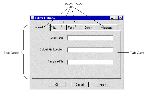
Figure 16-1 A sample tab dialog screen illustrating the parts of a tab control.
How to Create and Populate a Tab Control
 Extended WidgetsTab Deck or
  .Extended WidgetsTab Card and then clicking on the deck; the tab card icon is
  .
.
Where the mouse click occurs in relation to the existing index tabs determines the placement of the new tab card. Clicking to the far right adds it to the end of the deck, clicking to the far left adds it to the beginning of the deck, and clicking in the middle of the tab deck adds it between two index tabs of existing tab cards.
Note: A new tab card cannot be placed outside the borders of a tab deck.
Manipulating a Tab Deck and Tab Cards | |
How to Make a Tab Card the Topmost Card
How to Select a Tab Card for Editing
You can change the order (left to right) in which the tab cards appear.
How to Change the Tab Card Order
When you move, copy, or delete a tab deck, the members of the tab deck are moved, copied, or deleted as well.
While working with tab controls, be aware that:
How to Move, Copy, or Delete a Tab Deck
General Notes About Tab Controls
NCARD and PCARD move to the next and previous tab cards, respectively.
Creating a Tab Dialog Screen | |
A typical use for tab controls is in dialog windows. Such a dialog window would consist of a single tab control. Each card in the tab deck would provide a series of user-selectable choices. Outside of the tab control, there would typically be a series of push buttons to indicate user acceptance of the choices made.
Default/Cancel property to specify the push button's behavior (refer to "Assigning Default and Cancel").Dialog property to Yes (refer to "Creating a Dialog Box").
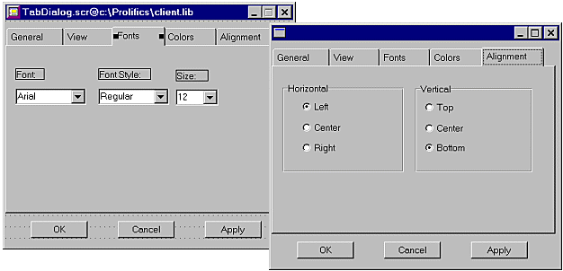
Figure 16-2 Two views of a tab deck, showing two of the cards in the deck. Notice the push button controls which are placed on the screen outside the tab deck.
Tab Control Properties | |
This sections describes special properties appearing in the Properties window for tab cards and tab decks. In addition, there are runtime properties for tab controls. For more information, refer to "Accessing Tab Controls" in Application Development Guide.
The following properties of tab decks require special mention:
If set to Yes, users will be unable to change the tab card and the logical keys NCARD and PCARD will not advance the card; but the top card can be changed by setting the deck's topmost_card property.
You cannot specify the color of the tab deck itself. It is derived from your Windows color scheme. Setting BG Color affects only the background color of label widgets placed on the tab deck.
Render the labels on the index tabs. A single setting affects all the index tabs in a particular deck.
For tab cards, the following categories in the Properties window should be noted:
Note: For Motif applications, all the index tabs in a tab deck have the same length. Also, the index tabs will not be resized when the labels are shortened. Only Motif 2.2 supports having both text and an image on a tab.
Setting the Color properties on the tab card has no effect in Windows. It is derived from your Windows color scheme.
Tab cards have three sets of entry and exit events. To understand the distinction between them, keep in mind that a tab card consists of two distinct components: a field that is displayed as the card's index tab, and a set of widgets that the tab card contains. At runtime, the index tab of the topmost card in a deck is one of the fields on the screen and can gain focus. Consequently, the index tab has its own entry and exit events.
For more information about entry and exit functions specific to tab cards, refer to "Tab Control Events" in Application Development Guide.
For the Card Entry and Card Exit Functions, the index tab field is considered to be a widget "contained on the tab card."
In addition to the events that occur when a tab card is exposed or hidden, the Expose Function is called on screen entry for the card that will be topmost, and the Hide Function is called on screen exit for the current topmost card. These events occur even if the tab deck is hidden. However, the Expose and Hide Functions do not execute when the tab deck's Hidden property is used to hide or unhide a tab deck.
The index tab has the following two functions:
The order of execution for the above entry functions is as follows:
Not all events may happen at the same time. For example, focus can go directly onto a widget on the tab card—bypassing the tab index—if a widget on the card receives focus. In that case, the tab entry event does not occur. Similarly, if the card was exposed as part of an earlier event (at screen entry or when it was made topmost), the expose event does not occur when focus enters the tab card.
A situation when all three entry events occur is when the screen is being opened and the tab deck is the first widget to get focus.
Exit events occur in the corresponding opposite order.
To validate all the tab cards in a deck, call sm_validate on the tab deck and this will iteratively call validation functions on all the tab cards in the deck, whether they are hidden or not.
Note:
Do not call sm_validate on the tab card as part of the tab card's validation function, since this will produce an infinite loop.
Note: Only Motif 2.2 supports having both text and an image on a tab. Earlier versions can only have text or an image.