


| Using the Editors | |
The chapter describes some basic procedures needed for widgets in the Editor.
Selecting a Widget |  |
You must select a widget or widgets to set properties at the widget-level. A selected widget is displayed with a changed border—on GUI platforms small, black boxes, or grab handles are displayed; in character mode, the widget is surrounded by square brackets ([ ]). A selected grid widget member is displayed in reverse video from unselected members.
When more than one widget is selected, the first one you select is considered the dominant selection; all other widgets in the selection set are indicated with hollow boxes in GUIs and curly braces ({ }) in character mode. The position and size of the dominant widget determines how the other widgets in your selection set will align or resize.
Note: If you are using Panther in character mode without a mouse, refer to Appendix A, "Keyboard Interface," for details on using the keyboard to manipulate widgets and navigate in the Editor.
You can select widgets in the following ways:
Click on a widget with the mouse. Only one widget can be selected using this method. All previously selected widgets on the screen are deselected.
(For selecting grid widgets and their members, refer to "Manipulating a Grid Widget and Grid Members."
With the mouse button pressed, drag a bounding box, also known as a rubberband, around the desired widgets. This method allows you to select contiguous widgets. Any widgets that fall within the rubberband boundary are selected. Only one widget in the selection set is dominant.
Press Ctrl+click on any widget in your selection set to make that widget the dominant selection.
Shift+rubberband to toggle the selection state of all widgets within the bounding box. Ctrl+rubberband to select any widgets that are not already selected; this does not change the dominant selection.
Do either of the following:
Rubberbanding
Deselecting Widgets
How to Deselect Widgets
Use the Widget List to:
Using the Widget List
You can use the Type option menu to only view widgets of one widget type. In a GUI, you can click on the Name and Column labels to change the sort of the Widget List.
You cannot move widgets in the Widget List window; however, once widgets have been selected, you gain access to their properties and you can move, copy or delete the selected widgets together.
How to Select Objects Using the Widget List
 Widget List. The Widget List is displayed.
The widgets on the current screen are listed in top to bottom and left to right order. The left column lists the widget numbers; the middle column lists the widgets by name (or by field number or contents if the widget is not named); the right column lists the widget type.
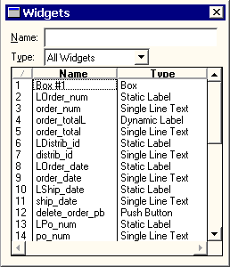
Figure 9-1 The Widget List's left column is the widget number; the middle column is the widget name (or field number or contents) and the right column is the type.
Resizing a Widget | |
You can resize, copy, and move widgets:
Note:
Some selection methods are unique to the platform on which Panther is running.
If you are using Panther in character mode without a mouse, refer to Appendix A, "Keyboard Interface," for details on using the keyboard to manipulate widgets and navigate in the screen editor.
You can resize and control the size of a widget by:
Use the method that works best for your immediate requirements.
If the size of the widget is inherited from a repository widget, Panther reminds you that inheritance for that Geometry property will be removed. You can choose to either change the size or retain the inherited size. Refer to "Controlling Inheritance" for details.
A widget's horizontal dimension (with the exception of scales, lines, and boxes) is defined by its Length property setting. This value defines the amount of data, in columns, that the widget can display on the screen. Its vertical dimension is defined by the number of onscreen occurrences and the size of the font that the widget uses.
Height and Width properties define a widget's physical size. And, a widget's length is not necessarily dependent on its width specification. So, you can have a widget appear wider than the actual amount of data it will display.
Default-sized widgets do not have Height and Width specifications. When you resize a widget, Panther automatically applies values to these properties.
Defining a Widget's Size
Dragging to Size
How to Resize a Widget
To resize one or more widgets to a specific size, use the Properties window:
Select the widget or widgets that you want to resize. Under Geometry, enter a value (default is grid units) in the Height and/or Width properties. Refer to Table 9-1 for a list of valid units of measurement.
For example, 5c means five characters wide, 5 (without a unit of measure) denotes five grid units.
The width and/or height of the selected widgets adjusts according to your specification.
The widget (except for static labels) dynamically resizes at runtime if its content changes.
If you increase or decrease the number of characters in the widget's Label property, the widget's length adjusts appropriately to fit the content. If you reset both Height and Width properties, the Size to Contents property is ignored.
You can resize all widgets in your selection set to be the same size by using the Size command; adjust both the width and height of the widgets.

Size and the directional dimension or the appropriate Size button on the toolbar.
The widgets in your selection set match the height and/or width of the dominant widget.
Only in GUIs does Panther provide properties for certain widgets which allow them to grow and shrink proportionally when the user resizes the screen at runtime. The following widget types can be configured to resize:
The screen's Resizeable property (under Geometry) must be set to Yes to allow widgets to resize.
Note:
The Resizeable property is supported only in GUIs.
How to Define the Vertical Resizing Behavior for Capable Widgets
vert_max_size) property.vert_min_size) property.For valid units of measurement, refer to Table 9-1.
horiz_max_size) property.horiz_min_size) property.For valid units of measurement, refer to Table 9-1.
This section explains how the auto-resize properties affect behavior at runtime. Review the following rules when designing your screen; they will help you take advantage of Panther's automatic resizing capability. In addition, if you find that Panther's built-in resize capability does not satisfy a specific requirement, you can attach a custom resize function via the screen's Resize Function property.
When configuring Panther for your desired resize behavior, think in terms of each resizable widget forming a path across the screen. The path occupies the area that the widget would take up if it were resized horizontally to its maximum in either direction. If one or more resizable widgets share the same Starting Row, Height, and Vertical Anchor, then these widgets share the same path. If widgets with either Horiz or Vert Auto Resize property set have an overlapping, but non-identical path, then the widgets cannot resize.
Moving and Copying Widgets | |
Alternative methods for moving and copying widgets in character mode are also described here, since character mode Panther is unable to take advantage of Shift+click and Ctrl+click to move and copy objects.

When you move or copy a widget, its properties and all other pertinent information go with it, including its inheritance.
Alternatively and in character mode:
Copy (or the Copy button from the toolbar).Paste (or the Paste button).The copied widget is pasted down and to the right of the original widget by one grid unit.
Note: In character mode, if you are in Multiple Select Mode, remember both the source and copied widgets are selected and it is difficult to carry out an operation without affecting both widgets—in other words, both widgets will move together.
Alternatively and in character mode:
Cut (or the Cut button on the toolbar).Paste (or the Paste button).The widget is pasted in the same location in the destination screen as it was in the source screen. If another widget is in the destination location, the widget is positioned down and to the right by one grid unit.
You can add a widget to your application screen by dragging (copying) a named widget from a repository entry, and thereby inherit properties from a single source.
You can also do the reverse operation: copy named widgets from your application screen to a repository entry. The original widgets become the children and are automatically defined to inherit from the copied widgets in the repository.
The inheritance relationship between parent objects in the repository and their child objects can be retained, thus ensuring that standards are established and that changes in repositories are propagated to your application appropriately. Refer to "Controlling Inheritance" for more information on repositories and inheritance.
Select a widget. Do either of the following:
To and From a Repository
Deleting Widgets
How to Delete or Remove a Widget
Cut or the Cut button from the toolbar.
This places the removed widget in a temporary buffer. You can then paste the widget in the same screen or in another screen. The cut object remains in the buffer until it is overwritten by the next Cut operation.
Delete or press the Delete key.
Arranging Widgets | |
You can arrange widgets along vertical and horizontal axes; you can align or space them in relation to one another or arrange them at specific positions on the screen. You can do this by:
When you arrange widgets on your screen using the Align command, the dominant widget remains fixed, and the other widgets in your selection set align with it. The Align command doesn't change the size of the widgets.
Aligning Widgets
How to Align Widgets with Each Other
Align and the orientation or the appropriate Align button on the toolbar.

In the Properties window, three question marks are displayed in the Start Row and Start Column properties (under Geometry) if the selected widgets are not already aligned on the same coordinate.
Changing the Start Row aligns the top edges of selected widgets on the specified unit; changing the Start Column aligns the left edges of the widgets on the specified unit.
The selected widgets, including the dominant selection, align accordingly on the specified coordinate.
Grid (or the Grid button on the toolbar) to toggle the screen grid display on.Grid Align and the position:
Note: The Grid Align command is dependent on the screen grid display.
Choose OptionsSnap To Grid.
In a character environment, all objects are aligned to a grid coordinate, so the Start Row and Start Column properties will have whole number values.
By using the Space command, you can position widgets on your screen so that there is an equal amount of space between the widgets in your selection set. You can let Panther automatically space the widgets evenly, or you can explicitly set the distance between widgets.
To create an equal amount of space between widgets:
Spacing Widgets
How to Create Automatic Spacing
The widgets that are outermost in your selection set—that is, the left- and right-most, or top- and bottom-most—are designated as left and right anchors, or top and bottom anchors, respectively. The anchors do not move when you use the Space command; the other widgets in the selection set adjust positions within the anchors' boundaries.

Space and an orientation or choose the appropriate Space button on the toolbar.
To specify an absolute amount of space between widgets in a selection set:
SpaceCustom. The Set Custom Spacing dialog box opens.If there is insufficient space to arrange the widgets using the specified value, a message is displayed. You might correct the problem by trying any of the following:
The Center command treats multiple widgets as a set, and, therefore, their orientation to one another is not changed.
Select one or more widgets. Choose Edit Centering Widgets

How to Center Widgets on a Screen
Center and an orientation, or choose the appropriate Center button on the toolbar.
Controlling a Widget's Position at Runtime | |
You can control where a widget is repositioned at runtime in the event that:
By default, a widget is positioned along its left edge and vertically along its middle axis. The anchor properties also determine how the widget retains its alignment to other widgets on the screen.
How to Set a Widget's Position in Relation to Other Widgets
Alignment and anchoring go hand-in-hand. Left-aligned widgets that have a Horizontal Anchor of Left remain left-aligned. The same is true for all other similar combinations (e.g., right-align and right anchor). If you align widgets by choosing EditAlign, Panther automatically sets the appropriate Anchor property position.
In addition, if you align widgets to a grid coordinate by choosing EditGrid Align, widgets align at their anchor specification along the nearest grid coordinate (refer to "How to Position a Widget on a Grid Coordinate" for more information).
Undoing Actions | |
Panther keeps track of editing and formatting changes that you make on each open screen. If you inadvertently move a widget or change your mind, you can usually reverse the last several (10 by default) actions you took, including setting changes you make via the Properties window. You can also change the number of undo levels for your authoring environment.
Multiple actions are undone or redone in sequence. However, there are some actions that you can't undo, such as saving a screen or selecting widgets.

Choose EditUndo or the Undo button on the toolbar to reverse the last action. The Undo menu option identifies the last action that can be reversed.
Choose EditRedo or the Redo button on the toolbar to redo the last canceled action. The Redo menu option identifies the last action that can be redone.
Undo Levels. The Configure Undo Levels dialog box opens.0 to 99 to define the number of levels that can be undone and redone for each screen.