


| Using the Editors | |
Data entry widgets are used to accept and display text or data that the user enters. They also accept data from external sources, such as a database or an LDB screen.
Defining the Input with Keystroke Filters |  |
The Keystroke Filter property, a property for single line and multiline text widgets and combo boxes, provides a mechanism for validating input, character-by-character, as a user types. In addition, you can define a regular expression that also validates the entire field when the field is exited at runtime. In general, if a user attempts to enter a character that does not match the Keystroke Filter specification for the field, a warning beep sounds, and the character is rejected.
By default, the Keystroke Filter property is set to Unfiltered, meaning that entry of any character is accepted when typed.
Under Input, in the Keystroke Filter property, select the desired filter from the Setting option menu. Possible filters are:
Specifying Digits-only as a filter type:
Digits Only Filter
In general, use this type of data filter for fields requiring no special punctuation or format, or if the input can be variable in length. For example, specify a digits-only filter for a field where a quantity is entered. On the other hand, if you have a field used for entering a number of fixed length and format, like a Social Security number or identification number, consider using an edit mask filter.
You can embed alphabetic characters, punctuation, or special characters in a digits-only field.
How to Embed Special Characters in a Digits-Only Field
For example, an initial text entry of # - - displays in the field at runtime. The user can type numbers without overwriting the punctuation.
Refer to Chapter 10, "Controlling the Way Things Look," for more information on defining the display format.
Specifying Yes-No as a Keystroke Filter setting allows entry of the initial letters of "yes" and "no." This edit uses the initial letters, in upper and lower case, defined in the SM_YES and SM_NO entries in the Panther message file. You can change the message file to support non-English equivalents of Y and N. Refer to "Setting Yes/No Values" in Application Development Guide for details on changing the default values.
By default, all of the following entries are acceptable at runtime: y, Y, n, N, or space, which is converted to n.
The alphabetic and numeric keystroke filters let you enforce entry of alphabetic characters, numbers, or a combination of both. In general, these filters are useful for a field that accepts data that can vary in length, like names or titles, or that requires no special punctuation or format.
Panther uses library functions to evaluate alphabetic and numeric input.
For information on how Panther interprets keystroke filters for multilingual applications, refer to "Keystroke Filter Translation" in Application Development Guide.
Allows only a-z, A-Z, and the space character. Alphabetic filters allow the entry of a variable number of characters. For example, in a Name field, the user can enter any size name, up to the length specified for the field.
Allows entry of digits, a plus or minus sign, and one decimal point. If a plus or minus sign is entered, it must be leftmost in the field. When a valid character is entered into the middle of an otherwise empty field, it is rejected (due to the leading/trailing blanks).
Numeric filters are useful when input data must be specified to be positive or negative, or when the data length is not fixed or formatted.
Allows entry of any digits, the letters a-z and A-Z, and the space character.
Edit masks let you:
Alphanumeric Edits
Edit Masks
Panther strips out the display characters, or mask, from the data. Library functions like sm_getfield return data characters only.
How to Define an Edit Mask
Note: If your edit mask includes embedded punctuation, omit the punctuation from other format properties, substring operations, and JPL procedures when validating, comparing, or manipulating the data.
900 and 999) when the field is exited.The following mask represents an 11-character field; seven of the characters are data characters; the letters C, N, pound sign, and hyphen are display characters:
CN#\9\9\9-\9\9\9\9
When the user enters the field, the cursor is positioned on the first data character, in this example, on the first digit position, bypassing the display characters (CN#).
If a widget has an edit mask and also has the Null Field property under Format/ Display set to Yes, only the data characters are replaced by the null edit. Consider defining a null text string indicator in the Null Text property (a subproperty of Null Field), such as an asterisk, and set the Repeating property to Yes. This ensures that a field with the edit mask CN#\9\9\9-\9\9\9\9 appears as CN#***-**** when the field is null.
Include the display characters in the edit mask, for instance, as \9\9-\9\9-\9\9. Specify a custom date format in the Format Type property that does not include the special characters—for example, MON2DATE2YR2 as opposed to MON2-DATE2-YR2. This latter specification would result in an invalid date/time format error when the user enters a date value.
Regular expressions let you:
The rules for defining a regular expression are the same for both character-level and field-level expressions, except they are stored as different properties.
How to Define a Character-Level Regular Expression
At runtime, each character is checked against the regular expression as the use types. Invalid input is rejected immediately, and a warning beep is issued. The data is also verified when the field is validated, in the event that the user deleted a character, causing the string to be invalid.
Select the data entry widget. Under Input, type the expression string in the Regular Expression property.
At runtime, the content of the field is matched against the regular expression when the field is validated. If the data doesn't match the specified pattern, Panther displays a message (for example, Entry out of range) and the cursor is automatically positioned at the invalid character if the entry does not match the specified pattern.
[0-9]\{3\}-[a-zA-Z0-9]\{3,6\} defines an identification number of three-digits followed by a hyphen, followed by a minimum of three letters or numbers, but no more than six.
[iI][cC][eE] matches ice, icE, iCe, Ice, IcE, ICe, or ICE.
212-[0-9]\{3\}-[0-9]\{4\} matches any phone number having a 212 area code.
[0-9]\{3\}-[0-9]\{2\}-[0-9]\{4\} matches any social security number.
[a-zA-Z_][0-9a-zA-Z_]* matches an identifier in the C programming language.
There are two kinds of rules for constructing a regular expression: one for forming simple expressions, and one for combining expressions into more complex expressions.
The simplest regular expression is a single character, which matches itself. The regular expression z matches the string z. A blank in a regular expression matches a blank in a field. Table 14-2 identifies special characters you can use in constructing a regular expression.
The backslash (\):
\. matches the dot, and the sequence \\ matches a single backslash.
Character classes are a group of characters between brackets ( Table 14-3 lists special characters that you can include within a character class when constructing a regular expression.
Rules for Character Classes
[]). A valid entry matches any of the specified characters within the brackets. For example, the expression [13579] matches any single, odd-digit; the expression [aA] matches an a of either case.
The following exceptions indicate when a caret, hyphen or bracket stands for itself:
For example, to allow a field to accept any character except Put one expression after the other. The entered data must match whatever matches the first expression, followed by whatever matches the next, and so on. Data is matched sequentially with each subexpression.
For example, an expression that comprises the following subexpressions:
accepts any five-letter word that doesn't begin with upper or lower case X, Y, or Z and whose second, third, and fourth letters are lower case characters.
You can define an expression that includes the number of times that the expression, or subexpression, is to be repeated.
^ (caret), - (hyphen), [ (opening square bracket), ] (closing square bracket, . (dot or period), or \ (backslash), use the following expression:
[^][.\-]
Rules for Combining Two or More Expressions
[^xXyYzZ][a-z][a-z][a-z][a-z]
Rules for Defining an Expression with a Repeated Pattern Match
* that follows an expression or subexpression means that the pattern defined in the preceding expression is to be repeated zero or more times. For example, the expression [0-9]* matches any number of digits or none at all, as opposed to [0-9] which matches only one digit in the range of zero to nine.
To force the entry of at least one digit, use the expression [0-9][0-9]*.
\{ and \} immediately after the expression or subexpression. The count or number you define specifies the number of times that the expression is to be repeated. There are three forms you can use to specify a repeat number:
You can construct a complex expression using abbreviated syntax. These types of expressions are useful when specific repeated patterns are required as input in a field.
Rules for Rematching Subexpressions
\( and \) around the subexpression. Then place a quoted digit later in your expression; for example, \n will match whatever the nth subexpression surrounded by \(\) matched.
For example, to enforce a string construction that expects the first and third characters to be the same, your expression might be:
Acceptable input would be in which case, acceptable input would be \([A-Z]\)\([0-9]\)\1
B5B, J9J, and so on; while A8B is not accepted. To rematch the second subexpression as well as the first, change the expression to
\([A-Z]\)\([0-9]\)\1\2
B5B5, A1A1, and so on, while input like U2U5 and A7B7 are not.
Converting Case
How to Ensure that Data is Entered in the Desired Case
Controlling What Occurs on Input | |
For the most part, Input properties control the behavior of the field and not the actual content of the field. These properties apply to those widgets that accept data—single line and multiline text widgets, combo boxes, and, in some cases, scales.
A range specification can ensure that a user stays within a specified range when entering data in the selected widget. Any widget that can accept data by user input, including a scale widget, can have a Minimum Value and Maximum Value property specification.
Note:
If the data entry widget has a Keystroke Filter property setting of Numeric, or if the widget's Keystroke Filter property setting is one of Unfiltered, Regular Exp or Edit Mask and if the Data Formatting property setting is Numeric, the values entered are compared numerically. Otherwise, the values are compared as character strings. For example, a Minimum Value of Martin and a Maximum Value of Mary accept any character string that falls within the specified range—where Marty is a valid entry, but Marilyn is not.
0 (zero).
If you only specify a Minimum Value, then data greater than or equal to the specification are accepted at runtime and empty fields are considered to be within the range.
100.
If you only specify a Maximum Value, then data less than or equal to the specification are accepted at runtime.
The following properties let you define the restrictions or behavior of a field when the user brings focus to that field at runtime.
If the Null Field under Format/Display is set to Yes and the Required property is set to Yes, then the field must be non-null at runtime in order to pass validation. The null indicator string (set in the Null Text property) does not satisfy the requirement for data.
For widgets that are arrays, the Required property specifies that data is required only for the number of onscreen occurrences.
At runtime, the field is considered valid in either of the following cases:
The Select on Entry property can be useful for:
How to Control if Data is Selected when Tabbing into a Field
By default, text widgets and combo boxes are not protected from data entry; however, you can change the property setting. At runtime, library functions can remove the input protection, while other functions can put data into fields that are protected.
All data entry and input device widgets (except for option menus which do not have this property) have the Clearing Protect property. You can protect the data in such widgets by setting the property accordingly.
Entering Data on Multiple Lines | |
Both a single line text widget having an array specification greater than one and a multiline text widget can accept and display multiple lines of text. However, they look different. An arrayed single line text widget displays as a collection of separate widgets, while a multiline text widget's onscreen elements are enclosed within a single border.
For character mode Panther applications, you can define different border styles, a title, and horizontal scroll bars on a multiline text widget.
Refer to "Arrays"in Application Development Guide for more information about using arrays.
Both single line and multiline text widgets can have a greater number of occurrences than can display on the screen. This is referred to as a scrolling array. On a multiline text widget you can include a vertical scroll bar to allow users to view offscreen occurrences.
If the maximum length of the widget is greater than the display length, the widget is referred to as a shifting field. When the Word Wrap property under Format/Display is set to No for a multiline text widget, you can include a horizontal scroll bar on the widget to allow users to view offscreen data. Refer to "Creating Shifting/Scrolling Fields" for more information on defining scrolling/shifting properties and behavior.
In addition, users can view offscreen data by using vertical scroll bars, the right/left arrow keys, or the SHIFT, SCROLL, or ZOOM keys.
A multiline text widget, by default, accepts and displays data in a word wrap fashion. It is nonshifting and scrollable. As the user types into a multiline field, words shift between occurrences to avoid being split, and large unused portions of occurrences are eliminated. The following properties define a multiline text widget:
In word wrap fields, the following logical keys are available to aid in editing the content:
Wordwrap Mode
toggle control code display
Hard New Line
hard new line a word wrap field
Hard Tab
hard tab in a word wrap field
Note:
The For the most part, word wrap is handled by the native GUI (Motif and Windows specifically). Therefore, word wrapped fields behave as follows:
Mnemonic
Long Name
Description
WMODE
WNL
WTAB
ZOOM logical key is not supported if the Word Wrap property is set to Yes for a multiline text widget.
Word Wrap Function
WW_COMPATIBLE setup variable (refer to page 2-30 in Configuration Guide).
Using Input Devices | |
Scales and option menus provide users of your application with the ability to enter data without actually typing the information. Combo boxes provide both a list from which to choose as well as a means of typing data. These input device widgets are particularly useful when you want to provide users with a range or list of choices, but with some restrictions. These devices also occupy a minimal amount of space on a screen, and therefore are useful when conservation of screen real estate is an issue.
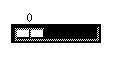
A scale widget allows a user to specify a numeric value within a predefined range of values. The scale widget can be horizontal or vertical in position and consists of:
Use the library functions sm_getfield and sm_putfield to retrieve and set a value at runtime.
How to Implement a Scale Widget
By default, scales have a minimum value of 0 and a maximum value of 100. The length of the scale is determined by the maximum and minimum values and the number of decimal places you specify.
Note: Vertical widgets always have the lower end of the range at the lower end of the scale.
On screen entry, the scale's slider is positioned to this value and can act as a default.
Note: If the user chooses the CLR (clear all) or FERA (clear field) keys, the scale resets to its minimum value, as opposed to the initial value specification.
Option menus and combo boxes are similar in appearance—each has a text portion and a list portion; however, option menus are protected from data entry, while combo boxes allow users to type into the text portion of the widget.
At runtime, the user can select from these widget types by:
Using Option Menus and Combo Boxes
The list of options for these widgets can be populated in two ways:
To determine what selection is made or entered (if a combo box) by the user, use the library function sm_e_getfield.
Populating the List with Constant Data
To Populate an Option Menu or Combo Box List with Static Data
In Motif, the drop-down list displays all occurrences to their full length. In character mode and Windows, the list width is determined by the length/width of the option menu widget itself, and therefore, some occurrences may appear truncated.
For applications running in character mode and Windows, you can define the number of entries that are immediately visible when the user expands an option menu or combo box. This property setting is particularly useful if the data list is extensive or screen space is limited.
Note: In Motif, option menus and combo boxes do not scroll; therefore, the Drop-Down Size property has no effect.
You can populate an option menu or combo box from an external source, for example, a screen that is dynamically populated from a database. You must also create the external source screen.
Using Data from an External Source
How to Populate an Option Menu or Combo Box List from an External Source
The screen you specify should consist of a list box (or any other array widget) that can have either a specific or infinite number of occurrences. It can be populated dynamically at runtime from still another source, such as another screen (LDB, local data block) or a database.
Create a screen that holds a database-derived widget that you copied from a repository entry. The screen will contain a simple screen entry function that invokes a VIEW command, and fetches the required data.
VIEW transaction command, for example:
procprocedureName{
call sm_tm_command("VIEW")
}
Choose File CloseJPL/Javascript to save the procedure and to return to the Properties window.
procedureName in the Entry Function property.Create a screen that holds one widget that has more than one occurrence (list box, multiline text, or single line text with an Array Size property value greater than 1). Refer to "Using Local Data Blocks" in Application Development Guide for more details on using LDBs.
When a widget gets its data from an LDB, the widget on the external screen should be initialized with no data.
Only the top portion of a combo box and option menu displays when the screen opens at runtime.
The data can be one of the items in the drop-down portion of the widget, and can serve as a default. If you clear the Initial Text property of any text, on entry to the screen, the option menu/combo box will be blank.