


| Using the Editors | |
Adding graphical elements to your screens can enhance the look and, in addition, can serve to illustrate, organize, and group information—thus achieving an attractive presentation as well as a functional one.
This chapter describes how to:
Using Boxes and Lines |  |
Drawing a line or box on your screen is as simple as dragging the mouse.
 Line or Box, or select the icon on the Create toolbar.
The widget acquires a native line style (Default). You can change the style, as well as assign foreground colors and background colors.
To control where the line or box starts and/or ends on the screen:
Use grid positions if portability is an issue, or use fractional specifications if desired. (Refer to Table 9-1 for a list of valid units of measurement.)
When you draw a line or box on your screen, a default style is assigned which is appropriate to the native environment. However, you can choose other styles as well as assign a style that can, ultimately, make your specification portable to other platforms.
You can specify a line name alias by choosing Other in the Line/Box Style. The Other Style subproperty is displayed. Enter the name as defined in the configuration map file for your application.
To control line/box style mapping and alias names, you can assign the desired specification in the configuration map file. Refer to "Defining Line and Box Styles" in Application Development Guide for more information on assigning and mapping line/box styles.
Styles 0 through 9 are native to Panther running in character mode. Style 1 is defined as the default line style. When you assign a character-specific style as the Style property value for a line or box style in the editor, that style is mapped to style 1 on non-character mode Panther applications. GUI-specific styles map to style 1 when running in character mode.
Motif's native line styles are: single, double, dash, double dash, etched in, etched in dash, etched out, etched out dash, and none. The Default setting maps to a single line style. Motif's box styles are: etched in, etched out, in, and out; the Default setting maps to Etched In.
Native styles for lines and boxes in Windows are: single, dash, dot, dashdot, and dashdotdot. The Default setting maps to a single line style for both graphical elements.
If the 3D feature is enabled, the etched in style is also available under Windows. Refer to "Giving Screens a 3D Appearance" for an explanation of how line and box appearance is affected on 3D screens on these platforms.
Frames can help you design attractive, logically structured, and easy-to-use screens. You create a frame by using the box widget. The box can be titled or untitled. Use frames around widgets on your screen to:
Character Mode Lines and Boxes
GUI Lines and Boxes
Creating Frames
Note:
Don't confuse the Box widget with borders. For character mode applications, you can define border properties for list boxes and multiline text widgets.

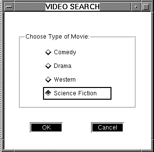
Figure 21-1 Boxes can be used to enclose widgets, creating a physical group of related widgets as opposed to a functional group.
When you use a box to enclose, for example, related widgets, you can also provide a title on the box that identifies the fields as a group.
Notes:
The Label property is not supported for boxes in Panther reports.
How to Include a Title on a Box
By default, the label text is centered on the top border of the box.
If you want to control how widgets resize and shift if you port your screens, you can use the screen's positioning properties, or you can identify the box widget as a positioning region in and of itself.
Add lines to your screen to create physical definition and provide organization to the content of the screen. Like the box widget, you can choose the style of line.
Using Boxes as Positioning Regions | |
Panther uses a positioning algorithm to recalculate screen size and widget positions (refer to "Controlling Widget Positions and Screen Size" for more information) when you open a screen in an environment that is different from the one in which it was created. This algorithm uses the settings of the screen's Positioning properties (subproperties under Geometry).
Similarly, each box has its own set of Positioning properties, available when the Position Region property is set to Yes, that can be set independently of the screen. When you open a screen in a new environment, Panther recognizes each box as an autonomous positioning region and recalculates its size and the positions of widgets within it.
When a box widget's Position Region property is set to Yes, its Positioning properties let you:
Note:
Positioning properties are recognized only in GUI environments.
Two properties, Minimum Horizontal Space and Minimum Vertical Space, let you specify the minimum amount of space between widgets in any direction. You can set the amount of space in any unit of measurement (refer to Table 9-1). If all available whitespace is used up between widgets, Panther moves them or adjusts the box size in order to maintain the minimum spacing required.
Determines the minimum amount of space maintained between widgets that are horizontally contiguous. The default 0 allows widgets to touch. If you place widgets closer than the distance specified by this property, Panther does not try to increase the space between them.
Determines the minimum amount of space maintained between widgets that are vertically contiguous. The default value is 1 grid unit. If you place widgets closer than the distance specified by this property, Panther does not try to increase the space between them.
The Region Margin property creates a buffer of white space between the box's inner border and its contents.
Spacing Widgets within a Box
Minimum Horizontal Space
Minimum Vertical Space
How to Define a Margin Within the Box Frame
The default 0 allows widgets to touch the box border. If you place widgets within the margin, Panther does not try to increase the space between them and the box's border.
You can set the amount of space in any unit of measurement (refer to Table 9-1). For example, enter 4 to indicate four pixels or 3g to indicate three grid units.
When you open a screen in an environment different from the one in which it was created, Panther attempts to minimize differences between the presentation of the same screen on different platforms. In so doing, it typically adjusts a box widget's dimensions and the start positions of other widgets within it.
Panther adjusts widget start positions in order to simulate their original proximity; when moving from character mode to GUI modes, this is likely to leave extra white space at the box's borders.
Adding Borders to Widgets | |
The list box and multiline text widgets both have properties that allow you to specify a border style as well as a title. These properties have no effect on the GUI platforms; however, you can achieve the same look in the GUI environments by using a box widget around the widget.
The numeric style specifications are defined in your video file (refer to "Borders and Line Drawing" in Configuration Guide for information on border styles).
Displaying a Picture on Widgets | |
In general, a textual label is displayed on push buttons, toggle buttons, radio buttons, check boxes, static and dynamic labels.
Panther provides properties for you to specify the name of a bitmap image that will display instead of the text on these particular widgets. These property settings have no effect in character mode.
To create a bitmap, use the image editor or paintbrush utility on Windows. On Motif, use the bitmap utility provided with X, or create a pixmap file in the standard pixmap format, either as a text file or via a utility provided with your GUI. Most GUI platforms also provide sample image files that you can use.
Panther supports BMP (.bmp), GIF (.gif), and JPEG (.jpg) files under Windows and Motif, XPM (.xpm, .xpm1, .xpm3) and XBM (.xbm) files on Motif.
Under the Format/Display heading in the Properties window, there are three image-related properties. Via these properties, you can assign one (static labels take only one) or more images (dynamic labels have only two of these properties) to a widget with each picture depicting a different state: active, armed, or inactive.
Note: Specify a textual label in the widget's Label property as well. If the Active Pixmap file is not found at runtime or is not supported by the local GUI, or if you run your application in character mode, the widget's label is displayed instead.
The image displays immediately if the image file is in one of your open libraries.
At runtime, the specified image is displayed on the widget whenever the widget appears and as long as the widget is active (that is, it can get focus). If the widget is made inactive at runtime, you can specify another image to indicate the widget's state.
The specified image is displayed on the widget when the widget is activated (or armed), that is, when it is pushed, selected, or checked. This property is not available for static or dynamic label widgets because they cannot get focus.
The specified image is displayed on the widget when the widget is set to be inactive (via the Active property under Identity) or is made inactive at runtime.
Note: Via the Select Library Member dialog box, you can add image files on the system to an open library by choosing the Add button.
To facilitate portability and provide maximum flexibility, omit the filename extension when you specify an image file. At runtime, Panther searches for files in all open libraries using all possible image extensions supported on the local platform.
On the other hand, if you have multiple images of the same name but of different type (for example, dog.bmp might be a bitmap image while dog.jgp is a photograph), include the extension to ensure that the correct image is displayed at runtime.
Note: Under Windows, if you compile the image into your resource-definition file, the resource id must match the Wallpaper Pixmap property setting exactly.
Under Motif, if the file is not found in an open library, then the path indicated in the resource file is used to search for X bitmap files (for the XmGetPixmap resource). Refer to the OSF/Motif Programmer's Reference.
Under Windows, Panther searches for bitmaps in these locations, in the order given:
Bitmap images display by default at the size they were created. Default-sized widgets (those having no Height or Width property settings) will resize to accommodate the image. Once you attach the image, resize the widget to the desired size by either dragging the widget or by setting its Height and Width properties to accommodate the image.
Under Windows, bitmap images automatically scale to fit within the specified geometry of the widget. Under Motif, the bitmap image is truncated if it cannot fit within the specified dimensions of the widget.
To ensure that the widget size remains fixed and is unaffected by changes to the pixmap image, set explicit values in the widget's Height and Width properties.
Using Customer Drawn Widgets | |
You can use Panther's push buttons, toggle buttons, and dynamic label widgets to display dynamically drawn content by your application, instead of a label or a static pixmap. To let Panther know that you have installed a drawing function, set the Customer Drawn property under Format/Display to Yes. Use the library function sm_attach_drawing_func to attach the drawing function. This property setting only has an effect in GUIs. When running your application in character mode, the default Panther widgets display.
The widgets behave as they are defined through their properties. In other words, the push button and toggle button are pushed to activate, and dynamic labels are protected from getting focus at runtime. Panther handles all processing for these widgets as it normally would, except for drawing them. However, the shading, where applicable, is still handled by Panther.