


| Using the Editors | |
With Panther's menu bar editor, you can create menus with pulldowns and submenus and attach them to your screens as menu bars. You can optionally specify items in a menu bar to appear simultaneously on a toolbar. Menus can also be invoked as popups from a screen or field, or as external submenus used by other menus at runtime.
After you define a menu, you can attach it to a screen or widget through its Properties window in the screen editor. Alternatively, you can load and install a menu at runtime through Panther's library functions. The library functions also let you change a menu's runtime behavior and appearance.
This chapter shows how to create menus with the menu bar editor. For information about Panther's menu system and runtime options, refer to Chapter 15, "Including Menus and Toolbars," in Application Development Guide.
Starting the Menu Bar Editor |  |
Do any one of the following:
 Menubar Editor.
mbedit (or the full pathname of the menu bar editor executable).
To invoke the menu bar editor and open a specific menu file, use this command:
The menu bar editor workspace contains up to six components:
mbedit
[menuFile]menuFile must be a binary menu file, either created with the menu bar editor or converted from an ASCII menu script with m2asc. If you specify a file in an open library, the menu bar editor opens it; otherwise, it opens with a new untitled menu:

Figure 25-1 The menu bar editor workspace, with the editor menu, toolbar, a new untitled menu, and the menu item's Properties window.
When you are in edit mode, a menu appears in its popup format—that is, the top-level menu items are displayed vertically. Test mode shows the menu in its menu bar format.
This window automatically opens when you start the menu bar editor. You can close and open it through ViewItem Properties.
You can open and close this window through ViewMenu Properties.
Creating Menus | |
When you enter the menu bar editor, it displays a new untitled menu.
New (or the New button on the toolbar).>).>).Insert. The editor places the new item above the previous selection with the label UNTITLED.Creating Submenus | |
A menu item can invoke a submenu if its Type property is set to Submenu. Items in a submenu can themselves invoke other submenus.
When you set a menu item's type to Submenu, the menu bar editor displays a submenu indicator (->) on the item; it also creates an empty menu—named and incrementally numbered (Submenu_1, Submenu_2, and so on)—and sets this name in the Submenu property of the parent item. You can accept this name or change it. If you enter a name that is currently undefined in this file, the newly created menu is assigned this name.
After you create a Submenu item, you can define its submenu in one of three ways:
Set the item's Submenu property. The property is set through a combo box, whose drop-down menu contains the names of all menus defined in the current file. Select one of these menus or enter the name directly; Panther attaches it to the submenu item.
Add items to the newly created submenu; select the submenu item and either click on it or press right arrow. An empty menu displays to the right and below the parent item. Edit this menu by inserting items and changing their properties.
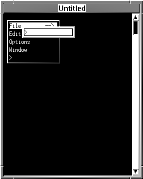
Figure 25-2 After the File menu item is defined as a Submenu item type, the editor attaches a new empty submenu to it.
Set the Submenu property to the name of a menu that is not defined in the current file. At runtime, Panther assumes that an undefined submenu is an external menu and searches for it among all menu files that are loaded into memory. This option is useful for invoking the same submenu in different menus, for example, a generic Edit menu.
Menu Properties | |
Menus have their own properties, some of which apply to the menu, while others set default values for new items in that menu.
The following menu properties apply to menu items; refer to "Item Properties" for their descriptions:
Accelerator
Show Accelerator
Separator Style
Indicator State
Accelerator Active
Active
The following properties identify the menu and define its behavior:
Note: Menu properties are accessible at runtime through Panther library functions. For more information on these, refer to Chapter 15, "Including Menus and Toolbars," in Application Development Guide.
Item Properties | |
All menu items have a set of properties. Some of these are valid for all menu items; others are type-specific. At runtime, you can use Panther library functions to access menu item properties. For more information, refer to "Changing Menus at Runtime" in Application Development Guide.
&)—for example, Fi&le and &Open. Users can select the menu item from the keyboard by typing this character. To include an ampersand character in the label, precede it with another ampersand.
You can specify a label for all item types except separators and those types whose labels are system-defined—for example, Edit or Cut.
Note:
Motif only receives the character of the mnemonic, not its position, and underlines the first occurrence of that character. For example, Col&or will underline the first occurrence of the letter o in Motif applications.
keyboard-modifier-key
where keyboard-modifier can be Ctrl or Alt, and key can be any alphanumeric or Panther function key—for example, Ctrl-P or Alt-PF1
Accelerator keys for edit-type items such as Edit Cut or Edit Paste are set by the GUI platform—for example, in Windows, through the Panther initialization file; on Motif, in the Panther file. To change edit item accelerators, modify the appropriate GUI file.
If you specify an accelerator string, two check box subproperties become available:
If you set this property, all toolbar subproperties become available:
If this property is blank, Motif uses the Active Pixmap property for the item's armed state. Windows uses a modified version of the Active Pixmap property to display a toolbar item's armed state and ignores this property.
The position of the corresponding toolbar item is unaffected by this property.
Note: Panther always shows the help item in its correct position during test mode. When you exit test mode, Panther automatically repositions the help item as the last item.
The drop-down menu of this property's combo box lists the menus that are defined in the current file. Choose one to use an existing menu. To define a new menu or specify an external menu, enter its name. In either case,
Panther creates an empty menu. You can add items to this menu or leave it empty.
Note: If you leave a menu empty, Panther discards it when you save. At runtime, Panther assumes that the referenced menu exists in another file and looks for it accordingly.
Item Types | |
A menu item's type determines the action that occurs when users select the item. Each type is described in the following sections.
You set the indicator's initial state through the item's Indicator State property. The indicator's state can be determined and reset through sm_mnitem_get and sm_mnitem_change, respectively. Refer to "Changing the State of Toggle Items" in Application Development Guide for details on controlling the item's state at runtime.
In character mode, toggle items reserve a single space to the left of a label for the toggle indicator. To change the mark character for character mode applications—typically an X or check mark—assign a new value to MARKCHAR in the video file.
Motif ignores this setting for top-level items in a menu bar.
The menu items under View on the screen editor's menu bar are all toggle items. For example, when the Widget List is open, the menu item indicates that it is on, or open. When the item is toggled, the Widget List window closes.
Cascade, Tile, and Arrange Icons. These let you arrange screens and icons within the frame.
Applications running on character mode platforms ignore this item.
The menu bar editor provides standard editing types for menu items. These item types are valid only on GUI platforms:
The following restrictions apply to edit item types:
Prolifics file. To change edit item labels, modify the appropriate GUI file.
Note:
In test mode, edit item types are always inactive because no text is available to manipulate.
You can separate menu items with separator items—that is, items whose Item Type property is set to In character-based applications, On GUI platforms, each GUI determines which separator options are valid and how to display them. For information about GUI display of menu separator styles, refer to Table 45-10 in Application Development Guide.
Separator Styles
Separator. You can specify the display characteristics of the separator item by setting the Separator Style property to one of these values:
Single
Double
Double Dashed
Etched In
Etched Out
Dashed
Etched In Dashed
Etched Out Dashed
Nonesingle and double can use characters defined in the video file. If no definition exists in the video file, Panther uses its own default values: _ and = for vertical menus, | and || for horizontal menus.
Displaying Pictures on Toolbar Items | |
The menu item Properties window contains properties that let you specify the name of a bitmap image to display on a toolbar item:
For each toolbar state that you want to indicate in your application—active, inactive and hot—you must supply a pixmap for each toolbar item.
Under Motif, bitmaps and pixmaps display at the size at which they were created. If you use different-sized images for an item's active, armed, and inactive states, Motif uses the largest of the three for the item's frame. In Windows, bitmap images need to be the same size. Panther uses a size of 16 x 15 pixels.
Panther supports several file formats for pixmap properties. Table 25-1 shows which file types are valid on each platform:
Pixmap properties can optionally contain filename extensions. To facilitate portability and provide maximum flexibility, you can omit the filename extension.
If you omit the file extension, Panther searches for files in all open libraries using all possible image extensions supported on the local platform.
Keep the extension if you have multiple images that use the same name but different types. For example, dog.bmp might be a bitmap image while dog.jpg is a photograph. In this case, include the extension to ensure that the correct image displays at runtime.
Note: Under Windows, if you compile the image into your resource-definition file, the resource id must match the pixmap property setting exactly.
Panther looks for the file according to the following platform-specific search procedures:
XmGetPixmap function in the OSF/Motif Programmer's Reference for details.
Using the Menu List Window | |
The Menu List window lists the names of all menus defined in the current file. It provides a hierarchical view of the menu in outline form, where the topmost menu is the first entry, and its submenus are listed directly below it:
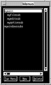
Figure 25-3 Hierarchical listing of menus defined in a menu file. The last menu is flush left and outside the hierarchy, indicating that it is unused.
The Menu List window also lists all menus that are defined in the current file but are unattached to a submenu item type. These names appear flush left at the bottom of the window. Unused menus are always accessible for later usage, either through the editor or at runtime through Panther library functions. For information about runtime menu installation, refer to the library function sm_menu_install in the Programming Guide.
Three push buttons let you create and delete menus, and manipulate the menu hierarchy:
Testing Menus | |
You can test a menu and its toolbar in one of two ways:
Test Mode (PF2) or the Test Mode button on the toolbar
This lets you view the appearance of a menu and its toolbar independently of an application.
During test mode, a selected menu or toolbar item simulates the behavior associated with its type and property settings: submenu types invoke submenus, toggle and action items invoke messages with their control strings, tear-off menus can be torn off, and so on. You can also view a toolbar item's tooltip text by positioning the cursor over the item.
To exit test mode, use EXIT—Ctrl+E on Motif, Esc on Windows.
This method lets you test the menu's functionality—for example, verify that a menu item's control string executes correctly. For more information, refer to "Attaching a Menu Bar."
Saving Menus | |
The menu bar editor has two save options available on the File menu:
You can convert binary menus to ASCII files and vice versa through the utility m2asc. The menu bar editor can only read binary files; in order to modify an ASCII menu file through the editor, first convert it to binary with m2asc and then use formlib to put it in a library.
Information about m2ascis in Application Development Guide. Information about formlib is in Application Development Guide. For information about ASCII menu format, refer to "Outputting Menu Definitions to ASCII" in Application Development Guide.