


| Using the Editors | |
Typically, one of the easiest ways to let a user carry out an action or procedure is to provide a push button. When a user clicks on a push button with the mouse or presses a mnemonic on the keyboard, the push button looks as though it is being pushed in and released, and an action is performed. This action is specified as a control string that is attached to the push button (refer to Chapter 18, "Programming Control Strings," in Application Development Guide for specific information).
This chapter describes
At runtime, a user can choose a push button:
Identifying a Push Button |  |
Push buttons can have:
How to Define the Push Button's Text
For Motif, you can change the default alignment of label text on push buttons by changing the value in the Panther-distributed resource file. Refer to "Aligning Button Labels in Motif" on page 10-6 for information.
Store standard push buttons, such as OK and Cancel, in a repository entry. Then you can copy the push buttons from the repository to each application screen where they are needed. This ensures that all push buttons of the same type inherit identical behavior and appearance from a single source. It also saves development time by allowing you to create each push button once, no matter how often it appears in your application.
Select the push button (and any widgets that take a label). Under Geometry, set the Size to Contents property to Yes.
All trailing spaces are eliminated and the widget is reduced in size. Leading spaces are also eliminated from push buttons and toggle buttons so that the label is centered on the widget.
Note:
If the push button is blank (has no label), the length of the widget is set to 1.
Identify a mnemonic for a push button to provide users with an alternative way of choosing a push button. The mnemonic is defined as one of the characters in the push buttons label.
How to Adjust the Size to Fit its Textual Content
How to Identify the Keyboard Mnemonic
For example, type the word Cancel.
You can enter any of the letters that appear in the label as the mnemonic—uppercase C defines the first letter, lowercase c defines the fourth letter; the numbers 1 and 4 would designate the same letters, respectively.
The property setting appears as character position and character. 1'C' denotes the first character in the string, which happens to be the letter C.
At runtime, the mnemonic is underlined or displayed in a contrasting color in character mode.
Using Pictures on Push Buttons | |
In addition to specifying a textual label on a push button, you can specify that an image be displayed when the application is operating on a GUI platform. If the specified picture cannot be found at runtime, then the label text is displayed instead.
Panther supports BMP (.bmp), GIF (.gif), JPEG (.jpg) and PNG (.png) files under Windows and Motif as well as XPM (.xpm, .xpm1, .xpm3, and .xbm) files on Motif.
You can display three different images, depending on the button's state:
How to Assign a Bitmap or Pixmap to a Push Button
Optionally, choose More on the Properties window to display the Select Library Member dialog box where you can select the desired file.
Note: In addition, the Select Library Member dialog box provides the capability to add image files on the system to a library with the Add button. If you choose the Add button, the Select File dialog box opens and you can choose the file that you want to include in a library.
In Windows, bitmapped images automatically scale to fit within the specified geometry of the push button. In Motif, the push button resizes to accommodate the image. However, once the image is on the push button, the image scales to fit within the specified geometry of the push button.
To ensure portability, consider the size of the image as well as the size of the push button; determine whether the picture can be accommodated.
Creating pictures to use in your application is GUI-dependent. In Windows, you can use the image editor or paintbrush utility to create bitmaps. Motif provides a bitmap utility. Use this or create a pixmap file in the standard pixmap format, either as a text file or via a utility provided with your GUI.
In addition, there are commercially available software packages that provide bitmapped images that can be incorporated into your application.
Refer to "Displaying a Picture on Widgets" for more information on installing and using images in your application.
Establishing Push Button Behavior | |
There are several ways to control how push buttons are initialized and behave on your application screens. You can:
A default push button is activated when the user presses Enter. The control string attached to the push button is executed. Only one push button on a screen can have the Default/Cancel property set to Default. Specifying a default push button automatically resets the Default/Cancel property to Neither on any other default push button on the screen.
A cancel push button is activated when the user presses Esc (or the logical In addition, a push button can be identified as both the cancel and default button on a screen.
Assigning Default and Cancel
EXIT key). The control string attached to the push button is executed. Only one push button on a screen can have the Default/Cancel property set to Cancel. Specifying a cancel push button automatically resets Default/Cancel property to Neither on any other cancel push button on the screen.
How to Specify a Default and/or Cancel Push Button
When you first add a push button to a screen, it is active; that is, the push button can receive focus and respond to user-generated actions, such as a key press and mouse activity.
When a push button is inactive, it appears grayed and cannot receive focus. You can make a push button active or inactive at runtime by changing the Active property programmatically. For information on changing properties at runtime, refer to "Properties" in Application Development Guide.
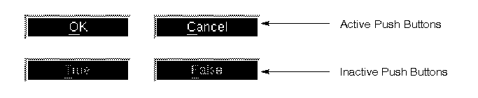
Figure 19-1 The label on an inactive push button appears to be grayed and, therefore, cannot receive focus.
To cause an action to take place when a push button is selected, you attach a control string. The type of action performed by a control string is determined by the leading characters in the control string. Table 19-1summarizes the syntax you use in the Control String property under Validation.
Refer to Chapter 18, "Programming Control Strings," in Application Development Guide for more information on control strings.
To display another screen when the push button is pressed, specify the name of a screen, along with the appropriate leading character, in the Control String property under Validation for the push button. You can also specify the geometry of the screen and its location. The examples in Table 19-1 specify that the status screen displays at the fifth row and fourth column of the physical display (refer to "Screen Display Defaults" in Application Development Guide for details on specifying a viewport).
You can display a screen as a:
To invoke a function, specify the name of the function preceded by a caret (^) in the Control String property under Validation for the push button, for example, You can invoke:
Invoking a Function
^myproc. Panther first checks for installed C functions and then JPL code. For more information on the order of precedence for calling JPL, refer to "Precedence of Called Objects" in Application Development Guide.
jm prefix. They need no prototyping or installation. Refer to Chapter 3, "Built-in Control Functions," in Programming Guide for a description of all Panther built-in functions.
To invoke a system program from a push button, specify the program and its arguments, preceded by an exclamation point ( Invoking a Program
!) in the Control String property under Validation for the push button. At runtime, the string (program name and arguments) are expanded and passed to the operating system for execution. Depending on the operating system and the program, after execution is complete, the user is prompted to press the Spacebar before returning.