


| Using the Editors | |
An essential component of a well-designed application is consistency in presentation and behavior. This consistency helps users learn and use the application more quickly and more reliably. Not surprisingly, the larger and more complicated the project, the greater the need and the difficulty of maintaining this consistency. The styles editor addresses this issue. It allows you to specify globally how an application will appear and behave when it uses the transaction manager commands.
The transaction manager applies a set of default classes and styles to your application screens. The styles editor is used to edit these default settings or to define new styles and classes.
This chapter explains how the default styles and classes are applied as well as how to create a new style or class.
Starting the Styles Editor |  |
Invoke the styles editor by choosing Tools Styles Editor. On opening the styles editor, Panther looks in all open libraries for the binary file called
 styles.sty (Figure 23-1 illustrates Panther's default styles file) and opens it. If the file isn't found, a new, untitled styles file opens. The styles.sty is distributed in the client library.
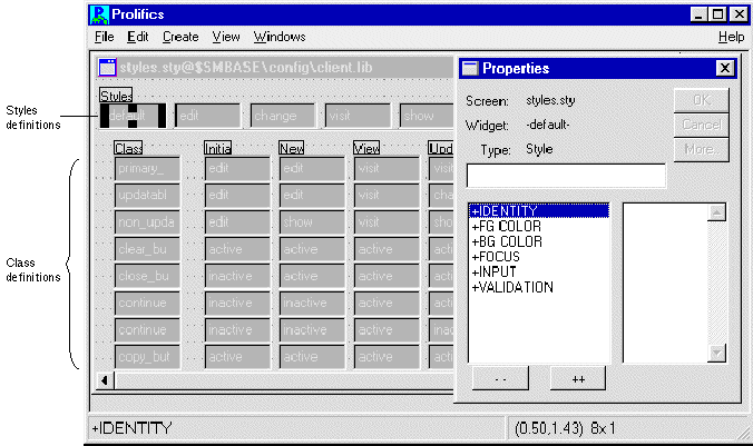
Figure 23-1 The styles editor opens the default styles.sty file.
The styles editor provides a workspace with up to five components:
Transaction Modes | |
When an application calls a Panther transaction manager command, the transaction manager checks the current transaction mode and either changes the mode or reports an error if the current mode is invalid for the command. Since you can define a different style for each mode, the accessibility or appearance of widgets in your application screen can change as you change transaction modes.
Each transaction mode is represented in the styles.sty file. The transaction manager supports the following modes:
new
INSERT statements.
update
Before fetching data, Panther applies the update styles to the widgets. After occurrences containing data are fetched to a widget, Panther applies the update_occ style to the widget.
Saving updated data typically generates SQL UPDATE statements for altered data, SQL DELETE statements for deleted data, and SQL INSERT statements for new data.
view
initial
qbe
The following transaction manager commands change the current transaction mode, thus reflecting the state of the transaction:
| Command | Changes mode to: |
|---|---|
|
| |
|
| |
|
| |
|
| |
|
|
When an application calls one of these transaction manager commands, by way of a push button, menu item, or function key execution, the transaction manager checks the Class property (set in the screen editor Properties window under Transaction) of every onscreen widget and applies the appropriate style for the mode.
The most common style change is protection edits for data entry type widgets or availability status for menu items and push buttons. For example, if the NEW command is selected, the application needs to permit input in some or all data entry widgets on a screen, make a "save" button active, and gray out (deactivate) the "continue" button. On the other hand, if the VIEW command is selected, the application needs to protect some or all data entry widgets from input and make a "save" button inactive.
Some commands do not change the current transaction manager mode but require a particular current mode:
| Command | Requires mode: |
|---|---|
|
| |
|
|
Since the transaction mode does not change for these commands, no style changes are made. Whatever styles were set by the required mode (such as view, update, or new) remain in effect. Therefore, when the NEW transaction manager command is selected, the user can enter data in the unprotected fields and choose the save button. If the save button calls sm_tm_command("SAVE"), the data is saved to the database. Until the application calls one of the commands which changes the transaction mode, the screen's data entry fields permit input and the save button remains active.
Using Styles and Classes | |
Each widget on your application screen has a Class property setting (under Transaction in the screen editor's Properties window). Each menu item has a TM Class property. This property determines how the widget or menu item behaves in each of the transaction manager modes. A class is a matrix of styles and modes. A style is a set of properties that are imposed on the widget.
For example, if you create the following styles:
view—Foreground Color = Red; Focus Protect = Yes
edit—Foreground Color = Blue; Focus Protect = No; Input Protect = No
You can then create a class and set a style for each mode:
You can now set a widget's Class property to Panther has a series of predefined styles and classes. Initially, Panther uses its internal styles to define the default classes. The internal styles set protections only. Table 23-1 lists the internal styles and their property settings that are used text widgets.
The styles editor also supports the values Default and None. When a style property is set to Default, Panther determines the value at runtime based on the value saved in the screen editor.
You are not required to define transaction classes for an application; your application can use the default classes supplied by Panther or not use any classes.
When a widget's transaction class is set to Default, Panther determines the widget's class at runtime based on the properties set in the screen editor for the widget and for the widget's table view.
There are three default classes:
Transaction Class
Initial
New
View
Update Occ
Update
test
edit
edit
view
edit
edit
test. Then, when the screen is in initial, new, and update modes, the widget with a Class property setting of test has a blue foreground and permits focus and keyboard input. In view mode, however, the same widget has a red foreground and does not permit focus.
Using the Default Styles Settings
Using the Default Transaction Classes
If a widget is a member of a non-updatable table view, its default Class property is If a widget is in an updatable table view and it is part of the table view's primary key, its default Class property is If a widget is in an updatable table view and is not a part of the table view's primary key, its default Class property is These default Class properties are assigned the following styles in each of the respective transaction modes:
There are predefined classes that you can apply to push buttons and menu bar items on your application screens. However, they are not applied when the Class property (for buttons) and TM Class property (for menu items) are set to Default. You must explicitly set the Class property under Transaction in the screen editor for each push button, and the TM Class property in the menu bar editor for each menu item. The following table lists the predefined classes and their active/inactive setting in each mode.
The styles for each of these classes make the push button or menu bar active or inactive according to the current mode.
non_updatable.
primary_key.
updatable.
Transaction manager class
Initial
New
View
Update occ
Update
non_updatable
edit
show
visit
show
show
primary_key
edit
edit
visit
visit
edit
updatable
edit
edit
visit
change
edit
Setting Classes for Menu Items and Push Buttons
Defining a New Transaction Style | |
To create a new style, choose CreateStyle. A style widget is created in the styles editor window under the Styles heading. With the widget selected, you can access its style properties in the Properties window.
You can also copy style widgets from other style files that are currently open in workspace. Use the Copy and Paste options on the Edit menu.
The Properties window in the styles editor supports a subset of properties available in the screen editor. In addition to the values available in the screen editor, the styles editor also supports the value Default. When you set a style property to Default, Panther determines the value at runtime based on the value defined and saved with the individual widgets in the screen editor.
Identity properties include the following:
style#x, where x is a number. Consider renaming the style with a more descriptive name.
The color and display attributes under the color properties correspond to Panther's basic color specifications. Setting foreground and/or background colors in the styles editor overrides any basic, scheme, or extended color assigned to a widget on your application screen. Color changes can provide users with a visual cue that a field is protected. For instance, if the screen is in update mode, primary keys can be displayed with white text (foreground) on a blue background, while updatable fields can be displayed with blue text on a white background.
This category lists the following property:
Input properties include the following:
Even though you can set the enforcement of a filter that you have defined in the screen editor, you cannot change the edit mask string or regular expression edit in the styles editor. In order to temporarily change these values, you can redefine the property specification programmatically.
For example, in the screen editor, the widget order_num has the edit mask specification of \A\A-\9\9\9\9 and its Class property set to criteria. The criteria class has the following styles:
| Initial mode | New mode |
|---|---|
|
Foreground=Blue |
Foreground=Cyan |
|
Keystroke Filter=Unfiltered |
Keystroke Filter=Default |
In initial mode, the order_num widget has a blue foreground and permits any keystrokes. In new mode, order_num has a cyan foreground. Since the Keystroke Filter for new mode is set to Default, Panther restores the original keystroke filter, \A\A-\9\9\9\9.
For descriptions of keystroke filters, refer to "Defining the Input with Keystroke Filters."
This category has the following property:
Creating a New Transaction Class | |
To create a new class, choose CreateClass. A new row in the class section of the styles editor window is created.
styles.sty file. If you do not want to assign a style name for a particular mode, set it to None. If you select a group of mode widgets, you can assign them the same style.
Note: QBE mode is reserved for a future release.
update and update occ modes.A class should use a set of compatible styles. Therefore, for best results, the styles for a particular class should set the same properties. For example, if the new mode style sets the Foreground Color Name to Blue, the other styles in the same class should also set Foreground to a non-default value.
Testing Styles | |
With a style widget selected, choose FileTest Style to view and test the properties you assigned to the style widget. The Test Style screen displays one of each Panther widget type, and illustrates how the style's properties will affect those widgets at runtime.
While in test mode, you can enter data in the data entry widgets, choose the selection widgets to test either the current color or protection settings, or check whether the appropriate widgets are inactive or active given the selected style. In addition, a sample menu bar is provided so that you can determine the status of menu items.
To change any of the settings, exit test mode by choosing Close from the Test Style window's system menu.
Saving a Styles File | |
Although the styles editor allows you to save your styles file under any name, the file must be named styles.sty to be accessed by your application.
The styles editor has two save options available on the File menu:
styles.sty file (in binary format) to its source in a library. If the file is new, Panther opens the Save As Library Member dialog box where you can provide a name and select the library in which to save it. In general, it is recommended that styles.sty reside in the client library.
.sty extension).