


| Using the Editors | |
This chapter describes each of the selection widgets and how, when they are grouped together, they provide users with choices. Selection widgets include:
Selection widgets provide a graphical way of displaying valid choices to your users. Each of these widget types offers a unique presentation and facility for selecting and indicating which option or choice the user has made.
To determine what choice a user has made, refer to "Selection Group Data" in Application Development Guide for information on querying selection groups.
Using Check Boxes |  |
Check boxes provide a method for turning conditions off or on. When you group check boxes (refer to "Grouping Selection Widgets"), you provide a set of choices from which a user can select one or more options, or none. At runtime, when a check box item is selected, a check mark or an x (in Windows) appears next to the selected item; a three-dimensional, shaded box changes color in Motif.
In the following illustration, the grouped check boxes allow for one or more selections to be made. You can use the library function sm_getfield to determine what choices a user has made.
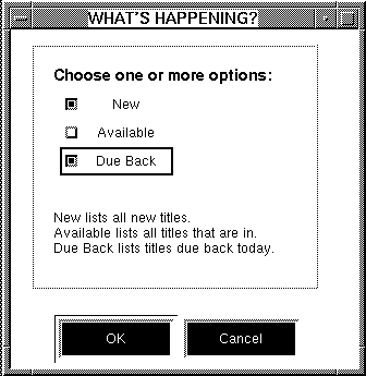
Figure 20-1 One or more options can be checked.
Use the Label property to define the literal text that displays next to the check box. If your application runs on a GUI platform, you can assign a pixmap to a check box so that an image appears next to the check box instead of text; assign one to display when the check box is selected, another to indicate that it is not armed, and still another to indicate that the check box is inactive. Refer to "Displaying a Picture on Widgets" for more information.
Using List Boxes | |
A list box presents the user with a noneditable, vertical column of choices. The list box can be one of two list box types:
When you group a list box (choose Edit Select a list box. Under Identity, specify the how you want to use the list box in the Listbox Type property:
 GroupCreateSelection Group), you can control the number of allowable selections and assign group entry and exit functions to the widget.
How to Define a List Box's Behavior
To make a selection, the user can:
Selected items are displayed in reverse video.
You can determine the user's selection by querying the Refer to "Making Selections in List Boxes" in Application Development Guide for more information about extended selections in list boxes.
By default, a list box has a border around it. For character mode, you can assign a border style and title as well. You can also set the Border property to No to display no border at all. These settings have no effect on the GUI platforms. However, to include a title on a list box, you can draw a box (use the box widget) and assign a label to the box. Refer to "Adding Borders to Widgets" for details on creating borders and boxes around widgets.
Figure 20-2 illustrates three list boxes that are synchronized arrays. In this example, the data from three different, but related, columns scroll together and allow the user to select one or more records from the group. This is achieved by using a validation function on each list box that ensures that the other list boxes have the same occurrence selected as the one the user selected.
To restrict the number of selections to only one, define a list box as a group (refer to "Grouping Selection Widgets") and set the # of Selections property appropriately.
You define how many occurrences display on the screen. When the number of items, or occurrences, exceeds what can be displayed at one time, the user can scroll the list.
selected property of the list box's occurrences.

Figure 20-2 Synchronized list boxes can provide a means of selecting multiple records.
Scrolling the Data
How to Make a Scrolling List Box
If the number of elements in the array exceeds what can be displayed onscreen in the list box:
Do any of the following to populate a list box:
Select the list box. Under Format/Display in the Initial Text property, enter the data (one item per line). Press Enter after each line. You can also choose the Read File button to read data from an external file. Choose OK to save your additions and to exit the Initial Text dialog box.
You can assign a control string to each occurrence in a list box to cause an action or event to occur when the user chooses items on the list. In this way, the list box functions as a menu might. However, if you define the list box to function as a selection group (by choosing Edit Performing Actions
GroupCreateSelection Group), the behavior is controlled by the group validation via a control string attached to the entire list box (for more information on group validation hook functions, refer to "Group Functions" in Application Development Guide).
How to Make a List Box Function Like a Menu
Refer to Chapter 18, "Programming Control Strings," in Application Development Guide for details on control string syntax and invoking a control string from a widget.
Using Radio Buttons | |
Radio buttons allow the user to make exactly one selection (or none) in a group. When the user selects a radio button at runtime, its button appears darkened, and any other radio buttons in the group are immediately deselected.
By default, a radio button specifies that zero or one selection can be made, and on screen entry, none of the radio buttons are selected.
The Type field at the top of the Properties window should indicate that a Group is selected.
The Type field at the top of the Properties window should indicate that a Group is selected.
For example, in Figure 20-3, the radio button group consists of two buttons. The Init Selections property is set to 1. So when the screen opens, the first radio button (Customer) is selected. This group of radio buttons also specifies that one of the two radio buttons must be chosen before the user can proceed.

Figure 20-3 The user can choose one radio button: Customer or Employee.
Using Toggle Buttons | |
Toggle buttons are in/out graphical buttons. At runtime, when a toggle button is pushed, a particular behavior is turned on. The button remains on—or in the "in" position—until it is selected again. It then appears to be in the off or "out" position—so the behavior is toggled off.
By default, any number of toggle buttons can be selected. You can redefine the number of possible selections by grouping the buttons and setting the # of Selections property for the group.
Figure 20-4 illustrates how toggle buttons can be used to turn a specific behavior on or off. The screen, typical of many word processing applications, allows the user to choose B to implement bold text, U to underline, and I to italicize.

Figure 20-4 Both theBandItoggle buttons are selected—turning both bold and italic attributes on.
Use the Label property to define the literal text that displays on the toggle button. By default, the text is centered. In Motif, you can change the default alignment of the text by changing the value in the Panther distributed resource file (refer to "Aligning Button Labels in Motif" for information).
If your application runs on a GUI platform, you can assign pixmaps to a toggle button so that an image appears on the button instead of text; assign one to display when the button is selected, another to indicate that it is not armed, and still another to indicate that the button is inactive. Refer to "Displaying a Picture on Widgets" for more information on displaying pictures on buttons.
Grouping Selection Widgets | |
When you group selection widgets, you can define behavior for the group as a single entity, as opposed to defining behavior for individual widgets. By virtue of creating a group, you gain access to properties that define the group as a whole—such as group name, number of selections, tabbing behavior, group entry, exit and validation functions—and you can use group-specific library functions at runtime.
This section describes:
Depending on the widget type and the property specification for the group, a user can make one or more selections from the group.
Creating Selection Groups
How to Create a Selection Group
All widgets in the group must be of the same type. They can be close together or far apart on the screen.
GroupCreateSelection Group. An invisible group widget is created; notice that the Type field at the top of the Properties window indicates that a Group is selected. You now have access to the group properties.To identify and assign property values to all widgets that comprise a group, you must first find all members of the group. You can set properties for all members and thereby ensure that they are the same color, font, size, etc.
GroupSelect Members.
All members of the group are selected, and you can set the intersecting properties for the widgets.
If you select widgets associated with two or more different groups, the Select Group Member dialog box (Figure 20-5) opens. Select the group from the left hand column and choose OK.
All members that comprise the group are selected.
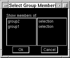
Figure 20-5 The Select Group Members dialog box displays all the groups with which the selected widget is associated.
While you can define unique property settings for each member of a group, you can also define how the group as a whole should behave through its properties. There are two methods you can use to access a group's properties:
Note: Although a group is selected, its members are not visibly selected on the workspace screen.
Widget List.group followed by a number. The hidden group identifier precedes the members that comprise that group. Be sure that no other widgets are selected. Only the group identifier should be highlighted in the Widget List to access its properties.GroupSelect Groups. The Properties window now displays the properties associated with the group.Table 20-1 lists the group properties alphabetically along with the heading under which they can be found in the Properties window.
Panther assigns a default name to a group when it is created—group followed by a consecutive number. The groups on a screen are numbered in the order in which they are created. So, the first group you create on the screen is identified as group1.
Group names follow the same conventions as widget names; they can be up to 31 character long, and must start with an alphabetic character. A group and widget cannot share the same name on the screen.
Use the Widget List to determine the number that corresponds to the desired widget. For groups that allow more than one selection, separate the numbers with a comma in the property specification.
For example, to specify that the second widget in a group be the initial selection on screen entry, enter 2 in the Init Selections property. Figure 20-6 illustrates how that might look in a group consisting of four check boxes—two-by-two. The second check box in the group is already selected on screen entry.
Figure 20-6 The second widget in the selection group is identified as the initial selection for the group.
To change the content of a group—by either adding or removing widgets—you essentially redefine the group as a whole.
GroupSelect Members.GroupUpdate Group Members.
The existing group now includes the additional widgets, and the group's properties are displayed in the Properties window.
GroupUpdate Group Members.
The existing group is redefined to includes the new set of widgets, and the group's properties are displayed in the Properties window.