


| Using the Editors | |
There are several means of displaying data on a screen. You can create:
Labeling Information |  |
Use static labels to display text on your screen that the user cannot interact with or modify. Static labels cannot be changed at runtime—either by the user or by application code. They are read-only widgets and are especially suited for:
Static labels have a limited set of properties associated with them and therefore, you will find that dynamic labels are a better choice for displaying text.
Static labels are automatically assigned to database columns that are imported into a repository. The label is given a name beginning with the letter L and is followed by the name of the text widget that is associated with it. For example, the database column You determine the content, size, and appearance of a static label at design time. By default, a static label takes the background color of the container that holds it; usually the background color of the screen is the background color of the label.
cust_id is imported as a text widget of the same name. The import process creates a corresponding static label with the name Lcust_id.
Defining the Look of a Static Label
How to Define the Content of a Static Label
If the widget has no values set in the Height and Width properties under Geometry, the widget's size adjusts to fit its content (Size to Content property under Geometry is set to Yes).
Note: The widget's size will adjust to accommodate a larger label. However, if you increase the widget's size, either by dragging its resize handles or by specifying a size in the Length property, the widget's size remains unchanged.
As long as the Size to Contents property is set to Yes, trailing blanks are eliminated.
If you reset both Height and Width properties, the Size to Contents property is ignored.
Note: If you change the Length property (either by setting the property value or by resizing the widget itself) or specify a picture to display on the label, the Size to Contents property is automatically reset to No.
Creating Output Labels | |
Use dynamic labels for displaying data or output that can be generated and changed by the application at runtime. The user cannot directly change the contents of dynamic labels. Typically, dynamic labels are useful for:
You can control how the output data appears by setting the Format/Display properties. These include, for example, definitions for date/time format, how numeric output should appear, and what characters should appear if the output is null. For details on how to define display formats, refer to "To Display or Not Display."
When the content of a dynamic label changes, you can also force the widget's size to adjust to fit its new content.
Defining Output Labels
How to Change the Size Dynamically When Content Changes
If you decrease the number of characters in the Label property, the label's length adjusts appropriately to fit the content.
If you reset both Height and Width properties, the Size to Contents property is ignored.
Note:
If you change the Length property (either by setting the property value or by resizing the widget itself in the screen editor) or specify a picture to display on the label, the Size to Contents property is automatically reset to No.
In addition, you can display multiple lines of data in an output label by setting the Array Size property.
Using Graphs to Display Data | |
You can present data on your application screens in graph or chart format by using graph widgets. Graph data can be generated at runtime or obtained from static sources and can be displayed in a variety of formats:
The information on graph widgets is divided into five main sections. The first describes how to create a graph widget of any type and provides detailed information on the topics that apply to more than one graph type.
The four remaining sections are each dedicated to one particular type of graph: pie chart, bar/line graph, XY-plot, and high/low chart. Each of these sections outlines the procedure for creating a graph of the specified type and presents detailed information on the topics unique to that graph type.
How to Create a Graph Widget
 Graph or choose the graph icon from the Create toolbar.
On GUI platforms, a pie chart containing sample data appears in the widget. Once you supply data to the widget, it will replace the sample data initially displayed.
In character mode Panther, an empty rectangle is displayed. (Graphs are not visible in character mode Panther, although you can set all graph widget properties; the graph will be displayed when the screen is opened in a GUI environment.)
Panther internally assigns the graph widget a field number. Graphs are numbered sequentially from left to right and top to bottom—as Graph #1, etc.
Note: If data are not visible on the sample chart, adjust the graph widget's foreground and background colors. Refer to "Changing Color Properties" for information.

Figure 13-1 Samples of chart types. Newly created graphs are displayed with sample data
The properties unique to graph widgets are listed under the Graph heading in the Properties window. Some graph properties apply to all types, but many are specific only to particular graph types.
If you later (either in the editor or at runtime) change the type of a graph widget, some of the properties initially specified will not be applicable to the new graph. These properties no longer appear in the Properties window, but they are retained in the widget. If you later change the widget back to the previous type, these properties again appear in the Properties window, their settings the same as before the type was changed.
Note: If you enter Test mode before populating the graph with data, the widget is displayed as a graph or chart with no data. The graph or chart that initially appears when you create the widget is populated with sample data and serves only as a visual cue. In Test mode, the pie chart appears to consist of just a single segment representing the entire pie chart; other chart types simply display X and Y axes but no data.
Text that can appear on a graph falls into the following categories:
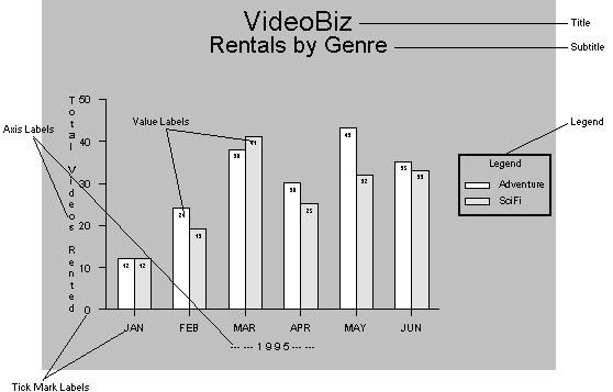
Figure 13-2 A variety of text components is available for all chart types.
The font and style for all text in the graph widget is determined by the property settings under the Font heading. Note that the fonts available on some platforms are specific to graph widgets and might differ from those you can choose for the screen and other widget types.
How to Specify a Font for the Graph
These settings apply to all text in the graph widget. If the Font Name property is set to Default, text on the graph will be in the Simplex font.
To ensure portability of fonts across different platforms, use graph-specific font specifications (prefixed with the word Graph in the font name). On Windows, graph-specific fonts are listed after the system fonts.
For further information on applying font properties to widgets, refer to "Specifying Fonts."
Text size within a graph widget is always specified relative to the graph size. This way, if you change the size of the graph widget, the text size increases or decreases proportionately.
Text size is specified as a value between 0.0 and 100.0, inclusive, representing a percentage of the widget size. It is set independently for the title, subtitle, legend, and labels. Table 13-1 indicates the location of the applicable Text Size property and its default value for each of these text elements.
You can add a title and/or subtitle to any graph widget. The title, if present, is centered near the top of the widget. The subtitle, if present, is centered beneath the title. The font and style of the title and subtitle text are determined by the settings of the properties under the Font heading.
A legend is an optional element of a graph widget. If present, it serves as a key to the data displayed on the graph:
How to Add a Legend to the Graph Widget
If you set the legend's Placement property to Location, you can place the legend in one of nine preset locations in the graph widget, either within or outside of the data area.
By default, when Location is specified, the legend is centered vertically on the right side of the graph widget, outside of the data space.
If the legend is centered in the widget (X Location set to Center, Y Location set to Middle), the legend appears within the data space, regardless of the setting of the In Data Space property.
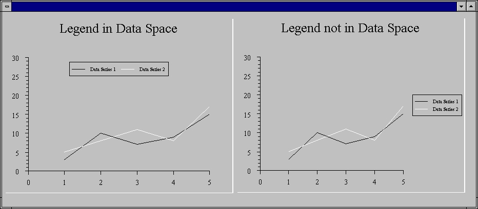
Figure 13-3 Legends can be displayed in the data space (left graph) or outside the data space (right).
If you set the legend's Placement property to Position, you determine its location precisely by specifying X and Y coordinates and by indicating which part of the legend is anchored to those coordinates.
Note: The value must be a number between 0.0 and 100.0, inclusive, representing a percentage of the widget size. The default is 2.0.
This text size setting applies to:
The font and style of the text are determined by the settings of the properties under the Font heading.
Bar/line graphs, XY-plots, and high/low charts can be oriented either vertically or horizontally. By default, they are oriented vertically.
When the graph is oriented vertically, the X axis runs horizontally and the Y axes run vertically. When the graph is oriented horizontally, the X axis runs vertically and the Y axes run horizontally.
Orienting the Graph Vertically or Horizontally

Figure 13-4 Graphs can be oriented vertically (default) or horizontally (right)
How to Specify the Graph Orientation
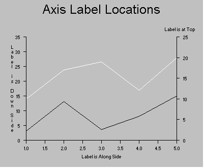
Bar/line graphs, XY-plots, and high/low charts have one X axis and one or two Y axes (Y1 and Y2). The X axis is described by the properties under the X Axis and X Tick Marks subheadings of the Graph heading; the Y1 and Y2 axes are described by the properties under the Y1 and Y2 Axis and Tick Marks subheadings, respectively.
The Y1 Axis and Tick Mark headings are present whether or not data is plotted against this axis. Headings for the Y2 axis are displayed if at least one data series is plotted against it. (Refer to "How to Specify the Y Axis for a Data Series" for information.)
The text size for axis labels and tick marks is determined by the setting of the Text Size property under the Graph heading. For information on setting text size, refer to "Specifying Sizes for Graph Text."
In a Bar/line Graph, XY-Plot, or High/Low Chart, Panther allows you to specify where the axes are positioned on the graph.
The axis locations defined by each of these settings depends on the orientation selected for the graph. Refer to "Orienting the Graph Vertically or Horizontally" for an explanation of graph orientation.
Table 13-2 shows where each Location setting places the axes when the graph orientation is set to Vertical. Table 13-3 shows where each Location setting places the axes when the graph orientation is set to Horizontal.
In a Bar/line Graph, XY-Plot, or High/Low Chart, Panther allows you to specify text labels for the axes in the graph widget.
By default, Panther determines appropriate minimum and maximum values and tick mark increments based on the data to be plotted. You can specify the following tick mark characteristics for each axis:
In a Bar/line Graph, XY-Plot, or High/Low Chart:
How to Specify Minimum and Maximum Values for the X/Y Axes
By default, Panther determines appropriate minimum and maximum values for each axis based on the data to be plotted.
In a Bar/line Graph, XY-Plot, or High/Low Chart:
By default in a Bar/line Graph, XY-Plot, or High/Low Chart, Panther determines appropriate increments for the major tick marks on each axis, based on the data to be plotted. You can specify different values if desired, as well as place minor tick marks on the axes, at increments of your choosing.
Note: The increment must be a positive value. The default is a value determined by Panther based on the data plotted against this axis.
Note: The increment must be a positive value. The default is no minor tick marks.
In a Bar/line Graph, XY-Plot, or High/Low Chart:
In a Bar/line Graph, XY-Plot, or High/Low Chart:
Note: The default tick mark width is 1. Higher values represent broader tick marks. The absolute width scales up and down with the size of the widget.
In a Bar/line Graph, XY-Plot, or High/Low Chart:
Note: The Labels set in the Label Source property are only placed on major (larger) tick marks. Minor (smaller) tick marks are not labelled.
To specify an array on the current screen, simply enter the widget name. For example:
To specify an array on another screen, enter the array name in the Any type of array can be used. However, single and multiline text widgets and list boxes are best suited to this purpose. The array can be hidden.
Y1_tick_labels
screen_name!field_name format, such as:
graph_format_screen!Y2_labels
Begin the list with an equal sign (
Note:
In the third example, a slash (=) and separate all values with a space or other appropriate delimiter. If a non-alphanumeric character follows the equal sign, it is interpreted as the delimiter for the list; if an alphanumeric character follows the equal sign, then space is assumed to be the delimiter. For example:
=Jan Feb Mar Apr May Jun
= Jan Feb Mar Apr May Jun
=/Mar 31/Jun 30/Sept 30/Dec 31
/) is used as the delimiter since the values contain spaces.
Note: If desired, you can expand the tick marks on any or all axes into grid lines.
In a Bar/line Graph, XY-Plot, or High/Low Chart:
For more information on how the 3D property settings affect the appearance of a particular chart type, refer to the following:
A data series represents not only the source for one set of data values, but also the plot style, Y axis specification, and labelling information for the data in the series.
For all chart types, there is at least one "Data Series" subheading of the Graph properties heading; under each data series, the data or its source is specified in one or more "Value Source" properties. Table 13-5 shows the names of these headings and properties for each chart type, along with the number of data sources permitted for each.
When you first expand the Data Series heading, only the Value Source property appears. Once you specify the value source, additional properties are displayed. The specific properties you can set for a data series depend on the chart type.
In the Properties window, one additional data series heading is always provided beyond the last one that contains a value source (up to the maximum number of data series permitted for the specified chart type). Thus, there is always a place to add the next data set. For example, if three data series have been entered for a bar/line graph, the heading Data Series #4 is also present in the Properties window.
The method for specifying the data value source is the same for all chart types. The names of the properties differ, however, and the number of sources permitted depends on the type.
Data supplied in the value sources must be numeric. If the values have a numeric format that includes non-numeric characters such as a currency symbol, these are stripped out. In pie charts and bar/line graphs, where the value can be displayed with the plot, only the numeric portion appears.
Defining the Data Series
How to Specify Data Values
The array name need not exist or contain data at this time. Data is used in the graph as it becomes available, such as when the array is populated at runtime. To specify an array on the current screen, simply enter the widget name. For example:
To specify an array on another screen, enter the array name in the
Note:
If the value source is an array on another screen, the values do not appear on the graph while you are in the screen editor; sample data is displayed instead. In test or application mode, however, Panther plots the values from the source you have specified.
Any type of array can be used as a value source. However, single and multiline text widgets and list boxes are best suited to this purpose.
Since every keystroke into the source array at runtime causes a re-draw, use hidden arrays as value sources for the data series. Capture the data from user input or from the database into an onscreen array; then copy the contents of that array into the hidden array. The chart is thus re-drawn only once—when the values are copied into the hidden array that you have specified as the value source.
cust_totals
screen_name!field_name format, such as:
admin_screen!num_rentals
To enter a list of values into Value Source, begin the list with an equal sign (
Note:
Once you have specified the value source for a data series, additional properties are displayed.
=) and separate all values with a space or other appropriate non-alphanumeric delimiter. If the character following the equal sign is alphanumeric, space is assumed to be the delimiter; if the character following the equal sign is not alphanumeric, then that character is the delimiter for the list. For example:
= 1.5 3 4.5
=1.5 3 4.5
=/1.5/3/4.5
For each data series in a bar/line graph or XY-plot and for data series 5 and up in a high/low chart, you can specify the format for displaying the data. You can use different formats within the same graph.
If the Style property is not displayed, be sure to set the Value Source property first.
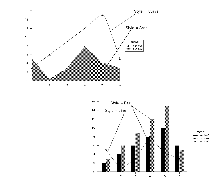
Note: If the chart type is Bar (all data series) or High/Low (data series 5 and above), the style must be one of:
If the chart type is XY-Plot, the style must be one of:
How to Specify the Line Style for a Data Series
Note: If the Point Marker property is not displayed, be sure to set the Value Source property first.
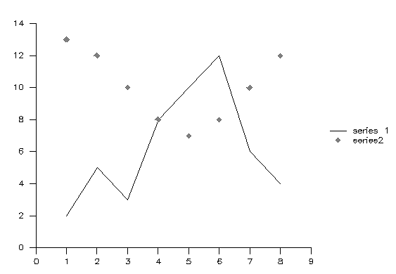
The point marker format for the data series can be any one of: None (default), Dot, +, *, O, X, Square, Diamond, Triangle, Circle, Filled Square, Filled Diamond, Filled Triangle, or Filled Circle.
Point markers are displayed if the Style property for the data series is Line, Curve, Point, or Trend.
If the chart type is Bar, XY-Plot, or High/Low, you can specify the Y axis (Y1 or Y2) against which the data in this series is to be plotted.
By default, the Y1 axis appears on the left and the Y2 axis on the right when the graph is oriented vertically. When the graph is oriented horizontally, the Y1 axis runs along the bottom and the Y2 axis along the top. For more information on positioning the Y axes, refer to "How to Specify the Axis Locations."
Note: If the Y Axis property is not displayed, be sure to set the Value Source property first.
If the chart type is Bar, XY-Plot, or High/Low, you can specify a Panther basic color for each data set's plot. For information on Panther basic colors, refer to "Using Panther Basic Colors."
The data in this series will be plotted in the specified color.
Note: If the Color property is not displayed, be sure to set the Value Source property first.
By default, each data series is plotted in a different color: data series #1 in black, #2 in blue, #3 in green, #4 in cyan, and so forth, through the list of Panther basic colors.
If the chart type is Bar, XY-Plot, or High/Low, you can supply a text string for each data series to identify it in the legend for the graph.
If you do not enter legend text for the series, it will not be listed in the graph's legend. If the graph does not have a legend, any legend text entered here is ignored; it is retained, however, and is used if a legend is later added to the graph.
For information on creating and displaying a legend in a graph widget, refer to "Adding a Legend to a Graph."
The text you enter in this property is used to identify the data series in the legend for the graph.
Note: If the Legend property is not displayed, be sure to set the Value Source property first.
If you change the chart type (either while in the editor or at runtime) of the widget after data value sources have been specified, Panther retains the information, even if it is not all applicable to the new chart type.
For example, if a bar graph with three data series is changed to a pie chart, only the first data series is used. If this widget is later changed to a high/low plot, all three data series are used; they become the High, Low, and Close Data Series, respectively. If converted back to a bar chart or line graph, the values once again become Data Series #1, 2, and 3.
When an XY-plot is converted to another chart type, the Y value source becomes the value source for the corresponding data series. The X value source is ignored, but it remains intact and is again used if the graph is later converted back to an XY-plot.
When any other chart type is converted to an XY-plot, the value source from the original chart becomes the Y value source on the XY-plot.
Pie Charts | |
A pie chart expresses values from a single data source as proportional segments of a circle. Graph properties for a pie chart allow you to customize its format and to specify the data source.

Figure 13-8 Pie chart drawn in 3D. Value Location property is set to In; Percent Location is Out; Label Location is Out.
The following steps summarize the process for creating a pie chart:
By default, a pie chart is displayed in two dimensions, as a flat circle. You can, however, specify that you want the chart to appear in three dimensions.
At 0 degrees, the viewer is looking straight into the pie chart, as if it were simply shown in two dimensions. As the degree of rotation increases, the top of the chart rotates away from the viewer so that at 90 degrees, the chart appears to be lying on a horizontal plane, and only the lower edge is visible.
The default value for Vert Rotation is 30 degrees.
Data for the pie chart must come from a single source, which can be either an array on any screen in the application or constant data entered directly into the Properties window.
For detailed information on formatting the value source array name or value list, refer to "How to Specify Data Values."
By default, a pie chart is centered in the widget and has a diameter 30% of the widget size. The segment order is counterclockwise, beginning on the right. You can change the pie chart layout via the properties under the Pie subheading.
Note:
This value must be a number between 0.0 and 200.0, inclusive.
At 100.0, the edge of the pie chart just touches the boundary of the widget. At 200.0, the edges of the chart are not visible. The default diameter is 30.0 percent.
Note:
Values for these properties must be values between 0.0 and 100.0, inclusive.
The default position for a pie chart is centered (X Position and Y Position both set to 50).
Panther provides a variety of ways you can identify the segments in a pie chart. Any or all of the following can be displayed:
You can also control the appearance of each individual segment: normal, exploded, or hidden.
How to Identify the Segments of a Pie Chart
To specify an array on the current screen, simply enter the widget name. For example:
To specify an array on another screen, enter the array name in the Any type of array can be used. However, single and multiline text widgets and list boxes are best suited to this purpose. The array can be hidden.
genre_segment_labels
screen_name!field_name format, such as:
graph_format_screen!segment_labels
Begin the list with an equal sign ( (In the third example, a slash ( Labels in the array or list must be entered in the same order as the corresponding data values are specified in the Value Source property under Data Series.
Once you set the Label Source property, an additional property, Label Location, is displayed.
=) and separate all values with a space or other appropriate non-alphanumeric delimiter. If a non-alphanumeric character follows the equal sign, it is interpreted as the delimiter for the list; if an alphanumeric character follows the equal sign, then space is assumed to be the delimiter. For example:
=Comedy SciFi Adventure Drama Musical
= Comedy SciFi Adventure Drama Musical
=/Oct 14/Nov 14/Dec 14/Jan 15/Feb 15
/) is used as the delimiter since the values contain spaces.)
0.0 and 100.0, inclusive, representing a proportion of the widget size. The default is 2.0.
Note: If the Label Location property under Pie Segments is set to Legend, the labels are displayed in the text size set for the legend.
To specify an array on the current screen, simply enter the widget name. For example:
To specify an array on another screen, enter the array name in the Any type of array can be used. However, single and multiline text widgets and list boxes are best suited to this purpose. The array can be hidden.
my_pie_styles
screen_name!field_name format, such as:
graph_format_screen!segment_styles
Begin the list with an equal sign (
Note:
In this example, a slash ( Styles in the array or list must be entered in the same order as the corresponding data values are specified in the Value Source property under Data Series.
Segment styles can be any of the following:
=) and separate all values with a space or other appropriate delimiter. If a non-alphanumeric character follows the equal sign, it is interpreted as the delimiter for the list; if an alphanumeric character follows the equal sign, then space is assumed to be the delimiter. For example:
=/explode/with prev/normal/normal/hidden/normal
/) is used as the delimiter since the values can contain spaces.
Bar/Line Graphs | |
A bar/line graph allows you to display data from up to 12 sources in a variety of bar and line formats. Graph properties for a bar/line graph allow you to customize its format and to specify the data value sources.
The following steps summarize the process for creating a bar/line graph:
Once you have set the Value Source property, you can specify additional characteristics of the data series:
Use the Bar Type property, under Graph, to define how each slice through the data is formatted.
A slice is the nth value of each data series in the widget, all of which are plotted at the nth tick mark on the X axis. For example, the third value in each data series is plotted at the third tick mark.
Values in a slice can be formatted in a variety of ways, such as side-by-side, stacked (as if they were added together), or overlapped.
Note:
Stack, Step, and 100 are best used with positive values.

Figure 13-10 Bar/line graph with 3D property set to Yes and Bar Type set to Overlap.
By default, a bar/line graph is displayed in two dimensions, as a flat plot. You can, however, specify that you want the graph to appear in three dimensions.
At 0 degrees, the viewer is looking straight into the graph. As the degree of rotation increases, the right side rotates toward the viewer so that at 90 degrees, the viewer is looking directly into the right side of the graph. At this setting, bars are visible only if they are taller than any of the bars that are "closer" to the viewer.
The default value for Horiz Rotation of a bar/line graph is a special value that approximates a 20 degree view angle, but the horizontal axis remains parallel to the bottom edge of the widget. At any other setting, the horizontal axis is angled to match the three-dimensional perspective. To return to the default setting if you have previously entered a number into this property, simply enter a blank space.
At 0 degrees, the viewer is looking straight into the graph. As the degree of rotation increases, the top of the chart rotates toward the viewer so that at 90 degrees, the graph appears to be lying on a horizontal plane, with only the top edge visible.
The default value for Vert Rotation of a bar/line graph is 20 degrees.

Figure 13-11 Bar/line graph with Bar Type property set to Absolute; 3D set to Yes; tick mark Grid Style for both X and Y1 axes set to Dashed.
Each data series in a bar/line graph takes a single value source. The first value in each data series is plotted at the first tick mark on the X axis, the second at the second tick mark, and so forth.
For detailed information on formatting the value source array name or value list, refer to "How to Specify Data Values."
Once you have specified the value source for a data series, additional properties are displayed.
For each data series on a bar/line graph, you can specify whether or not to display the value of each point or bar.
XY-Plots | |
An XY-plot allows you to display data from up to 12 X and Y data source pairs. Graph properties for an XY-plot allow you to customize its format and to specify the data sources.
The following steps summarize the process for creating an XY-plot:
Once you have set the Y Value Source property, you can specify additional characteristics of the data series:
By default, an XY-plot is displayed in two dimensions, as a flat plot. You can, however, specify that you want it to appear in three dimensions.
When an XY-plot is displayed in 3D, only the axes acquire depth; the plot lines do not. All elements, plot lines as well as axes, however, are rotated together so that the lines appear in the correct position relative to the axes.
At 0 degrees, the viewer is looking straight into the graph. As the degree of rotation increases, the right side rotates toward the viewer so that at 90 degrees, the viewer is looking directly into the right side of the graph. At this setting, bars are visible only if they are taller than any of the bars that are "closer" to the viewer.
The default value for Horiz Rotation of an XY-plot is a special value that approximates a 20 degree view angle, but the horizontal axis remains parallel to the bottom edge of the widget. At any other setting, the horizontal axis is angled to match the three-dimensional perspective. To return to the default setting if you have previously entered a number into this property, simply enter a blank space.
At 0 degrees, the viewer is looking straight into the graph. As the degree of rotation increases, the top of the chart rotates toward the viewer so that at 90 degrees, the graph appears to be lying on a horizontal plane, with only the top edge visible.
The default value for Vert Rotation of an XY-plot is 20 degrees.
On an XY-plot, only the axes acquire depth; the plotted lines do not.
Each point on an XY-plot is identified by two coordinates—the X value and the Y value. Thus, each data series in an XY-plot has two value sources. The first entry in the Y value source is plotted against the first entry in the X value source, the second Y value against the second X value, and so forth, until all value pairs have been exhausted. Only value pairs are plotted; excess X or Y values are ignored.
For detailed information on formatting the value source array name or value list, refer to "How to Specify Data Values."
After you have entered the Y Value Source, additional properties for the data series are displayed.
Alternatively, you can omit the X Value Source.
If no X Value Source is given for a data series, Panther plots the Y values against the X values for the previous data series. If the first data series in an XY-plot has no X values, Panther assumes integer X values of 1, 2, 3, etc.
High/Low Charts | |
In a high/low chart, the first four data series are labelled High, Low, Close, and Open. Corresponding values from these data series are plotted together on a single marker that resembles an I-beam. This type of chart is typically used to track the values of stocks, bonds, or commodities.
High/low charts can also accommodate up to eight additional data series, which are labelled numerically, beginning with Data Series #5, and are formatted in the same manner as data on a bar/line graph.
Graph properties for a high/low chart allow you to customize it and specify the data sources.
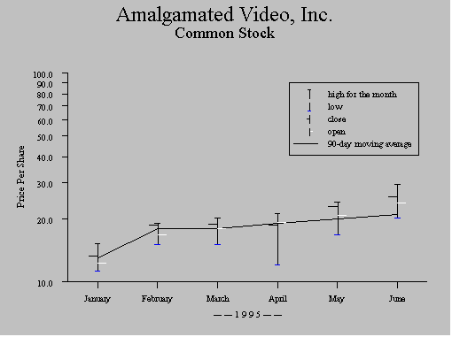
Figure 13-12 A high/low chart. One related data series is also plotted on this graph; its Style property, under the Data Series #5 heading, is set to Line. The Y1 axis Scale property is set to Common Log, and the Y1 axis Label Location is Along Side. The legend is located in the data space.
The following steps summarize the process for creating a high/low chart:
Once you have set the Value Source property, you can specify additional characteristics for the data series. For the high, low, close, and open data series, you can specify the following:
For data series 5 and above (if any are present), you can specify:
By default, a high/low chart is displayed in two dimensions, as a flat plot. You can, however, specify that you want it to appear in three dimensions.
When a high/low chart is displayed in 3D, the high/low bars do not acquire depth. The axes, as well as the bars, lines, and/or areas from additional data series, however, do take on a three-dimensional appearance.
At 0 degrees, the viewer is looking straight into the graph. As the degree of rotation increases, the right side rotates toward the viewer so that at 90 degrees, the viewer is looking directly into the right side of the graph. At this setting, bars are visible only if they are taller than any of the bars that are "closer" to the viewer.
The default value for Horiz Rotation of a high/low chart is a special value that approximates a 20 degree view angle, but the horizontal axis remains parallel to the bottom edge of the widget. At any other setting, the horizontal axis is angled to match the three-dimensional perspective. To return to the default setting if you have previously entered a number into this property, simply enter a blank space.
At 0 degrees, the viewer is looking straight into the graph. As the degree of rotation increases, the top of the chart rotates toward the viewer so that at 90 degrees, the graph appears to be lying on a horizontal plane, with only the top edge visible.
The default value for Vert Rotation of a bar/line graph is 20 degrees.
The high/low bars do not acquire depth, but all other plot elements, including the axes, do.
Each data series in a high/low chart takes a single value source. The first value in each data series is plotted at the first tick mark on the X axis, the second at the second tick mark, and so forth. Corresponding points from the High, Low, Close, and Open data series are plotted together on a single marker. Values from additional data series are formatted as if they were on a bar/line graph.
For detailed information on formatting the value source array name or value list, refer to "How to Specify Data Values."