


| Using the Editors | |
The role of the screen is determined, in part, by where it is stored. You can create a screen and store it:
Creating, Opening, and Saving Screens |  |
Your Panther screens are created in the editor and then stored in a library or a repository. An screen can be:
You can populate a screen with widgets by:
A new, untitled screen is open by default when you start up the editor. This screen can be a client screen or a screen in a repository depending on where you choose to store it. Now you can begin populating the screen with widgets, or defining the screen's properties.
Note:
As of Panther 4.5, a special type of screen, a frameset, can contain multiple screens. For more information, refer to Chapter 17, "Framesets and Splitters."
Creating a New Screen
How to Create a New Screen
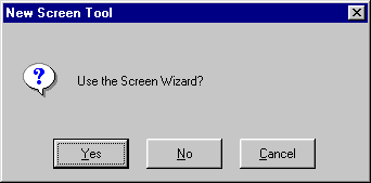
 NewScreen (or the New Screen button on the toolbar). The New Screen Tool dialog box appears and prompts:
Since you can have different types of application components open in the editor at the same time, you can identify screens in the following ways:
Untitled#.
screenName@libraryName.
screenName@[Repository].
You can create screens that are derived from your database by following the procedure for importing database tables to a repository (refer to "Populating a Repository with Database Objects"). Once you import the database tables, you can use the resulting repository entries to create your application screens.
Creating a Screen from a Repository
How to Add Objects to Your Screen from a Repository
OpenRepository if the repository is not open.The copied (child) object in your application screen has property settings that match its parent in the repository. Inherited property values are indicated in reverse video in the Properties window. The position (Start Row, Start Column, End Row, and End Column properties) are not inherited; and although the initial value for the Name and Inherit From properties are derived from the parent object, there is no inheritance relationship for these property settings.
The Inherit From property for the child widget indicates the source of inheritance—the name defined for the parent object and its repository entry in the format repository_entry!widget_name. Refer to "Controlling Inheritance" for ways of controlling inheritance.
A screen that has the Dialog property set:
For additional information about window styles in Windows applications, refer to "Specifying Styles under Windows."
How to Define a Screen as a Dialog Box
The screen, in application/test mode, is now an application modal window. Consider providing some mechanism, like an OK button, to allow the user to continue or exit the screen.
For instructions on creating a tab dialog in Windows applications, refer to "Creating a Tab Dialog Screen."
For information about opening screens, refer to "Opening Application Components."
For information about saving screens to a library, refer to "Saving an Application Component."
For information about saving screens to a repository, refer to "Saving Application Components to a Repository."
Resizing a Screen | |
By default, new screens have a predefined Height and Width property setting—18 (grid rows) by 48 (grid columns). These properties define the initial dimension of a screen.
Since Panther screens are virtual screens, you can create screens as large as 254 lines by 254 columns. When a virtual screen is larger than the physical display can accommodate, then the screen is viewed through a mechanism called a viewport.
Do either of the following:
The grid size and the size of the font can have an effect on screen size as well.
You can control the initial size of the screen as well as define what users can do to resize the screen.
Conventions for Controlling Screen Size at Runtime
Changing the Viewport
How to Control Whether Users Can Resize a Screen at Runtime
In addition, when a user changes the size of a screen, you can control how widgets will grow or shrink to take advantage of the screen's new size. The screen editor Properties window is a good example of how widgets can resize and move depending on the window's size. Refer to "Controlling a Widget's Size at Runtime" for details on controlling widget size.
Panther provides a mechanism for resizing widgets based on the size of the screen, but you can also write a function that Panther calls when the viewport size is changed. The function can control how widgets, under a GUI platform, are resized and rearranged when the user changes the viewport size.
In a GUI environment, you can control whether the standard maximize and minimize buttons are available to the user. In addition, you can define whether a screen starts off in a maximized or minimized (iconified) state. By default, when a screen is invoked, it starts up in the size you specify at design time.
At runtime, a user restores a window to its original size by:
How to Define a Screen's Startup State
Note:
The Maximized value has no effect under Motif.
Note: While in Edit mode in the screen editor, all screens have a minimize button only, regardless of the property setting. This allows you to iconify screens while you are designing. In Test mode, screens reflect the actual property specifications.
On a GUI platform, when a screen is minimized at runtime, a default operating system icon is provided by Motif, and Windows uses an empty square. You can provide your own icon that is displayed when the screen is minimized.
You can browse libraries with the Open button. Windows only supports *.ico formats for icon usage. Motif will display BMP (.bmp), GIF (.gif), JPEG (.jpg), XPM (.xpm, .xpm1, .xpm3) and XBM (.xbm) style files.
Note: Motif does not scale images, so if they are too large for the icon space, the icon image may appear truncated.
In addition, the Select Library Member dialog box provides the capability to browse libraries with the Open button, and to add icon image files to a library with the Add button. If you choose the Add button, the Select File dialog box opens and you can select the icon file that you want to include in a library.
Test Mode (or the Test Mode button on the toolbar).The icon displays if the file is in one of your open libraries.
To facilitate portability and provide maximum flexibility, omit the filename extension when you specify an icon file. At runtime, Panther searches for files in all open libraries using all possible image extensions supported on the local platform.
If you have icon images of the same name but of different types (for example, logo.ico is the Windows icon format, while logo.jpg is a photograph), include the extension to ensure that the correct image is displayed at runtime.
Note: Under Windows, if you compile the icon into your resource-definition file, the resource id must match the Icon property setting exactly.
Using the Screen Grid | |
Panther uses a grid to determine widget location. The height and width of the entire screen is measured in grid units, expressed in grid rows and grid columns, respectively.
Notes: The horizontal grid marks indicate different units of measurement: in character mode, the space between each grid mark represents two grid units; in GUI modes, it represents one unit.
In character-mode Panther, the grid is fixed; each character occupies one grid cell.
If you explicitly set the Grid Height and Grid Width properties, under a GUI platform, Panther uses these; otherwise, it uses the screen's font size to determine the grid size (refer to "Specifying Fonts" for more information on setting font preferences).
To toggle the display of the grid, choose OptionsGrid (or the Grid button on the toolbar).
Select the screen. Under Geometry in the Grid Height and/or Grid Width properties, enter the desired measurement (default is grid units). (Refer to Table 9-1 for a list of valid units of measurement.)
This setting overrides the screen's font size as a determining factor for sizing the positioning grid.
Controlling Screen Location | |
When invoking a screen, you can specify parameters that control the screen's location and size. If you omit these parameters, Panther uses its own defaults. By default, Panther displays the screen in its entirety. When you invoke a screen:
Refer to "Displaying Screens" in Application Development Guide for detailed instructions on specifying screen position in control strings or runtime library functions.
Controlling Geometry Changes Across Platforms | |
Panther recalculates a screen's size and the positions of its widgets when you open a screen in an environment that is different from the one in which it was created—for example, a screen created in character mode that is opened in Motif. When this happens, Panther uses a positioning algorithm that makes several assumptions about screen size and the correct placement of widgets. By default, these assumptions include maximizing the use of whitespace while maintaining the relative positions of widgets to each other.
The screen's Positioning properties let you:
Note:
Positioning properties are recognized only in GUI environments.
Spacing Widgets for Portability
How to Control the Amount of Space Between Widgets
Note: The default 0 allows widgets to touch the screen border. If you place widgets within the margin, Panther does not try to increase the space between them and the screen's border.
When you open a screen in an environment different from the one in which it was created, Panther attempts to minimize differences between the presentation of the same screen on different platforms. Panther typically adjusts the widget's start positions and the screen's dimensions by shrinking or expanding the grid.
To illustrate how these settings work, three versions of the following screen were created in character mode. Each has different vertical and horizontal shrinking properties settings. In character mode, all versions appear to be identical (Figure 6-1).
Figure 6-1 Screen created in character mode.
When you port these screens to Windows, however, the differences become evident.

Figure 6-2 Vertical and Horizontal shrinking properties were set to Decrease region size for this screen ported to Windows.

Figure 6-3 Vertical and Horizontal Shrinking properties were set to Keep region size for this screen ported to Windows.
Refer to "Controlling a Widget's Position at Runtime" for information on controlling widget position when a screen resizes.
Including Screen Wallpaper | |
Instead of displaying a screen background color, you can display a picture, drawing, or photograph as the screen background. This is referred to as wallpaper.
Panther supports BMP (.bmp), GIF (.gif), and JPEG (.jpg) files under Windows and Motif as well as XPM (.xpm, .xpm1, .xpm3) and XBM (.xbm) files under Motif. Images appear in the size in which they were created.
Grid or toggle the Grid button on the toolbar to turn the grid off.
Note: The wallpaper does not display in Edit mode when the grid is on.
The image displays immediately if the file is in one of your open libraries.
In addition, the Select Library Member dialog box provides the capability to browse libraries with the Open button, and to add image files on the system to a library with the Add button. If you choose the Add button, the Select File dialog box appears and allows you to select the files that you want to include in a library.
To facilitate portability and provide maximum flexibility, omit the filename extension when you specify an image file. At runtime, Panther searches for files in all open libraries using all possible image extensions supported on the local platform.
If you have images of the same name but of different types (for example, dog.xpm might be a bitmapped image while dog.jgp is a photograph), include the extension to ensure that the correct image is displayed at runtime.
Note: Under Windows, if you compile the image into your resource-definition file, the resource id must match the Wallpaper Pixmap property setting exactly.
To specify a wallpaper for Panther's MDI parent window in Windows applications, set the appropriate variables in your Panther initialization (*.ini) file. For details on settings in the initialization file, refer to MDIWallpaperPixmap in Configuration Guide.
Specifying a Mouse Pointer | |
In general, the mouse is the primary method for navigating in GUI applications. For the most part, the native window manager handles the way your mouse pointer looks and behaves. In Motif, the default pointer shape is an arrow, but can be specified in the pointerShape resource; in Windows, the default cursor is also an arrow. These are considered application-wide pointers. However, you can also specify a mouse pointer shape for a screen that is different from the default.
In addition, you can use the library function sm_delay_cursor to change mouse pointer shapes at runtime.
Note: Motif and Windows each have pointer shape specifications that are unique to their environments. Therefore, they are not portable across platforms.
In Windows, you can create your own cursor shapes and designate your custom cursor in the Pointer property for the screen.
.rc file) using the following format:
pointerCURSORimage_file
where pointer is a name you devise to identify the image; image_file is the bitmap filename of the image you created.
pointer in the Pointer property.Including Borders and Decorations | |
By default, a screen has a border and is fully decorated with an area for the screen title (title bar), minimize and maximize buttons (in GUIs only), and a system menu. Scroll bars appear in the border only if they are necessary, that is, if the screen is larger than can be displayed in the physical monitor or you choose to display the screen as a viewport.
In addition to designing screens with and without borders, you can control what appears on a border and control the title bar components. For example:
Borders are included, by default, on all newly created screens. Borders can add visual interest and help distinguish the edges of a screen when it is opened on top of another screen of the same color. This is particularly useful in character mode applications. Borderless screens, on the other hand, have no title bar, system menu, or minimize and maximize buttons.
Designing the Screen Borders
How to Define a Screen's Border Display
Note: The numeric styles correspond to characters and are defined in your video file. You can modify them in the video file to control the actual character set associated with a particular border style. (For more information, refer to "Borders and Line Drawing" in Configuration Guide.)
While you are working in the editor, the title bar for your application screen displays the filename and library you specified when you saved the screen, or, when unsaved, it is Untitled followed by a number. However, to provide a title for your screen in application mode or test mode, you need to set the Title property.
In application/test mode, the title is displayed in the screen's border or title bar.
Note: The Title property has no effect in character mode if the Border property is set to No. In the GUIs, there is no effect if the Title Bar property is set to No.
Identifying a mnemonic for screens running in character mode provides users with an alternative way, and GUI-like means, of bringing focus to a screen. At runtime, the user can bring focus to a screen by choosing the Windows menu bar option, and then selecting the desired screen from the drop-down menu by typing the mnemonic that is highlighted. The mnemonic is designated as one of the characters in the screen's title.
For example, if the screen's title is Customer Information, you can specify any of its letters as the mnemonic. Enter an upper case C (or 1), or lower case u (or 2). Uppercase C or the number 1 defines the first letter in the string to be the mnemonic, while lowercase u or the number 2 defines the second letter in title to be the mnemonic.
The property setting displays the position of the character followed by the character. For example, if you enter the mnemonic C for the Customer Information screen, the Mnemonic Position property displays 1 \QC'—the first character in the title.
All newly created screens have a title bar. The title bar includes the screen's title, the system menu in the upper left corner, and minimize and maximize buttons in the upper right corner.
Note: The Title Bar property has no effect in character mode if the Border property is set to No.
A screen's system (or control) menu is displayed in the upper left corner of the screen border (displays as [=] in character mode). By default, all newly created screens have a system menu. In general, the system menu includes the following options: Restore, Move, Size, Minimize, Maximize, and Close.
Note:
In Motif, you can define the contents of your system menu in the .mwmrc file.
Most options on the system menu have other means of access, such as resize handles, and maximize and minimize buttons.
Note: The System Menu property has no effect if Border is set to No in character mode or Title Bar is set to No
Note: This property setting is particularly useful on dialog boxes where user input may be required before proceeding.
Specifying Styles under Windows | |
As of Panther 4.5, there are new options for opening windows under the Windows operating system. Previously windows could either be opened as MDI windows, or as dialogs. An MDI window cannot be moved outside the MDI frame. A dialog can be moved outside the MDI frame, but blocks access to the MDI frame – when a dialog is opened, focus cannot be given to any MDI windows, nor can the MDI menu be accessed until the dialog is closed.
The new options are implemented by the properties Keep in Frame and Topmost. These are screen-level properties and are found under the Identity section in the Properties window.
The Keep in Frame property is a subproperty of the Dialog property. If a window is specified as a dialog, the new option doesn't apply.
The default value for Keep in Frame is Yes. A non-dialog window with Keep In Frame set to Yes will behave exactly like the MDI windows Panther has always supported. Setting Keep In Frame to No will make the screen open as a non-MDI window, that is not a modal dialog. Such a screen can be moved outside the MDI frame, but does not block access to the MDI windows nor to the MDIs menu bar.
When Keep in Frame is set to No, two further properties appear in the Properties window. These are Keep On Top and Parent Window. The Parent Window property is relevant only to windows that have Keep in Frame set to No, and Keep On Top also set to No. The Parent Window property will not appear in the Properties window if the Keep On Top property is set to Yes.
Unlike dialogs, screens that have Keep in Frame set to No can be minimized or maximized. The behavior when they are minimized is determined by the Parent Window property.
Windows outside the MDI frame do not appear in the Windows menu list in the standard MDI application menu. And they cannot be accessed by function keys like Ctrl+F6. They can, however be accessed by Windows shortcuts such as Alt+F6.
Windows that have the Keep in Frame property set to No and are not designated as Topmost windows can either have no parent or they can be parented by the MDI frame. If the parent is designated as None then the screen can be hidden by the MDI frame when the latter is given focus. If the screen is designated as parented by the MDI frame, then the screen will always appear on top of the MDI frame. In this case, even if focus is given to the MDI frame, or one of the windows inside the MDI frame, the non-Keep in Frame window will always be displayed, and will not be obscured behind the MDI frame. Note that a non-Keep in Frame window whose parent is the MDI frame can still be hidden behind other windows that are not part of the Panther application. To designate that a window should never be obscured behind another window, whether that other window be part of the Panther application or not, use the Keep on Top property.
When a non-Keep In Frame window is minimized, the location of the icon representing it depends on the window's parent. A non-Keep In Frame window with no parent will be represented by an item on task bar. A non-Keep in frame window whose parent is the MDI frame will be represented by an icon in the desktop's lower left, just above the taskbar.
A non-Keep in Frame window can be designated as a Topmost window by setting the Keep On Top property to Yes. A Topmost window will generally be rendered on top of any other window on the desktop, no matter which application is active. The only windows that can be placed on top of a Topmost window are other Topmost windows.
At runtime the properties PR_KEEP_IN_FRAME, PR_KEEP_ON_TOP, and PR_WINDOW_PARENT are read only. Once a window has been opened, its status with regard to these settings cannot be changed.
Attaching a Menu Bar | |
Menu bars provide users with a convenient method for accessing a variety of commands and functions.
When you click on a menu option, a submenu drops down. Drop-down menus display items that can either invoke dialog boxes or carry out commands.
It is assumed that you have already created the menu and/or toolbar and that it resides in a menu script. For details on creating menu bars, refer to Chapter 25, "Menu Bar Editor." For information on loading menu script files, refer to Chapter 15, "Including Menus and Toolbars," in Application Development Guide.
How to Attach a Menu to a Screen
At runtime, Panther checks the screen-level location to see if the named menu is in the installed menu script, and then checks application-level. If the named menu is not in an installed menu script, proceed to step 3.
*.mnu) from the Select Library Member dialog box.
This specification loads the named script into this screen's memory. All other menus defined in this script are available for display with this screen.
If you do not supply a menu name in the Menu Name property, Panther displays the first menu in the specified script.
You can also load menu scripts and install menus by calling sm_mnscript_load and sm_menu_install, respectively. Refer to the Programming Guide for a description of these functions.
A popup menu can be opened when the user presses the right mouse button. By default, the screen's menu bar is displayed as the popup.
The menu must be in a script that is already loaded in memory. Panther checks the screen-level location first, and then application-level for the named menu. For details on creating menu bars, refer to Chapter 25, "Menu Bar Editor." For information on loading menu script files, refer to Chapter 15, "Including Menus and Toolbars," in Application Development Guide.
At runtime, the user sees the specified popup menu when the right mouse button is pressed anywhere in the screen area. However, if the mouse is over a field that has its own popup menu designation, the field's popup menu is displayed instead. For information on attaching a popup menu to a widget, refer to "Invoking a Popup Menu."
Once you attach the menu, you can test it with the screen.
Test Mode or choose the Test button on the toolbar.
The screen is displayed in Test mode with its menu bar.
Documenting Screens | |
Two properties under Identity in the Properties window help you document the contents of your screens:
By including a brief description of your screen, you can provide information to other developers about the screen, its content, and its purpose. This description is displayed when you view the Repository TOC and scroll through each of the repository entries.
Adding Comments
How to Add or Edit Comments on Your Screen
At runtime, you can access the screen's Memo Text property to determine what action to take depending on the property's content. For information on accessing screen properties, refer to "Properties" on page 19-40 in Application Development Guide.
Defining XML Tags for Screens | |
As of Panther 5, you can import and export XML data from a Panther screen. To use this feature, you must:
This section describes the property specifications for screens. For information on widget properties, refer to "Defining XML Tags for Widgets." For details on using the XML interface, refer to Chapter 22, "Using XML Data," in the Application Development Guide.
How to Set XML Properties for Screens
Under XML, enter a value in both the XML Prefix and XML Postfix properities.
Note:
If the XML Prefix property is empty, the generated XML begins with the following line:
<?xml version="1.0"?>
Testing Screens | |
For information on testing screens, refer to Chapter 38, "Testing Application Components," in Application Development Guide.
