


| Using the Editors | |
By default, Panther controls much of how widgets behave—each widget type having its own unique behavior. However, this chapter describes those attributes, via the Properties window, that allow you to control the way a widget behaves, such as:
Identifying and Naming Widgets |  |
Panther automatically assigns internal field numbers whenever you add a widget to a screen. However, to maintain maximum control of what happens on a screen at runtime and facilitate field referencing in programming, assign a name to each widget on a screen—under Identity, in the Name property.
The widget's name appears at the top of the Properties window when the widget is selected. You can also see the name (and number) assignments for all widgets on a screen by viewing the Widget List.
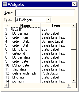
Figure 8-1 Provide widgets with easy-to-identify names to facilitate referencing them programmatically.
Panther automatically numbers each object on a screen as follows:
Field #1, Field #2, and so on.
Referencing by field name is generally safer than referencing field numbers, because field numbers can change each time the screen is changed; for example, when a record is inserted.
A widget name identifies a field on the screen. The name must be unique; that is, no other widget or group on the screen can share the name. Individual array occurrences are referenced by widget name and occurrence number. Widgets that are created as the result of importing database tables are automatically named after the database column with which it is associated.
Assigning a Widget Name
How to Assign a Name to a Selected Widget
Names can be up to 31 characters long, and must start with an alphabetic character, an underscore, a dollar sign, or a period. The rest of the name can contain alphanumeric characters, underscores, dollar signs, and periods. The names are case-sensitive; therefore, a widget named Use the widget name to refer to a widget both within the screen editor (e.g., to specify the Next Tab Stop property) and in application code. In addition, a widget must be named if:
city is different from a widget named City.
When you copy a widget within a screen, the copy retains all properties of the original except the name—otherwise a duplicate name would result. The new widget has no name.
When you copy a widget from one screen to another, the widget name is copied as well. Widgets on different screens can share the same name, but it is good practice to share names only when the widgets will share the same data or properties. In that way, data can be shared through the LDB, and properties can be inherited from the repository, respectively.
You can identify which character on a widget's label is treated as the widget's mnemonic. The mnemonic provides users with an alternative way of activating or bringing focus to a field, or related field, if the widget is protected. The following rules apply when you assign a mnemonic:
Assigning a Mnemonic
The mnemonic is designated as one of the characters in the widget's label. For example, if you have a check box on the screen with the label New Movies, you can specify any of its letters or a position as the mnemonic. You can specify upper case N or lower case w, or position 1 or 3, respectively. In this example, upper-case N defines the first letter in the string to be underlined (or displayed in a contrasting color in character mode), lower-case w defines the third letter in the word New to be designated as the mnemonic.
How to Identify the Keyboard Mnemonic on a Widget
The property setting returns the position of the character in the label. For example, if you enter the mnemonic A for a push button with the Label property setting Add, the Mnemonic Position property is defined as 1 \QA'—the first character in the Add label.
You can always activate a widget mnemonic from a non-data entry field, such as a radio button or toggle button, by pressing the mnemonic key by itself. If a data entry field has focus, you can activate a menu bar or widget mnemonic by pressing the Alt and mnemonic keys together. In Windows and character mode applications, the screen's menu bar is searched for an active item that uses that mnemonic; if none is found, the mnemonic is sought among the widgets on the current screen. In Motif applications, only menu bar items are searched.
When you import database tables, the widgets that represent the table's columns are automatically assigned a data type by Panther. For the most part, the C Type property does not affect the look or behavior of the widget in your application. For example, a C Type property (under Identity) set to Double, with the Precision property set to 3, does not set or effect a widget with a numeric property specification or perform any validations when the user enters data into the field.
You can use the C Type property to control the way Panther formats data before passing it to a database (refer to "Colon Preprocessing" in Application Development Guide for information). In this way, you can specify the database format as opposed to Panther's format.
Possible C type values are: Default (two decimal places), Omit, Char String, Int, Unsigned Int, Short Int, Long Int, Float, Double, Zoned Dec, Packed Dec, and Hex Dec.
The Omit specification means that the field should be omitted from the data structure.
If you select Float, Double, Zoned Dec, or Packed Dec, you can also specify the Precision property. The default is 2 decimal places.
You can also define zoned and packed decimal types to be either signed or unsigned. In the Sign property, enter Yes to indicate signed; enter No for unsigned.
Invoking a Popup Menu | |
A popup menu is a vertical menu bar. The menu bar that appears on the current screen can be accessed as a popup menu by clicking the right-mouse button. The popup menu appears at the current mouse cursor position.
The specified menu must be in a script that is already loaded in memory. Panther checks the screen-level location first, and then application-level for the named menu.
At runtime, when a user clicks the right-mouse button on the widget, the specified popup menu is displayed. If the widget's Popup Menu property is unspecified, the screen's menu bar is displayed as the popup.
*.mnu) from the Select Library Member dialog box.
If you do not supply a name in the Popup Menu Name property, Panther displays the first menu in the specified script.
Active Versus Inactive Widgets | |
Active widgets can get focus and respond to user-generated actions. Their appearance indicates that they can be selected or pressed. Widgets that can be made inactivate, or temporarily deactivated, are those that have a label—specifically, push buttons, toggle buttons, radio buttons, and check boxes.
You can inactivate specific widgets in a selection group. You must set the Active property under Identity to No for all members of the group to make the group inactive.
If you define that a dynamic label be initially inactive, consider deactivating its corresponding data entry widget (if one exists) at the same time. Under Focus, set the Focus Protection property to Yes for the data entry widget.
For information on accessing and setting a widget's property values programmatically, refer to "Properties" in Application Development Guide.
Protecting Widgets | |
Some widgets, by default, are protected and can only be unprotected at runtime via library functions. For example, dynamic labels are protected from getting focus; the user cannot type data directly into a dynamic label.
There are four types of protection properties available. You can set one or more of these on a widget.
When a widget has focus protection, at runtime the user cannot Tab, mouse click, or arrow into the field. However, you can use library functions, for example, sm_gofield to move the cursor into the field.
You can set focus protection for the following widget types:
How to Control a Widget's Focus Protection
Widgets that have horizontal and/or vertical scroll bars can be scrolled and shifted, but the contents of the field cannot get focus. All members of a grid, regardless of their individual specifications, are protected.
Focus-protected widgets, while not included in the tabbing order unless the protections are changed programmatically at runtime, can affect the tabbing order if the Next Tab Stop or Previous Tab Stop properties are specified. Refer to "Setting Tabbing Order" for information.
Validation occurs under the following circumstances:
IN_VALID to OK_NOVALID either as a default or by using the library function sm_option to temporarily change the behavior.
You can set validation protection for all widget types except static and dynamic labels and graphics widgets (including lines and boxes).
How to Protect a Field from Being Validated When the User Exits the Field
When a widget is protected from input, the field rejects all characters that the user types, issuing a beep. The CLR, FERA, DELE, DELL, and INSL keys do not work in fields that are protected from input.
The Input Protection property can be set for the following widget types:
How to Control Data Entry to a Widget
A field is protected from clearing if any of the following occur:
There are library functions that you can use to clear screens and fields at runtime; however, widgets that are protected from clearing are not affected.
The Clearing Protect property can be set for the following widget types:
How to Define Whether a Widget's Data Can Be Cleared or Not
Double-Click Events | |
A double click event occurs when the user quickly presses and releases the mouse button twice while over the following widget types:
To make something happen when the user double-clicks on a widget, you assign a control string to the widget.
How to Assign a Double-Click Event
At runtime, when the user double-clicks on the widget, the control string is executed. The control string causes one of the following actions or events to take place:
If you want the double-click event to trigger validation, call sm_fval or sm_validate as part of the function's processing.
Setting Tabbing Order | |
Tabbing order refers to the order in which the cursor moves from field to field in response to the TAB and BACK (Backtab) keys or when a character is entered into the last position of a field that has the Autotab property set to Yes. (Refer to "Autotabbing" for an explanation of auto tabbing.)
The cursor can only move to tab-accessible fields; that is, those widgets that have the Focus Protection property set to No. However, if widgets that are focus-protected have specifications for the tabbing order (in the Next Tab Stop or Previous Tab Stop properties), those specifications affect the tabbing order.
The forward tabbing order is the order of cursor movement when the user presses Tab or when auto tabbing occurs. By default, the forward tabbing order is left to right, and top to bottom. This corresponds to the way Panther internally numbers widgets on a screen.
The backward tabbing order is the order of cursor movement when the user presses the BACK key. By default, the back tabbing order is the reverse of the default for ward tabbing order—that is, right to left, and bottom to top.
You can change the tabbing order in two ways:
Next Tab Stop and Previous Tab Stop settings control cursor position only when the user tabs, auto tabs, or backtabs out of a field. The property specifications have no effect on the cursor positioning keys, mouse clicking, or the NL (newline) key.
If Focus Protection is set to Yes, the cursor will bypass this widget.
Note:
If the Next Tab Stop or Previous Tab Stop properties are specified for widgets that are focus-protected, those specifications affect the tabbing order.
How to Define the Tabbing Order for a Widget or Group
The Next Tab Stop property controls where the cursor goes next when the user presses the TAB key (or as a result of auto tabbing) in the current field. Panther uses the default forward tabbing order to position the cursor when no Next Tab Stop is defined.
The Previous Tab Stop property controls where the cursor goes when the user presses the BACK key while in the current field. Panther uses the default backward tabbing order to position the cursor when no Previous Tab Stop is defined.
The following steps illustrate how to specify a tab order from widget A to widget B:
Note: You can also specify a widget's field number, although field numbers should be used with caution since field numbers can change if you move a widget.
Use the Widget List to find widget B's name or select widget B on the screen; its name appears in the Widget field at the top of the Properties window. If a field number displays, you can name the widget—in the Name property under Identity.
If you specify a field by number, rather than the widget's name, precede the number with a # (pound) sign. For example, #12 refers to field number 12.
You can use relative referencing to refer to a field relative to the current field. Precede relative references with a plus or a minus sign. The field just before the current field is -1. The fifth field following the current field is +5. To refer to the current field, use +0 or -0. Using a widget name and relative referencing is not a valid designation; i.e., usr_id +2.
The following are all valid settings for Next or Previous Tab Stop property settings as well as their Alt Tab Stop settings:
|
|
specifies field #23 |
|
|
specifies the 12th field after the current widget |
|
|
specifies the 4th field preceding the current widget |
You can designate a particular occurrence in an array by appending the occurrence number in square brackets to the widget's name or field number. The occurrence number can be absolute or relative.
If you specify an array without giving an occurrence number, the cursor is positioned in the designated array at the same occurrence number it was in when it left the previous array. For example, if the cursor is currently in item[3] and the next tab stop is unit_price, tabbing out of the current field, specifically item at its third occurrence, will move the cursor to unit_price at its third occurrence, unit_price[3].
If the current field is not an array, the cursor moves to the first occurrence of the designated array.
The following are all valid designations for specifying a particular occurrence in an array as the Next or Previous Tab Stop:
Refer to "Element and Occurrence Numbering"in Application Development Guide for more information.
If you specify a group name as the next or previous tab stop, at runtime the cursor moves to the first field of the group. To move the cursor directly to a specific member of the group (for example, the nth field of the group), append [n] to the group name. For example, city[3] refers to the third member in the group city.
By default, the cursor does not move when the user makes a selection. Setting the Autotab property to Yes causes the cursor to leave the group once a selection is made.
This section includes some examples that illustrate how you can control the tab order.
By default, when TAB is pressed in a widget defined as a horizontal array, the cursor moves from left to right in the array. In Figure 8-2, the top portion of the screen illustrates the default tabbing order when there are two horizontal arrays on a screen: a widget named horiz1 and another horiz2. The cursor tabs through horiz1 before moving to horiz2.
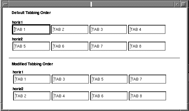
Figure 8-2 The default tabbing order in horizontal arrays can be modified to alternate between the two arrays.
To modify the tab order so that tabbing moves the cursor from top to bottom, and from left to right (as illustrated in the bottom portion of the screen in Figure 8-2):
horiz1.horiz2 (with no subscript) as the Next Tab Stop property setting.
This means when the user presses TAB while in horiz1, the cursor moves to the same occurrence of horiz2.
horiz2.horiz1[+1] as the Next Tab Stop setting.
When the user presses TAB while in horiz2, the cursor moves to the next occurrence in horiz1.
As the top portion of the screen in Figure 8-3 illustrates, the default tabbing order causes the cursor to move from the first occurrence of array1 to the first occurrence of array2, to the second occurrence of array1 to the second occurrence of array2, and so on. Scrolling through the occurrences of an array requires the user to press Enter or the DOWN ARROW key.

Figure 8-3 The default tabbing order for vertical arrays can be modified to cause the cursor to move through one array before moving to the next.
To change the default tabbing order so that the cursor moves through the screen in columns (as illustrated in the bottom portion of the screen in Figure 8-3):
array1.array1[+1] in the Next Tab Stop property under Focus.
This means that when the user presses TAB, the cursor moves to the next occurrence of the same array. In addition, Panther scrolls an array, if necessary, to make offscreen occurrences visible.
array2[1] in the Alt Tab Stop subproperty that displays under the Next Tab Stop property. This designation instructs Panther what to do when the user reaches the end of array1 (just beyond the maximum occurrence number), where its next field designation will fail.
The Alt Tab Stop designation causes the cursor to move to the top of the second array, and scroll both arrays so that their first occurrences are displayed in the top field of each.
array2.array2[+1] in the Next Tab Stop property.array2 in the Alt Tab Stop property.When a user fills a field to its last position, by default, the cursor remains in the field until the user presses Tab, Enter, or mouse clicks out of the field. You can force the cursor to automatically move onto the next field when a user enters the required data in a field or makes a selection.
The Autotab property can be set for the following widget types:
Synchronizing Scrolling Arrays | |
Scrolling arrays can be synchronized so that they scroll together. This helps manage related information in table-like screens. Panther automatically synchronizes arrays when they meet either of the following conditions:
You can manually synchronize arrays that do not meet the above conditions by making the widgets members of a synchronized scrolling group. Refer to "Creating and Modifying Synchronized Arrays" for instructions.
The behavior of synchronized arrays is largely determined by the following rules:
Array Behavior
You can also prevent one or more arrays within a synchronized group from deletion and insertion of occurrences by setting the Clearing Protect property to Yes for the array you wish to protect. This lets you synchronize a protected array that contains an unchanging sequence of numbers with an adjoining unprotected array whose data grows and shrinks
Note:
Setting an array's Clearing Protect property to Yes does not prevent deletion and insertion of occurrences in the array when it has focus.
The movement of the cursor from one occurrence to the next in an array occurs as follows:
Logical Key Behavior
If you are accessing arrays with the transaction manager, all the widgets that are members of the same server view must have the same number of occurrences if those widgets are participating in SQL This automatic synchronization of arrays by the transaction manager is attempted:
Automatic Synchronization
INSERT, UPDATE, and DELETE statements that occur as a result of the SAVE command. Otherwise, the transaction manager displays an error message that it is unable to synchronize the table view.
Synchronization of arrays is necessary for commands that alter the database—NEW, COPY, and SELECT. If it fails, an error message is displayed. Synchronization of arrays is also attempted for the If you get a synchronization error for the table view and you do not want to change the number of occurrences, you can review the Use In Update, Use In Insert and Use In Select properties for the widgets in the server view. Also, the Synchronization property for a widget can be set to No. However, changing the Synchronization property will not change the way Panther displays data in arrays. Panther fetches the number of rows equal to the smallest number of occurrences for the widgets in a server view whose Use In Select property is set to Yes.
To ensure that arrays are synchronized regardless of where they are on the screen, you can create a synchronized scrolling group. (You do not need to do this for arrays in a grid widget, or for those that are synchronized by virtue of the table view to which they belong.)
VIEW command; however, no error message is displayed if it fails.
Creating and Modifying Synchronized Arrays
How to Synchronize a Set of Scrolling Arrays
 GroupCreateSynchronized Scrolling.
All selected arrays will scroll together.
GroupSelect Groups. If the widget belongs to more than one group, the Select Group dialog box opens. Select the Sync. Group from the list.
The Properties window displays Sync. Group-specific properties.
GroupSelect Members. All widgets associated with the synchronized group are selected.
If you select widgets associated with two or more groups, the Select Group Member dialog box opens. Continue to step 3.
GroupUpdate Group Members.
The existing group now includes the additional arrayed widget.
GroupUpdate Group Members.
The group is redefined to include the new set of widgets.
You can sort data in arrays by specifying a custom sort order function or by calling the C function sm_obj_sort.
Calling sm_obj_sort for a widget in the array will use the order specified in the widget's Sort Order property: Lexicographic, Numeric, Date/Time, or Custom.
If you choose to write a custom function, it must conform to certain requirements. For more information, refer to "Writing a Custom Sort Function."
Panther uses memory-based scrolling by default. If you want to save memory at the expense of speed, you can set up a disk-based scroll driver by writing your own scrolling function. Attach the scrolling function to your arrays via the Alt Scroll Func property.
Performing Calculations and Validating Numbers | |
You can attach math and check digit calculations to widgets; they are performed at runtime when the field is validated.
Under Validation, define the math expression in the Calculation property.
You can attach one or more math calculations to a widget; separate expressions with a semicolon. The math expression takes the following format:
The square brackets indicate an optional specification. Do not include the brackets in the specification.
The optional size specification is followed by the destination widget designation (e.g., field name or number), an equal sign, and the body of the expression. The optional floating point size specification defines the destination widget.
There are three special functions that you can use in math expressions:
Math Expression Syntax
How to Attach a Math Calculation to a Selected Widget
[%
m.n | %tm.n.] destination_widget = calculation Using Functions
@sum—Calculates the sum of all the occurrences in a given array. For example, @sum(array1) totals the values in array1; @sum(#2) totals the values in the array containing field number 2.
@date—Calculates the number of days between January 1, 1753 and the argument to @date. The argument must be either a widget name or field number that has a Data Formatting property set to Date/Time and a format specification that expects MM/DD/YY or MM/DD/YYYY format, or a literal date in the format specified in the message file under the constant SM_CALC_DATE. The default literal format is %m%d%4y (MON/DATE/YR4). (For information on specifying Date/Time properties, refer to "Creating a Date and Time Field.")
The following is an example of the An error occurs if the destination widget does not have the proper format. The number resulting from the calculation is interpreted as the number of days elapsed since 1/1/1753. If a destination widget has a date format, then the result is displayed according to its format; otherwise the date is displayed as the number of days since 1/1/1753. If sets the date in The following expression sets @date function:
@date(3/31/1985)
fieldA and fieldB have the Data Formatting property set to Date/Time, the following expression
fieldB = @date(fieldB) + 30
fieldB to 30 days past the date in fieldA.
daysgoneby to the number of days between field1 and field2:
daysgoneby = @date(fieldB) - @date(fieldA)
@length—Counts the number of characters, including embedded blanks, in one or more string arguments, and returns an integer. For example, the following expression counts the number of characters in lname and fname:
A check digit calculation is used to validate a data entry widget (single line text, multiline text, and combo box widgets).
Check Digit Calculations
How to Attach a Check Digit Calculation to a Widget
Note: The source code to the check digit validation function sm_ckdigit is provided and can be modified to support other check digit algorithms.
Documenting Widgets | |
Two properties under Identity in the Properties window help you document the contents of your widgets:
By including a brief description of your widget, you can provide information to other developers about the widget, its content, and its purpose. This description is displayed when you view the Repository TOC and scroll through each of the repository entries.
Adding Comments
How to Add or Edit Comments for Your Widget
At runtime, you can access the widget's Memo Text property to determine what action to take depending on the property's content.
Defining XML Tags for Widgets | |
As of Panther 5, you can import and export data from a Panther screen to a buffer or file. Starting in Panther 5.40, you can also create XML reports. To use these features, you must:
This feature is available for the following widget types:
This section describes the property specifications for widgets. For information on XML screen properties, refer to "Defining XML Tags for Screens." For details on using the interface, refer to Chapter 22, "Using XML Data," in the Application Development Guide.
How to Set XML Properties for Widgets
When the XML is generated for the screen, container widgets are handled differently than data entry and selection widgets.
For container widgets (boxes, tab decks, tab cards and grids), Panther generates the following:
A container is included in the generated XML if any of its widgets have XML property values.
For data entry and selection widgets (dynamic labels, single line text widgets, multiline text widgets, option menus, combo boxes and listboxes), Panther generates the following:
For a sample file, refer to "Sample XML File" in Application Development Guide.
When a grid is converted to XML, the maximum number of occurrences of each grid member having an XML Tag property determines the number of occurrences to output. All offscreen data will be written to the XML.
Panther screens can import XML files. For this feature to work, the tags in the XML file must match the tags specified for the screen and the widgets.
Processing XML for Multiple Occurrences
Importing XML to Screens