


| Using the Editors | |
The screen wizard is a tool intended to help you design screens that work with the Panther transaction manager. It does not require that you have expertise with data types, widget types, primary or foreign keys, editor functions, or properties. It collects the basic design information by prompting you with a series of simple dialogs. The screen wizard is easy to use and quickly guides you through the design process for client screens and service components. You can also use the screen wizard to make a "first cut" of a complex screen.
Invoking the Screen Wizard |  |
To use the screen wizard, you must:
@DATABASE (specified in the object's Inherit From property). This property setting is the result of importing the desired database objects. (Refer to "Creating and Opening a Repository" for details.)
The screen wizard stores and uses information in the open repository to build new screens.
Now you can use the screen wizard.
How to Run the Screen Wizard
 NewScreen (or the New Screen button on the toolbar). The New Screen Tool dialog box opens.
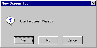
Figure 4-1 You can access the screen wizard whenever you create a new screen.
If the template screens in the repository are from an old version of the screen wizard, you will be asked whether to replace them. If you have made changes or additions to the template screens, you should back them up first, let the screen wizard overwrite them, and then redo your changes.
Note: If the screen wizard needs to add or update its template screens, make sure you have write permission on the open repository. If the repository already contains valid template screens, write permission is not necessary to run the screen wizard.
If you choose No, a blank, untitled screen opens in the screen editor workspace. If you choose Cancel, the new screen operation is canceled.
From this point, you are guided through several dialog boxes where you:
Screen Wizard Dialogs | |
The screen wizard guides you through a variety of dialog boxes, prompting you for information it needs to create the appropriate presentation for your database application screen. This section describes each of the dialog boxes.
The Format Selection dialog requests that you choose the basic structure of the new screen. Each format option determines the number of sections that will appear on a screen.
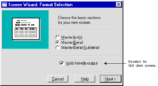
Figure 4-2 The Format Selection dialog lets you choose the basic structure of a screen.
If this option is checked, the wizard creates screens from the smwizweb template screen and enforces these Web-specific restrictions:
The First Master dialog box is where you identify the first table for the Master section and choose which of its columns you want included on your screen.
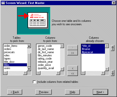
Figure 4-3 The First Master dialog displays a list of tables in the open repository. These were created as a result of importing database tables.
The list displays the names of all imported database tables in the open repository.
Once you select a table, the other two lists are populated:
The contents of the Columns Already Chosen list tells the screen wizard which columns to include on the new screen, and the order in which to display them.
Note:
Click+drag or Shift+click selects contiguous items, and Ctrl+click selects non-contiguous items.
The highlighted items shift up or down within the list, one position at a time.
The Include Columns from Related Tables check box is active if one or more link widgets are present on the repository screen of the selected table; otherwise, it is inactive.
If the first table you selected has a primary key definition, one of the following occurs:
If the selected table does not have a primary key, the Primary Key Selection dialog opens.
A primary key is the column, or combination of columns, that uniquely identifies each row in a database table. If the first table you have selected does not have a primary key definition, the Primary Key Selection dialog opens where you can identify a primary key for the table.
Note: The Primary Key Selection dialog does not open for any additional tables in the master section because the screen wizard assumes these are non-updatable tables.

Figure 4-4 The Primary Key Selection dialog is where you define your primary keys.
Click+drag or Shift+click selects contiguous columns; Ctrl+click selects non-contiguous columns.
Once a primary key is defined, the screen wizard can proceed (refer to the First Master Dialog section, step 6).
Primary Key columns that you define in the wizard are displayed with a leading plus sign (+) to distinguish them from Primary Key columns defined in the repository. Other than this, the screen wizard treats these columns exactly the same.
Note: If a user-defined Primary Key is used often, you should set the Primary Keys property (under Database) on the appropriate repository entry.
The Additional Master dialog opens if you have selected the Include Columns from Related Tables check box on the First Master dialog. Use this dialog to identify additional tables for the Master section and to specify which of their columns you want included on your screen. The following general rules can assist you in determining when a table is best used as an additional table or as the first table of the next section.
PG is the code for movie ratings and parental guidance is the text associated with the code.
How to Include Columns from Other Tables in the Master Section
This is a hierarchical list of all tables named in links on the repository screen of the First Master table you selected. It also lists tables related to those additional tables. Therefore, you can select columns from the immediate child tables and/or from their descendants.
Once you select a table, the other two lists are populated:
The contents of the Columns Already Chosen list tells the screen wizard which columns to include on the new screen, and the order in which to display them.
Note:
Click+drag or Shift+click selects contiguous items, and Ctrl+click selects non-contiguous items. You cannot remove selected columns in the Columns Already Chosen list if they are from the First Master table.
The highlighted items shift up or down within the list, one position at a time.
The screen wizard collects all of your chosen columns from all of your selected tables.
Depending on your specifications, the screen wizard proceeds by doing one of the following:
The First Detail dialog is identical to the First Master dialog. Use this dialog to identify the First table for the Detail section and to select which of its columns should be included on your screen.
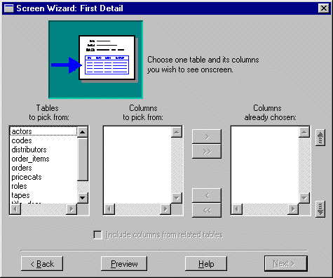
Figure 4-5 The First Detail dialog is where you define what fields display in the Detail section of your screen.
For identifying the First Master table of your screen, follow the directions as described under "First Master Dialog."
The Tables to Pick From list shows all tables in the open repository, but does not include the First Master table you selected.
When you choose Next, the screen wizard does the following if the table you selected has a primary key definition:
If the selected table does not have a primary key definition, see "Primary Key Selection Dialog."
The Additional Detail dialog opens if you have selected the Include Columns from Related Tables check box on the First Detail screen. Use this screen to identify additional tables for the detail section and which of their columns should be included on your screen.
Follow the directions as described for identifying Additional Master tables for your screen under "Additional Master Dialog."
When you are finished selecting additional tables and their respective columns for the Detail section of your screen, choose Next. The screen wizard checks for a link widget in the open repository that connects the First Master table to the First Detail table. If a usable link is found, the screen wizard proceeds by doing one of the following:
Additional Detail Dialog
How to Include Columns from Additional Detail Tables
If there is no link widget to connect the First Master table to the First Detail table, the Master-Detail Link dialog opens.
It is required that the First Master and First Detail tables be joined to each other by a link widget. The link defines the relationship between the two tables by keeping a list of which columns in the First Master should be matched to columns in the First Detail. If you have selected a First Detail table that does not have a link to the First Master table on your screen, the Master Detail Link dialog opens.
Note:
The Master-Detail Link dialog does not appear for additional table selections because the screen wizard only displays additional tables for which links already exist.
Master-Detail Link Dialog
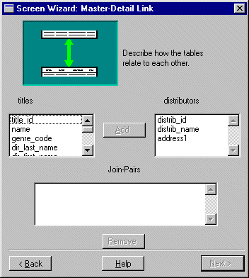
Figure 4-6 The Master-Detail Link dialog is where you define the relationship that connects the First Master and First Detail tables.
How to Define a Master-Detail Link
The selected columns move to the Join-Pairs list.
The screen wizard collects all of your chosen conditions in the Join-Pairs list.
The screen wizard allows you to specify First and Additional tables for the Subdetail section of your screen in exactly the same manner as for Detail tables.
The Tables to Pick From list box displays all tables in the open repository, but does not include the First Master or Detail tables you already selected.
For specific information, follow the directions as described for identifying the First Master table.
The Layout Selection dialog opens when you have made all table and column selections you require for your screen. Use this dialog to define the presentation layout for each section. The screen wizard chooses the most reasonable defaults for your screen specification. However, you can easily experiment with all possible variations for each section of your screen. Sample layouts are displayed on the Layout Selection dialog.
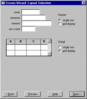
Figure 4-7 Choose either single row layout or grid display layout to display data.
In JetNet and Oracle Tuxedo executables, the Application Model Selection dialog is used to define the architecture and specify the screens that you want to generate. The screen wizard can generate client screens, service components, selection screens (if any) and their corresponding selection service components (if any) depending on what you specify. For an overview of two-tier and three-tier architectures, refer to Chapter 4, "Defining Application Architecture," in Application Development Guide.

Figure 4-8 Choose the architecture of your screens and specify the screens that you want to generate.
A client screen provides a user-interface for your application. A two-tier client screen is functionally ready to go; however, for a three-tier client screen to be functionally complete, you must define the services it uses in the JIF.
A service component is identical to a client screen except that it has no push buttons and no menu/toolbar controls, since there is no interaction between a user and a service component. Also, there is no screen title on a service component.
Selection screens, sometimes called pick lists, are most helpful when entering new records. They display a list of acceptable values for a field (or fields).
The selection service component facilitates the transfer of data from the server to the selection screen on the client side of the application. The server fetches this data from the database and provides the selection screens on the client side of the application with a list of acceptable values for a field (or fields).
Depending on your specifications, the screen wizard proceeds by doing one of the following:
In JetNet and Oracle Tuxedo executables, the Service Definition dialog appears only if you chose to generate a three-tier client screen. You use the Service Definition dialog to specify the services that are used by the screen. They are set as Service properties for the First Master table view widget on the client screen and on its selection screens (if any); the Service property is also set for link widgets on the client screen.
Note: You must also define these services in the JIF using the same service names. Refer to Chapter 24, "JIF Editor," for information on defining services in the JIF.
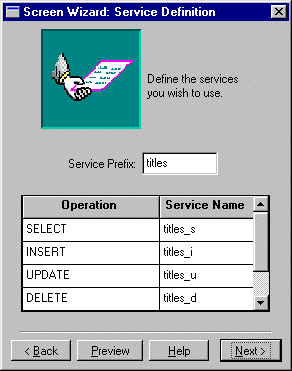
Figure 4-9 The Service Definition dialog is where you can specify the names of services.
The Service Definition dialog consists of the Service Prefix field and a list of screen wizard-named services. The list includes:
Note: A service prefix entry is required.
The list of unedited service names is updated with the new prefix specification.
Note: The Service properties on the client screen are set to the service name values.
The Style and Finish dialog is where you make the final design decisions.

Figure 4-10 Add the final touches to your screen on the Style and Finish dialog.
Note: The Screen Options are only applicable to client screens.
Note: The comments are written to all of the screens generated.
The completed screen is displayed, along with the following prompt:

Figure 4-11 Review the completed two-tier screen.
Table 4-2 lists the screens generated by the screen wizard and its default names depending on the architecture of your application and your selections in the Application Model Selection dialog.
In a two-tier architecture, you need a direct connection to the database and then you can immediately test your screens.
In JetNet and Oracle Tuxedo applications, you need a remote connection to the database to completely test your client screen and the services it uses. However, before you test your client screen, you must save the corresponding service component and selection service components (if any) to their appropriate libraries, and you must define the services in the JIF.
For further information on testing screens, refer to Chapter 38, "Testing Application Components," in Application Development Guide.
Output for Two-Tier Architecture | |
Two-tier output can consist of the following screens:
A number of properties on the screen and on individual widgets are automatically assigned. Some of these settings will work without any modifications. For further information on property settings, refer to "Two-Tier Property Specifications."
The client screen provides a user interface for your application. You can rearrange widgets and add decorations, but functionally, the screen is complete and ready to go.
Sections with single row layouts are surrounded by a positioning region box to align the widgets inside it. The box does not display at runtime. Below all the sections, the screen wizard places any link widgets needed by the screen. Link widgets are not visible at runtime; therefore, their placement is strictly a matter of convenience.
Push buttons, if specified, appear along the bottom of the screen: four Continue buttons and six command-specific buttons. The buttons are surrounded by a positioning region box to keep the buttons centered horizontally on the screen. The box does not display at runtime.
Each selection screen is named for the table it references, followed by the file extension Selection screens, sometimes called pick lists, are most helpful when entering new records. They display a list of acceptable values for a field (or fields). On the client screen, the selection screen is defined in the appropriate widget's Selection Screen property (under Help). If the property already has a value specification (via the repository), the screen wizard does not overwrite it and does not create a selection screen for the table associated with the widget.
Two-Tier Client Screen and How It Looks
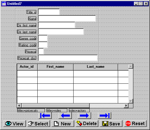
Figure 4-12 A client screen in a two-tier architecture.
Two-Tier Selection Screens
.itm. If a screen named table.itm already exists in an open library, the screen wizard does not regenerate it. If you need to recreate the selection screen, or want a new one for the same table, rename the old one before invoking the screen wizard.
Output for JetNet and Oracle Tuxedo Applications | |
In JetNet and Oracle Tuxedo applications, three-tier output can consist of the following screens:
When you generate a client screen and a service component, they are identical because a service component interacts with its client screen counterpart to transfer data to and from the appropriate services. The client screen and service component pair must be kept parallel. Thus, if you modify your client screen, you must also modify its corresponding service component in a similar fashion. This is true of selection screens and their corresponding selection service components.
Note:
Visual modifications (such as color, fonts, and pixmaps) on the client screen need not be duplicated on the service component.
A number of properties on the screen and on individual widgets are automatically assigned. Some of these settings will work without any modifications. For further information on property settings, refer to "Three-Tier Property Specifications."
The client screen provides a user interface for your application. It is light gray in color to distinguish it from its associated service component (highlight white background). You can rearrange widgets and add decorations. However, for your screens to be functionally complete and ready to go, you must define the services it uses in the JIF.
Sections with single row layouts are surrounded by a positioning region box to align the widgets inside it. The box does not display at runtime. Link widgets needed by the screen appear below the Master-Detail-Subdetail sections. Link widgets are not visible at runtime; therefore, their placement is strictly a matter of convenience.
The command-specific buttons, if chosen, appear at the bottom of the screen and are surrounded by a positioning region box. The positioning region box keeps the buttons centered horizontally on the screen.
Although the service component is never visible at runtime, it has a highlight white background to distinguish it from its associated client screen (light gray color) in the screen editor. It is used to transfer data from the clients screen to services and vice versa. You can rearrange widgets, but functionally, the screen is complete and ready to go.
A service component is identical to a client screen except that it has no push buttons and no menu/toolbar controls, since there is no interaction between a user and a service component. Also, there is no screen title on a service component.
For every Additional table you have specified via the screen wizard, a selection screen is generated (with a Selection screens, sometimes called pick lists, are most helpful when entering new records. They display a list of acceptable values for a field (or fields). On the client screen, the selection screen is defined in the appropriate widget's Selection Screen property (under Help). If the property already has a value specification (via the repository), the screen wizard does not overwrite it and does not create a selection screen for the table associated with the widget. For further information on using selection screens, refer to "Using Selection Screens."
In a three-tier architecture, for every Additional table you have specified via the screen wizard, a selection service component is generated (with an A selection service component facilitates the transfer of data from the server to the selection screen on the client side of the application. The server fetches this data from the database and provides the selection screens on the client side of the application with a list of acceptable values for a field (or fields).
Three-Tier Output and How It Looks
Three-Tier Client Screen

Figure 4-13 A client screen in a three-tier architecture.
Service Component

Figure 4-14 A service component.
Three-Tier Selection Screens
.cit extension).
Selection Service Components
.sit extension). It is identical to its corresponding selection screen, except that it does not have push buttons or a title bar.