


| Application Development | |
Panther lets you access and manipulate most widgets at runtime, get and modify their data and properties, ascertain the current selection within a radio button group or list box, and determine whether data has changed or passed validation. Panther differentiates between data entry widgets that can be thus accessed and manipulated, and other widgets that are static in nature, like lines, boxes, and static labels.
In order to access widgets, you must know how widgets are identified; for information on widget naming and array/occurrence numbering, refer to Chapter 14, "Identifying Screen Widgets."
Functions described in this section are documented in the Programming Guide; refer to that manual for the syntax and specific behavior of each function.
Changing Widget Display |  |
Widget display is determined by the setting for the Hidden property. By default, this property is set to No. You can change the setting to:
For tab decks, the topmost_card runtime property sets the topmost card in the deck or returns the object id of the card that is topmost in the tab deck.
Controlling Input | |
You can control what type of input in allowed for the widget by setting the widget's properties in the screen editor and, if necessary, changing those properties at runtime.
The Keystroke Filter property sets the criteria for data entry: the keys that can be used (numbers, letters, or a combination) and the format of the entered data.
For example, the following entry in the Edit Mask subproperty would force the user to enter three digits followed by six letters:
ID#\9\9\9-\X\X\X\X\X\X
ID# and the hyphen are only display characters. Display characters are stripped before sending the value to a database or copying the value with sm_getfield§. For more information, refer to "Edit Masks" in Using the Editors.
The Regular Expression property can also enforce a specific pattern of letters or numbers, and in addition, it can restrict the range of characters available. For example, the following expression defines a code of three digits ranging from 1-5, followed by a hyphen and minimum of three letters, but no more than six.
[1-5]\{3\}-[a-zA-Z]\{3,6\}For more information, refer to "Regular Expressions" in Using the Editors.
If you want to suggest a format pattern and have that format pattern saved to the database, you can use the Keystroke Filter property in combination with the Initial Text property. For example, an initial text entry of - - in combination with a setting of Numeric in the Keystroke Filter property would allow the user to enter groups of numbers separated by hyphens.
Other properties in the Input category determine if entry in the widget is required and if data in the widget is protected. For more information, refer to Chapter 14, "Data Entry Widgets," in Using the Editors.
Under Format/Display, properties determine if a widget's contents are right or left justified, a password, a date format, or a currency format. You can also specify the date or currency format which will be used to enter data. For a description of properties in the Format/Display category, refer to Chapter 10, "Controlling the Way Things Look," in Using the Editors.
Traversing Widgets | |
You can traverse widgets on the screen using the mouse or the TAB key.
Panther provides a set of library functions that enable you to traverse the contents of a container widgets. These are screens (including ones used as LDBs), grid widgets, box widgets, selection groups, synchronized scrolling groups, tab decks, tab cards and table views. Follow these steps:
sm_list_objects_start through repeated calls to sm_list_objects_next. This function, when first called, on a given list returns the object ID of the first widget in the list; each subsequent call returns the object ID of the next widget in the list.
When the list is completely traversed, the function returns PR_E_ERROR. You can use this error code to test whether a list is fully traversed; or use sm_list_objects_count to set a counter within a for loop.
For example, the following procedure creates an objects contents list for all members in a grid and traverses the list:
proc traverse_grid( grid_name )
vars grid_list, ct, member_ct, member_id
// create list of all members in grid
grid_list = sm_list_objects_start( sm_prop_id( grid_name ) )
if grid_list > 0
{
	// get count of listed object IDs
	member_ct = sm_list_objects_count( grid_list )

	for ct = 1 while ct <= member_ct
	// traverse list
	{
		member_id = sm_list_objects_next( grid_list )
		// use member's object ID to perform some action on it
	}
	call sm_list_objects_end( grid_list )
	return 1
}
return 0
The following example hides a box widget and the widgets positioned within its borders:
proc hide_box (name)
{
	vars box_list, count, i, item_id
	@widget(name)->hidden = PV_YES
	box_list = sm_list_objects_start ( sm_prop_id (name) )
	if box_list >0
	{
	count = sm_list_objects_count ( box_list )
	for i = 1 while i <= count
		{
			item_id = sm_list_objects_next ( box_list )
			// don't try to hide static labels
			if @id(item_id)->widget_type != PV_STATIC_LABEL
			{
				// don't try to hide always-hidden widgets
				if @id(item_id)->hidden != PV_ALWAYS
				{
					@id(item_id)->hidden = PV_YES
				}
			}
		}
		call sm_list_objects_end (box_list)
		return 0
	}
	return -1
}
In JPL, the member property can be used to find the members of a container. The following example cycles through the cards in the specified tab deck:
for i = 1 while i <= my_deck->number_of_cards
{
	a = my_deck->member[i]
	@id(a)-> ...

	//some JPL programming

}
Getting Widget Data | |
Panther library functions let you obtain the data in a widget or its occurrences; they also let you ascertain the widget's current property settings.
The following functions copy data from widgets and arrays:
You can also get information about the data in a widget with these functions:
SM_NO and SM_YES entries in the message file, ignoring case.
sm_null gets the widget's null indicator and compares it to the widget's value.
You can access all widget properties at runtime through JPL or the property functions: sm_prop_get, sm_prop_set, and sm_prop_id. For example, this JPL if statement conditionally unhides a widget at runtime by changing its hidden property to For more information about getting and setting widget properties in JPL, refer to Chapter 19, "Programming in JPL."
Getting Properties
PV_NO:
if (login == "super")
  emp_salary ->hidden = PV_NO
Changing Widget Data | |
The following library functions let you move data directly into widgets:
sm_ww_write wraps at the end of words and leaves a space at the end of each line. If a word is equal to or longer than the length of the widget, sm_ww_write breaks the word one character before the end of the field, appends a space, and wraps the rest of the word on the next line.
numeric_type property specification. If neither exists, it uses two decimal places.
To clear widget data:
Clearing Widget Data
FERA logical key to clear a widget's data.
CPROTECT). Date and time fields that take system values are reinitialized. Widgets with the null edit are reset to their null indicator values.
CPROTECT). sm_clear_array and sm_n_clear_array also clear arrays synchronized with the array unless they are protected from clearing. Variants sm_1clear_array and sm_n_1clear_array only clear the specified array.
You can insert rows in using the logical key Two functions let you delete and insert occurrences from arrays:
Inserting and Deleting Occurrences
INSL and delete rows using DELL.
If other arrays are synchronized with the one specified, Both functions ignore the target array's Clearing Protect setting.
sm_doccur and sm_ioccur perform the same operation on them, provided their Clearing Protect property is set to No. If a synchronized array is protected from clearing, Panther leaves it unchanged. Thus, you can synchronize a protected array that contains an unchanging sequence of numbers with an adjoining unprotected array whose data grows and shrinks.
Making Widget Selections | |
Panther has a set of functions that let you check the current selection or selections within a selection group, and change the selections.
Two functions, sm_isselected and sm_getfield, let you determine whether a selection has been made within a selection group and what those selections are.sm_isselected checks whether a selection has been made in a selection group. The selection is referenced by the group name and occurrence number.
If you call sm_n_getfield on a radio button group that allows one selection, the buffer that you pass into this function gets the group occurrence number of the selected item. For example, the radio button group rating has the third occurrence, PG-13, selected:

Given this selection, the following call to sm_n_getfield puts the string "3" into the string buffer pointed to by buffer:
ret =
sm_n_getfield (buffer, "rating");
If you call sm_n_getfield on a group of widget types that allows multiple selections, for example, a check box group. Panther puts the numbers of the selected occurrences into buffer. For example, the genre check box group has occurrences 1, 3, and 4 selected:
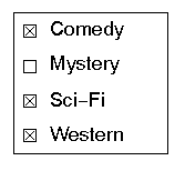
If you call sm_n_getfield on genre, buffer gets the string 1 3 4.
Panther sees a group's value as an array whose elements contain the offsets of the selected items. Thus, Panther stores the value of genre as follows:
genre[1] = "1"
genre[2] = "3"
genre[3] = "4
genre[4] = " "
sm_i_getfield gets the specified selection in the group. For example, this call gets the second-selected item in genre and puts its value, 3, into buffer:
retvar = sm_i_getfield (buffer, "genre", 2);
sm_select lets you select an occurrence within a selection widget group. If the group's # of Selections property allows no more than one selection, Panther first deselects the current selection before it selects the specified group occurrence. For more information about selection widgets, refer to Chapter 20, "Selection Widgets," in Using the Editors.
To deselect an occurrence, call sm_deselect.
The selected runtime property specifies whether a selection-type widget is selected.
For grid widgets, the grid_current_occ runtime property contains the grid widget's current (or selected) occurrence. The following JPL procedure uses this property to delete the selected row.
proc delete_selected_row(fld)
vars grid_name occ
{grid_name = @widget(fld)->grid
occ = @widget(grid_name)->grid_current_occ
call sm_i_doccur(fld, occ, 1)
return 0
}
Inside a list box, you can select multiple occurrences or change the application behavior to only allow a single choice. The LISTBOX_SELECTION behavior variable determines the behavior of list boxes in your application with its settings of SIMPLE_SELECTION and EXTENDED_SELECTION (default). The value for LISTBOX_SELECTION must remain constant during the running of the application.
For extended list boxes, the Listbox Type property must be set to Select Any. If it belongs to a selection group, the # of Selections property must also be set to Any. Extended selections pertain to selections within the list box, not the selection group. Therefore, if you have two list boxes in the group, the selection within one list box will have no effect on the other.
One of the field function arguments, K_EXTEND, can determine if the widget is an extended list box. Another field function argument, K_EXTEND_LAST, can determine if the cursor is in the last item of an extended selection list box.
The ADDM logical key toggles in and out of add mode within the list box.
Accessing Tab Controls | |
A tab control, available for Windows and Motif applications, consists of a tab deck and its associated cards. The tab deck is like a box; any widget within its boundaries is assigned to one of its cards. The number_of_cards read-only property gets the number of cards in the deck, including hidden ones.
Each tab card can have widgets which can be grouped as needed. The card property of each widget appearing on a tab card is set to the object ID of that card.
Tab cards are numbered sequentially within the tab deck. The Card Number property (card_number) determines the sequence of the cards. You can move to another card by clicking on its index tab or with the NCARD and PCARD logical keys.
The tab card currently on display in the screen is the topmost card. At runtime, you can set which card is topmost using the tab deck's topmost_card property. The following JPL statement set a new topmost card:
//  my_deck has three cards named card1, card2, and card3.
//  This call sets the second card as topmost card.

my_deck->topmost_card="card2"
Accessing ActiveX Controls | |
Active X controls, available for Windows and Web applications, are considered separately since the ActiveX control itself is not a Panther' widget, only the ActiveX container is. However, Panther can access the ActiveX control's properties, events, and methods. This allows you to manipulate the ActiveX control at runtime.
The Active X container's CLSID property (clsid) determines which ActiveX control is located inside the container. If the ActiveX control specified in that CLSID property is registered on your system, the control will be displayed in the screen editor and the Properties window will display the control's property names and settings.
To get and set property values at runtime:
ax_ prepended to the Active X control's property name. The ax_ prefix insures that there are no conflicts between Panther properties and ActiveX control properties.
sm_obj_get_property and sm_obj_set_property.
The author of an ActiveX control specifies what methods can be used to access the control, the arguments needed for those methods, and the events that are applicable to the control. Those methods can then be called in Windows applications using For more information and an example of an ActiveX control, refer to Chapter 18, "ActiveX Controls," in Using the Editors.
sm_obj_call and in Web applications using VBScript or JavaScript. An event handler can then be written for those events using sm_com_set_handler in Windows applications and VBScript functions in Web applications.
Checking Validation | |
Panther maintains two runtime properties that can be checked to determine the validation and modification status of a widget or group:
valided
PV_YES—the widget has passed validation.
PV_NO—the widget has not passed validation.
The valided property is initially set to During field validation, Panther tests a field's data against a number of formatting and input property settings. Refer to Table 17-1 for a list of these properties.
In order to allow users to move freely within a GUI application screen, validation is typically suppressed until they explicitly submit the screen data, for example, by pressing a Save push button. Field validation does not typically occur when the user uses a cursor key to move out of the widget, or mouse clicks into another widget. To force validation also to occur on these events, set the application behavior variable For information on validating widgets during screen exit processing, refer to "Screen Exit Processing."
PV_NO when a screen is displayed. It is reset to PV_NO each time the content of the widget is changed. It is set to PV_YES each time the widget passes its validation tests; for example when sm_fval forces validation processing on the widget. You can also explicitly set a widget's valided property to PV_YES or PV_NO.
IN_VALID to OK_NOVALID.
mdt
PV_YES—the data is changed.
The mdt property is initially set to Panther performs validation on a widget no matter how its valided property is set. If a widget's validation requires significant processing such as a database lookup, you can avoid redundant validation and significant overhead by setting its PV_NO after the screen's entry function is called and is set PV_YES when the content of the widget or group changes. Once set to PV_NO, a widget's mdt property remains unchanged while the screen is displayed; however, you can explicitly reset it to PV_YES.
no_validation property to PV_YES and test the state of its data only when necessary, for example, through the widget's own exit function. The following JPL code tests the mdt property of widget cust_id, to determine whether to force validation processing through sm_fval. Because this widget has validation initially disabled (no_validation = PV_YES), its no_validation property must be reset before the call to sm_fval:
/* If the data has changed, force-validate the widget */
if cust_id->mdt == PV_YES
{
  /* reenable validation */
  cust_id->no_validation = PV_NO

  /*  validate widget data */
  if ( sm_n_fval( "cust_id" ) == 0 )
  {
    cust_id->mdt = PV_NO            /* reset mdt flag */
    cust_id->no_validation = PV_YES /* disable validation */
  }
}mdt properties for all widgets:
PV_NO.
mdt bit set to PV_YES, the function returns with the base field and occurrence number. Use this function to ascertain whether any occurrence has been modified on the screen since the screen was displayed or its mdt was last cleared by sm_cl_all_mdts or by resetting the mdt property.