

 | Web Development |     |
This chapter discusses screen and widget properties and behavior that are specific to Web applications. In most respects, screens and widgets have the same properties and behavior in Web applications as on other platforms. You use the same tools—screen editor, screen wizard, debugger—to create and test Web screens. For information about these tools and common properties, refer to the Using the Editors.
Screen Properties |  |
Table 3-1 lists screen properties by category and describes their relevance in Web applications.
Table 3-2 lists the Web Options properties for screens that have property settings that are relevant only to Web applications:
Widget Types |  |
Table 3-3 lists Panther widget types whose presentation or behavior is different in Web applications:
Widget Properties |  |
Widgets have several properties that are relevant only to Web applications. A number of other properties are implemented differently in Web applications or are ignored altogether. Three widget types–push buttons, selection groups, and grid widgets–are discussed individually; widget positioning in an HTML document is also discussed separately.
Table 3-4 lists Web Options properties that can be set for widgets used in Web applications.
Table 3-5 shows which properties are implemented differently in a Web application.
Push buttons are used in Web applications to submit the form back to the server and perform the processing associated with that button. Inactive push buttons use the Inactive Pixmap property setting; if it is not set, the push button is drawn as display text with a border.
The size of a push button is controlled by the browser, which typically uses the label length; the push button's Length and Size to Contents properties are ignored.
JavaScript or VBScript can be specified for push buttons using the onClick event; however, do not specify pixmaps in this case. In the HTML specifications, the pixmap specification takes precedence, and the JavaScript or VBScript function for the push button is not activated.
To perform the processing attached to a push button without submitting the form back to the server, set the Submit property on the push button to No. One use for this property is when Java or JavaScript is specified for a push button. If the Submit property is No, activating the push button runs the Java/JavaScript on the Web browser without additional interaction with the HTTP server.
Warning: Do not use push buttons in Web applications to execute shell commands whose output is displayed back to the user. If you execute a shell command, redirect the output to a file, then display that file to the user.
You can use either radio button or check box widgets in a Web application to record the user's selection. If an application contains toggle buttons that are part of a multiple selection group, Panther converts them to a check boxes. Single-selection toggle buttons are converted to radio buttons.
If a selection group's member has its Active property set to No, the widget is removed; however, its text remains displayed.
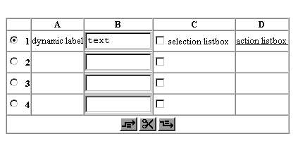
Three types of widgets can be included in grid widgets—dynamic labels, single line text, and list boxes. A Web application displays these widget types as follows:

Figure 3-1 A grid widget that contains four members: dynamic label, single line text, list box set to Select Any, and list box set to Action.
By default, the grid widget is created with a fixed size that is calculated from its Onscreen Rows property. If the number of rows in a grid is greater than this property, Panther inserts a column of scrolling push buttons to enable access to the unseen data (refer to "Scrolling Grids."). You can specify that a grid's size be set dynamically by setting its Auto Expand property (under Web Options) to Yes. When data returns, the size of the grid matches the number of returned rows. The screen size limit of 255 lines is not enforced with expandable grids.
When an expandable grid widget's size changes, all other widgets on a screen maintain their position relative to its borders. For example, when the grid expands, the widgets below it shift down. If widgets are aligned to the bottom of the grid, their positions remain unchanged, and they stay aligned to the bottom of the grid.
For sample usage, refer to the Panther Web gallery example Expandable Grids.
If one or more grid members is unprotected, Panther, by default, modifies the grid in two ways:
Dynamically Resizing Grids
Selecting and Modifying Grid Data
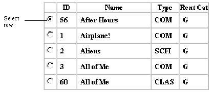
If all grid members are protected, you can allow users to select a row by setting the grid widget's Stripe Current Row property to Yes. A grid thus set contains a column of radio buttons that enable user selection.
When the screen is submitted back to the server, Panther sets the
If the Ins/Del Buttons property is set to No, the buttons to insert and delete rows are not generated. If the Radio Buttons property is set to No, the radio buttons indicating the current selection are not generated, even though the current selection is still tracked.
When screens are submitted at runtime, Panther variables contain information about the grid push button that was pressed and the grid's object ID and occurrence number. For more information, refer to "Web Entry Context Flags."
The grid push buttons derive their GIF images from a Panther library:
Insert Above
Insert Below
Delete Row
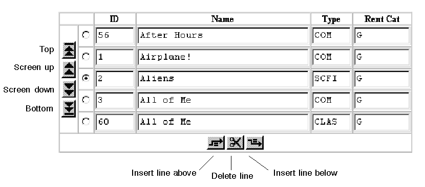
If a grid widget's size is fixed and it contains more rows than its onscreen size allows, a column of push buttons are inserted in the leftmost position of the grid widget to enable scrolling:
This default behavior can be changed by setting the Scroll Buttons property on the grid widget to No.
When screens are submitted at runtime, Panther variables contain information about the grid push button that was pressed and the grid's object ID and occurrence number. For more information, refer to "Web Entry Context Flags."
The grid push buttons derive their GIF images from a Panther library:
Bottom
Screen Down
Screen Up
Top
The Panther Gallery contains sample screens entitled Action & Selection in Grids and Scrolling Grids, and is accessible from the Web application server:
To maintain widget positions within an HTML document and maximize usage of window space, the following position-specific properties and design options are provided.
HTML does not support overlapping widgets. In order to quickly detect overlap ping widgets, radio buttons, check boxes and labels have borders to indicate whether they overlap another widget. These borders do not appear at runtime. Additionally, to check for overlapping widgets while editing a screen, choose Edit Each widget has two anchor properties–Horizontal Anchor and Vertical Anchor—to help align widgets. These properties can be set manually in the Properties window, but they are also set automatically when the screen editor's alignment feature is used. Thus, if you left-align a group of widgets, you are automatically setting their horizontal anchor properties to be left. Panther uses these anchor properties to determine how widgets are aligned with other widgets on the screen.
Each widget has one vertical and one horizontal anchor property, so you can control alignment once in each direction. If you align a widget one direction and then realign it the other way, only the latter setting of the anchor property is in effect. So, you can align a large widget like a pixmap or a grid widget relative to a widget on the left or on the right, but not both.
For example, a screen has a pixmap with several widgets to one side of it. The pixmap's Vertical Anchor property is set to middle.
Panther uses that middle point to determine where the pixmap lies relative to the widgets to the side of it. With this setting, you cannot directly control whether the topmost widget is above or below the upper border of the pixmap. To ensure that the topmost widget lies below the upper border of the pixmap, specify the pixmap's Vertical Anchor to be top and make sure that the topmost widget's vertical anchor is below the upper border of the pixmap.
In the screen editor, select Options If you want a group of widgets to be spaced close together, select all these widgets; then use Edit If you find that widgets are being pushed out further than expected in the generated HTML, place repeated design elements together in a positioning region. Widgets inside a positioning region keep the same relative distance to each other when the HTML is generated. A positioning region is defined through a box widget (refer to "Using Boxes as Positioning Regions" in Using the Editors); a screen can have multiple positioning regions.
Three screen properties that are otherwise ignored can affect how closely widgets can be positioned next to the browser window's borders: Border, Title Bar, and System Menu. Set all three properties to No in order to allow widgets to abut on the browser window's borders without any intermediate space.
One browser may create its widgets using different font families and sizes than another browser, or than the Panther screen editor. This results in screens that can appear slightly different (more or less space between widgets) from browser to browser, or from browser to screen editor. Specifying font sizes in the Panther screen editor results in better positioning than using header tags, such as grid_current_occ property to the selected row and performs all grid row entry and exit functions.

Figure 3-2 When the Radio Buttons property is set to Yes, radio buttons appear in the left column of the grid if one of the grid members is unprotected or if the grid's Stripe Current Row property is set to Yes.
Push button
GIF file
gridsi.gif
gridsa.gif
gridsd.gif
Scrolling Grids

Figure 3-3 A grid with unseen rows contains push buttons for scrolling all data into view.
Push button
GIF file
gridbb.gif
griddn.gif
gridup.gif
gridtt.gif
http://server-name/cgi-bin/jwsamp/main
Widget Positioning
Overlapping Widgets
 Find
Find Overlapping Widgets. To check for overlapping widgets when a screen in saved, choose Options
 Check Overlap on Screen Save.
Horizontal and Vertical Anchors
Snap to Grid
 Snap to Grid. With this option enabled, a new widget is automatically positioned at the nearest grid point. This makes it easier to visually align widgets.
Spacing of Widgets
 Space
Space Custom to distance them at 0, either horizontally or vertically.
Positioning Regions
Maximum Usage of Space
Fonts
H1.
Font Properties |  |
If the Font Name or Point Size property for a screen or widget is set to a value other than Default, the generated HTML specifies fonts and sizes in this format: <div style="font-size:relative-fontsize;font-family:font-family-names">
If a screen has its Font Name property set, a style tag that specifies this setting is generated for each widget whose Font Name property is set to Default. If a widget has its own Font Name property setting, the HTML contains a style tag that specifies the widget's font.
If font-name is supported by the browser, this setting overrides the browser's proportional and fixed font settings.
The font name must map to a font that the browser supports in order to have effect. For maximum flexibility, set the Font Name property to a font alias whose definition in the Web configuration map file webcmap specifies one or more fonts. For example, this entry maps Prolifics Helvetica to three comma-delimited sans serif fonts:
Prolifics Helvetica=Helvetica,Arial,Geneva
When HTML is generated, all Font Property settings that specify Prolifics Helvetica are mapped to Helvetica,Arial,Geneva in a style tag. Then the HTML is rendered, the browser will use the first font in the list that it supports.
When HTML is being generated by prorun or prodev, if the Configuration Map file has the [HTML Fonts] section, the font aliases specified are used instead of those in the [Display Fonts] section.
If a screen has its Point Size property set, a style tag that specifies this setting is generated for each widget whose Point Size property is set to Default. If a widget has its own Point Size property setting, the HTML contains a tag that specifies the widget's relative size.
Point Size property settings for screens and widgets are converted into equivalent HTML font sizes, as shown in Table 3-6:
| Point size | Relative font size |
|---|---|
|
6, 7, 8, 9 |
60% |
|
10, 11, 12 |
80% |
|
13, 14 |
100% |
|
15, 16, 17 |
120% |
|
18, 19, 20 |
150% |
|
21, 22, 23 |
200% |
|
24, 26, 28, 36, 48, 72 |
300% |
Application Properties |  |
Web applications also have access to the following runtime properties:
in_web
Values: PV_YES/, PV_NO
Constraints: Read-only.
The following section of a JPL procedure would hide the push buttons needed for Web processing in other types of applications:
if ( @app()->in_web=PV_NO )
	{
	pb_details->hidden=PV_YES
	pb_back->hidden=PV_YES
	}
The Panther Web Gallery contains a documentation sample entitled Web and GUI Application which uses in_web. The Panther Web Gallery is accessible from the Web Application Server at:
http://server-name/cgi-bin/jwsamp/main
previous_form
webid


